Modern web forms: some more subtleties
Most people perceive the world with their eyes, so visual design is of great importance when creating frontends of web applications. But are all these ryushechki and “caramel” so useful that modern web designers like to saturate the interface? In this article I would like to talk about common mistakes in the design of web forms, as well as share some secrets of creating the right interface.
')
It is worth making a reservation that by “correct interface” I mean such an interface that significantly increases conversion and provides subjective comfort for users. The reliability of the data is ensured both by studies conducted by our group and by studies of third-party (most often Western) UX specialists.
Recently, trends in the design of both web applications in general and forms in particular, strive for maximum decoration: the so-called "Caramel" design, gradients, shadows, bright and non-standard interface elements. Sometimes, among the "design" is difficult to find the actual content.
Such mindless embellishment leads to the fact that the user's attention is distracted from the main purpose of using the web application, the user begins to be fixed not on filling out the form, but on studying its design. In the end, the form is never filled and we do not receive our precious conversion.
So let's take a look at some fashion trends in web form design:
The heading (label) tells you what type of information you need to enter in a text or other field. This means that the user must read the heading before moving to the input field. For sites where content is read from top to bottom from left to right, the label is logical to place either above the input field or directly to the left of it. In practice, designers often put the heading anywhere, but not in a natural place for it.
A striking example is that the label is located below the input field (Fig. 1):

Fig.1 Heading for the input field below the field itself
This arrangement of the field header leads to the fact that people who are accustomed to read from top to bottom from childhood, see first an empty text field, after which they are forced to look further for an explanation of it, and then return back to the field. It turns out that the user takes two steps forward, then one step back, after that, going to the next field and its title, makes three more steps forward, then a step back, etc. It would seem - a trifle, but the long jump back and forth pretty quickly tires.
Obviously, the user spends much more effort filling out such an irregular form, attention is depleted more quickly and, as a result, the number of refusals increases.
According to our study using focus groups (30 people in the main and control groups), filling out a form with irregularly arranged field headings (20 textboxes, 10 checkboxes, 10 listboxes, 4 radiobutton groups of 3 each) occurred by 16.67 % more refusals than when filling out a standard form with a control group (46.67% versus 30%), 30% more errors when filling out fields (53.33% versus 23.33%), and also 63.33% more often expressed subjective dissatisfaction with the design of the form (73.33% versus 10%).

Fig.2 Results of usability study forms with headers located under the field
Another common case is forms with headers inside the input fields (Fig. 3):
Fig.3 Header for the input field inside the field itself
We list several reasons why so often used solution is in fact not the right choice:
So why, despite such obvious shortcomings, designers continue to use this technique when developing frontends? Some experts argue that the web form takes a more accurate look. With this statement it is possible to argue. Yes, the form takes less space, but significantly loses the functionality. It is like throwing out products from the refrigerator just so that the shelves in it look neater. Designers should suppress their passion for minimalism, if it damages usability.
Finally, the most mocking use of headlines is with animated headlines. Have you ever seen a heading that is normally inside the field, and when you click on a field, it slowly crawls to the left or right of it? I have seen it terrible in terms of both usability and design. Firstly, the space for this method is not saved, and secondly, the animation greatly distracts the user and we are faced with a bunch of problems: input errors, blank fields, etc.
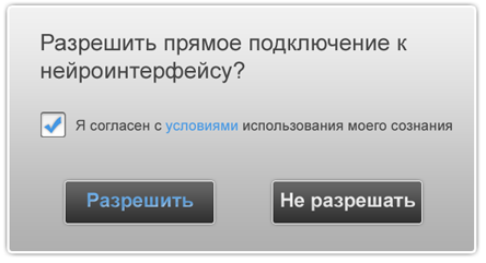
If you need to show the user the required fields, then why not use the red asterisk (*), which proved to be a de-facto standard? Perhaps this is not the best sample of infographics, but over the years of use on many sites, it has become familiar to users. In addition, in the asterisk is used so-called. “Double visual accent”, i.e. the user immediately recognizes it by its special form and color and, even in case of color perception violations, there will be no double interpretation of this indicator.
Nevertheless, there is a certain group of designers who are trying to make their own adjustments to this element of information design. Of course, there are people who do not know that the red asterisk means mandatory filling. But after all, much more people are accustomed to such an agreement and they are introduced into a stupor of deviation from it in the form of an arbitrary change in the shape and color of the tags (Fig. 4).

Fig.4 Examples of non-standard design of required field labels
And, finally, the coolest way to mark the required fields is underlining the title (Fig.5). Yes, even such things sometimes come into the creative minds of some designers.

Fig.5 Underlined headlines are top of “creative” mayhem
It is generally accepted that underlining in web documents means a link. And now let's imagine the cognitive dissonance arising from the user who sees underlined headings in the form. Personally, I would start clicking on them to find out what the links are and would be distracted from the form filling process. And for me, as for many users, it is not at all obvious that fields with underlined headers are required.
For the sake of interest, we conducted a small narrow study in a focus group of 30 people on the subject of mandatory fields, and here are the results: 90% of respondents identify a red asterisk as a symbol of a required field, 73.33% understand that the red box means the same that the asterisk (while 33.3% of them are subjectively experiencing discomfort from such a designation), and only 6.67% of the respondents immediately recognized the underlined indication that the field is mandatory to fill in (the rest tried to click on the “link”)

Fig.6 Results of usability study forms with standard and not very labels of required fields
In this part of the article we will talk about sliders and scrolls, which are not an auxiliary part of the interface, but the direct way of entering information into a form.
The standard set of controls used to enter information is limited: text boxes, radio beats, checkboxes, and drop-down lists. It is not surprising that designers and interface specialists are constantly tempted to expand this set. One of these “extensions” was a slider - a virtual analog of physical regulators, which allow smoothly changing the values of various parameters, from volume to plate heating temperature. Like a real analogue, the slider is designed to quickly select an approximate value. For such purposes as adjusting the volume level or moving around the video, the sliders are perfect. But are they really good when used in web forms?
Most often, the main property of the “knob-regulator” - smoothness of adjustment - is simply not required on the web, therefore, mutant sliders with clearly fixed values appear (Fig.7)

Fig.7. Inappropriate use of sliders in forms.
In cases where the user is required to provide a choice of several fixed values, use drop-down lists or radiobuttons more logical and appropriate. In particular, the advantages of the drop-down list for the slider are as follows:
One can argue for a long time about the advantages of drop-down lists in front of the sliders, however, the dry numbers speak for themselves: there is a clear decrease in conversion when using unusual controls.
Thus, a study conducted for the largest Australian job portal showed an eight percent increase in conversion when replacing the slider, which allows you to select a salary range, by two sheets of boxes (Fig. 8).

Fig.8 The results of replacing the “incomprehensible” slider with the usual drop-down lists
The conversion in this study was the use of a wage range as a criterion for selecting a vacancy.
The portal management has decided to use the “salary slider” on the “fine” page of search parameters, i.e. where it is necessary to clarify the results obtained (Fig. 9).

Fig.9 Slider can be successfully used in non-critical parts of the project
On many sites, sliders are used to offer users the ability to accurately select a wide range of values, while the user would be more satisfied with a few pre-installed solutions.
For example, the slider in Fig. 10 allows the user to set the maximum cost of a girl per night with an accuracy of 10 dollars. But does the user need to think about whether to limit his search to 740 dollars or still go broke by 750? It is much more preferable to facilitate the choice with checkboxes with pre-set price ranges (say, from 0 to 50 dollars, from 50 to 100, from 100 to 200, etc.).

Fig.10 Slider against a group of checkboxes: do not make people think again
Actually, the sliders are not so bad, you just need to use them (like any other controls) not as a hit, but only in really necessary cases.
An example of proper use of the slider can be considered Fig. 11, and here's why:

Fig.11 Slider allows the user to accurately select the value of his car
Contextual tips provide timely assistance to the user in the process of filling out forms. An example is the description of a valid password format below the pass-box field.
However, in the network you can find a bunch of forms in which contextual help is either hidden behind icons with a question icon, or is completely absent. This occurs, in particular, due to the lack of system knowledge of usability specialists. But it is not about illiterate designers.
In fact, providing the user with contextual help can significantly simplify filling out forms, and, consequently, increase conversion and loyalty. No need to force the user to make extra efforts in the form of clicks on the icons to obtain the necessary information.
A timely explicit explanation to the user that he should use a password longer than 5 characters (Fig. 12) will significantly reduce the number of errors and prevent re-filling the fields (which, by the way, will not always happen, in many cases the user will simply close the page unfriendly form).

Fig.12 An example of a form with competent contextual tooltips
Using familiar icons that hide contextual help beneath, of course, reduces the size of the form and brings it to a more “neat” form (Fig. 13), but forces the user to perform an extra action, which he will not always do before making a mistake (we don’t love to read the instructions).

Fig.13 Using icons to reduce the shape
In addition, do not forget about people who do not use the mouse when filling out forms. Think about whether you will click on the tiny help icon when you log on to the site from your iPad or phone? And if the user is accustomed to using only the keyboard when filling out forms, then he will have to reach out to the mouse, click on the icon, read, return the focus to the input field if a question arises ... Do you know how many users will get tired and throw filling?
According to our research with the participation of the focus group (60 people), 23.33% of users do not complete the filling of a complex form due to the complete lack of contextual help and 13.33% drop the form if it is necessary to click on the corresponding icon to get a hint. At the same time, 63.33% of respondents express subjective discontent with the lack of contextual help, and the need for an additional click on the help icon - 30% (Fig. 14)

Fig.14 Due to illiterate use of contextual help, up to 23% of users are lost, and loyalty is reduced in more than 60%.
In the same case, if circumstances force us to use icons instead of an explicit contextual hint, you should be concerned with the compliance of this icon with the usual standards.
It is generally accepted that help is indicated by a question mark on a blue background. Such infographics are used not only in web design, but also in everyday life, therefore, the majority of users have long developed “knowledge”: if something is marked with a blue question mark, then you can get help there.
When the designer decides to replace the standard icon with something more creative, for example, a lifeline (Fig. 15), this creates additional difficulties for the user, which ultimately reduces conversion.

Fig.15. Using a non-standard infographic to indicate a hint leads to difficulties in perceiving this form.
It would seem that a use of a pop-up window with the help text next to the field could be a compromise, however, problems may also lie in them:
Only in one case it makes sense to hide the context help under the icon or not to design it at all - when the expected percentage of users who may need such help in this particular web form is so low that the implementation of such a function in the interface becomes unprofitable.
In cases when contextual help is necessary, but it is difficult to add it explicitly, you can use tooltips - pop-up hints (Fig. 16). The most successful area of their use is checkboxes and radiobuttons, i.e. Those controls in which the pop-up window does not interfere with the input of information and will not distract the user.
At the same time, the user can be informed about the availability of contextual help by styling the control header with a dotted underscore, which is a familiar standard for this kind of links.
However, we should not forget that users who have come to the site from a smartphone or tablet will be deprived of the opportunity to see such prompts if they appear when the cursor hovers over the link.

Fig.16 A compromise solution is the use of tooltips.
All forms have a standard well-established set of controls that are familiar to most users and can implement almost all the required functions. Adding any new elements, as well as changing the design and functions of the standard should be done carefully. The interface specialist is obliged to guide the development of forms, not by his own preferences, but by user convenience and economic rationality.
Each implemented element of the form, each used out of place control leads to the creation of inconveniences for the user, a decrease in conversion and, ultimately, to the loss of profits by the company. The devil - he's in the details, remember this.
Disclaimer: The article is not written to “teach” anyone. The main goal is to open a discussion on such a delicate topic as the creation of convenient forms. Let's learn from each other to make the world a better place.
')
It is worth making a reservation that by “correct interface” I mean such an interface that significantly increases conversion and provides subjective comfort for users. The reliability of the data is ensured both by studies conducted by our group and by studies of third-party (most often Western) UX specialists.
Recently, trends in the design of both web applications in general and forms in particular, strive for maximum decoration: the so-called "Caramel" design, gradients, shadows, bright and non-standard interface elements. Sometimes, among the "design" is difficult to find the actual content.
Such mindless embellishment leads to the fact that the user's attention is distracted from the main purpose of using the web application, the user begins to be fixed not on filling out the form, but on studying its design. In the end, the form is never filled and we do not receive our precious conversion.
So let's take a look at some fashion trends in web form design:
- Non-standard location of field headers;
- "Creative" tags for required fields;
- Sliders everywhere;
- Unobvious context clues;
Non-standard location of field headers
The heading (label) tells you what type of information you need to enter in a text or other field. This means that the user must read the heading before moving to the input field. For sites where content is read from top to bottom from left to right, the label is logical to place either above the input field or directly to the left of it. In practice, designers often put the heading anywhere, but not in a natural place for it.
A striking example is that the label is located below the input field (Fig. 1):
Fig.1 Heading for the input field below the field itself
This arrangement of the field header leads to the fact that people who are accustomed to read from top to bottom from childhood, see first an empty text field, after which they are forced to look further for an explanation of it, and then return back to the field. It turns out that the user takes two steps forward, then one step back, after that, going to the next field and its title, makes three more steps forward, then a step back, etc. It would seem - a trifle, but the long jump back and forth pretty quickly tires.
Obviously, the user spends much more effort filling out such an irregular form, attention is depleted more quickly and, as a result, the number of refusals increases.
According to our study using focus groups (30 people in the main and control groups), filling out a form with irregularly arranged field headings (20 textboxes, 10 checkboxes, 10 listboxes, 4 radiobutton groups of 3 each) occurred by 16.67 % more refusals than when filling out a standard form with a control group (46.67% versus 30%), 30% more errors when filling out fields (53.33% versus 23.33%), and also 63.33% more often expressed subjective dissatisfaction with the design of the form (73.33% versus 10%).
Fig.2 Results of usability study forms with headers located under the field
Another common case is forms with headers inside the input fields (Fig. 3):
Fig.3 Header for the input field inside the field itself
We list several reasons why so often used solution is in fact not the right choice:
- When the user begins to enter data into the field, the header disappears. And if the user is distracted by something, then returning to the form, he will not immediately be able to understand what field he is filling;
- In particularly difficult cases, when developers are too lazy to use js to automatically disappear the header when they click in the field, the user will have to do a lot of additional mental and physical actions to remove this header. The same is true for existing, but broken javascript;
- Fields with headers inside appear as filled, so there is a high probability that the user will miss any of the fields;
- In that case, if the form is completely filled out, the user does not have the opportunity to verify the accuracy of filling in the fields, relating them to the headings;
- There is no possibility to directly print the form, since when there are no headers, it becomes unclear what the fields are filled in;
- It is not possible to use this form design in cases where the field headers consist of more than 2-3 words;
- JS, used to implement this design unnecessarily complicates the frontend code;
So why, despite such obvious shortcomings, designers continue to use this technique when developing frontends? Some experts argue that the web form takes a more accurate look. With this statement it is possible to argue. Yes, the form takes less space, but significantly loses the functionality. It is like throwing out products from the refrigerator just so that the shelves in it look neater. Designers should suppress their passion for minimalism, if it damages usability.
Finally, the most mocking use of headlines is with animated headlines. Have you ever seen a heading that is normally inside the field, and when you click on a field, it slowly crawls to the left or right of it? I have seen it terrible in terms of both usability and design. Firstly, the space for this method is not saved, and secondly, the animation greatly distracts the user and we are faced with a bunch of problems: input errors, blank fields, etc.
Creative tags for required fields
If you need to show the user the required fields, then why not use the red asterisk (*), which proved to be a de-facto standard? Perhaps this is not the best sample of infographics, but over the years of use on many sites, it has become familiar to users. In addition, in the asterisk is used so-called. “Double visual accent”, i.e. the user immediately recognizes it by its special form and color and, even in case of color perception violations, there will be no double interpretation of this indicator.
Nevertheless, there is a certain group of designers who are trying to make their own adjustments to this element of information design. Of course, there are people who do not know that the red asterisk means mandatory filling. But after all, much more people are accustomed to such an agreement and they are introduced into a stupor of deviation from it in the form of an arbitrary change in the shape and color of the tags (Fig. 4).
Fig.4 Examples of non-standard design of required field labels
And, finally, the coolest way to mark the required fields is underlining the title (Fig.5). Yes, even such things sometimes come into the creative minds of some designers.
Fig.5 Underlined headlines are top of “creative” mayhem
It is generally accepted that underlining in web documents means a link. And now let's imagine the cognitive dissonance arising from the user who sees underlined headings in the form. Personally, I would start clicking on them to find out what the links are and would be distracted from the form filling process. And for me, as for many users, it is not at all obvious that fields with underlined headers are required.
For the sake of interest, we conducted a small narrow study in a focus group of 30 people on the subject of mandatory fields, and here are the results: 90% of respondents identify a red asterisk as a symbol of a required field, 73.33% understand that the red box means the same that the asterisk (while 33.3% of them are subjectively experiencing discomfort from such a designation), and only 6.67% of the respondents immediately recognized the underlined indication that the field is mandatory to fill in (the rest tried to click on the “link”)
Fig.6 Results of usability study forms with standard and not very labels of required fields
Sliders and Scrolls in Forms
In this part of the article we will talk about sliders and scrolls, which are not an auxiliary part of the interface, but the direct way of entering information into a form.
The standard set of controls used to enter information is limited: text boxes, radio beats, checkboxes, and drop-down lists. It is not surprising that designers and interface specialists are constantly tempted to expand this set. One of these “extensions” was a slider - a virtual analog of physical regulators, which allow smoothly changing the values of various parameters, from volume to plate heating temperature. Like a real analogue, the slider is designed to quickly select an approximate value. For such purposes as adjusting the volume level or moving around the video, the sliders are perfect. But are they really good when used in web forms?
Most often, the main property of the “knob-regulator” - smoothness of adjustment - is simply not required on the web, therefore, mutant sliders with clearly fixed values appear (Fig.7)
Fig.7. Inappropriate use of sliders in forms.
In cases where the user is required to provide a choice of several fixed values, use drop-down lists or radiobuttons more logical and appropriate. In particular, the advantages of the drop-down list for the slider are as follows:
- The list box control itself says that the user can select only one value from a predefined list, while the slider means choosing from a range of values;
- To select a value in the drop-down list, the user can use either a keyboard or a mouse at his discretion, whereas with a slider it is limited, in most cases, only with a mouse;
- Users, in general, are more accustomed to the drop-down lists than to the sliders;
- Lisbox is more flexible and available for use by people with disabilities;
One can argue for a long time about the advantages of drop-down lists in front of the sliders, however, the dry numbers speak for themselves: there is a clear decrease in conversion when using unusual controls.
Thus, a study conducted for the largest Australian job portal showed an eight percent increase in conversion when replacing the slider, which allows you to select a salary range, by two sheets of boxes (Fig. 8).
Fig.8 The results of replacing the “incomprehensible” slider with the usual drop-down lists
The conversion in this study was the use of a wage range as a criterion for selecting a vacancy.
The portal management has decided to use the “salary slider” on the “fine” page of search parameters, i.e. where it is necessary to clarify the results obtained (Fig. 9).
Fig.9 Slider can be successfully used in non-critical parts of the project
On many sites, sliders are used to offer users the ability to accurately select a wide range of values, while the user would be more satisfied with a few pre-installed solutions.
For example, the slider in Fig. 10 allows the user to set the maximum cost of a girl per night with an accuracy of 10 dollars. But does the user need to think about whether to limit his search to 740 dollars or still go broke by 750? It is much more preferable to facilitate the choice with checkboxes with pre-set price ranges (say, from 0 to 50 dollars, from 50 to 100, from 100 to 200, etc.).
Fig.10 Slider against a group of checkboxes: do not make people think again
Actually, the sliders are not so bad, you just need to use them (like any other controls) not as a hit, but only in really necessary cases.
An example of proper use of the slider can be considered Fig. 11, and here's why:
- In this case, it is important to show the final values of the range from which the user can choose. With this visual presentation of data slider copes perfectly;
- It is possible to select the exact value;
- The user immediately sees the influence of his choice on the change in the cost of insurance premiums;
- If the user knows the exact cost of his car, he can immediately enter it into the text box, combined with the slider;
- By itself, the slider, as an unusual interface element, brings variety to the filling of a boring form;
Fig.11 Slider allows the user to accurately select the value of his car
Invisible contextual clues
Contextual tips provide timely assistance to the user in the process of filling out forms. An example is the description of a valid password format below the pass-box field.
However, in the network you can find a bunch of forms in which contextual help is either hidden behind icons with a question icon, or is completely absent. This occurs, in particular, due to the lack of system knowledge of usability specialists. But it is not about illiterate designers.
In fact, providing the user with contextual help can significantly simplify filling out forms, and, consequently, increase conversion and loyalty. No need to force the user to make extra efforts in the form of clicks on the icons to obtain the necessary information.
A timely explicit explanation to the user that he should use a password longer than 5 characters (Fig. 12) will significantly reduce the number of errors and prevent re-filling the fields (which, by the way, will not always happen, in many cases the user will simply close the page unfriendly form).
Fig.12 An example of a form with competent contextual tooltips
Using familiar icons that hide contextual help beneath, of course, reduces the size of the form and brings it to a more “neat” form (Fig. 13), but forces the user to perform an extra action, which he will not always do before making a mistake (we don’t love to read the instructions).
Fig.13 Using icons to reduce the shape
In addition, do not forget about people who do not use the mouse when filling out forms. Think about whether you will click on the tiny help icon when you log on to the site from your iPad or phone? And if the user is accustomed to using only the keyboard when filling out forms, then he will have to reach out to the mouse, click on the icon, read, return the focus to the input field if a question arises ... Do you know how many users will get tired and throw filling?
According to our research with the participation of the focus group (60 people), 23.33% of users do not complete the filling of a complex form due to the complete lack of contextual help and 13.33% drop the form if it is necessary to click on the corresponding icon to get a hint. At the same time, 63.33% of respondents express subjective discontent with the lack of contextual help, and the need for an additional click on the help icon - 30% (Fig. 14)
Fig.14 Due to illiterate use of contextual help, up to 23% of users are lost, and loyalty is reduced in more than 60%.
In the same case, if circumstances force us to use icons instead of an explicit contextual hint, you should be concerned with the compliance of this icon with the usual standards.
It is generally accepted that help is indicated by a question mark on a blue background. Such infographics are used not only in web design, but also in everyday life, therefore, the majority of users have long developed “knowledge”: if something is marked with a blue question mark, then you can get help there.
When the designer decides to replace the standard icon with something more creative, for example, a lifeline (Fig. 15), this creates additional difficulties for the user, which ultimately reduces conversion.
Fig.15. Using a non-standard infographic to indicate a hint leads to difficulties in perceiving this form.
It would seem that a use of a pop-up window with the help text next to the field could be a compromise, however, problems may also lie in them:
- Users, not knowing that there is contextual help, can begin to think about the questions they have before filling out the form. But we do not want users to tense up, right?
- In cases where checkboxes, radiobuttons and other controls are used, in addition to textboxes, users will see context-sensitive help only after the selection;
- Tooltips can overlap part of key information;
- Again, on mobile platforms, this solution can be very inconvenient for the user;
Only in one case it makes sense to hide the context help under the icon or not to design it at all - when the expected percentage of users who may need such help in this particular web form is so low that the implementation of such a function in the interface becomes unprofitable.
In cases when contextual help is necessary, but it is difficult to add it explicitly, you can use tooltips - pop-up hints (Fig. 16). The most successful area of their use is checkboxes and radiobuttons, i.e. Those controls in which the pop-up window does not interfere with the input of information and will not distract the user.
At the same time, the user can be informed about the availability of contextual help by styling the control header with a dotted underscore, which is a familiar standard for this kind of links.
However, we should not forget that users who have come to the site from a smartphone or tablet will be deprived of the opportunity to see such prompts if they appear when the cursor hovers over the link.
Fig.16 A compromise solution is the use of tooltips.
Conclusion
All forms have a standard well-established set of controls that are familiar to most users and can implement almost all the required functions. Adding any new elements, as well as changing the design and functions of the standard should be done carefully. The interface specialist is obliged to guide the development of forms, not by his own preferences, but by user convenience and economic rationality.
Each implemented element of the form, each used out of place control leads to the creation of inconveniences for the user, a decrease in conversion and, ultimately, to the loss of profits by the company. The devil - he's in the details, remember this.
Disclaimer: The article is not written to “teach” anyone. The main goal is to open a discussion on such a delicate topic as the creation of convenient forms. Let's learn from each other to make the world a better place.
Source: https://habr.com/ru/post/112083/
All Articles