Web Design Trends 2011
There is a fine line between design and development, which, with the transition to a new decade, is becoming increasingly blurred. Is it enough just to draw a beautiful layout in Photoshop? Maybe five years ago that was enough. Nowadays, the average Internet user requires more. The entire gloss of the site over time bothers if there is no essence in it. If your only goal is to hit the design community with your bright works you will not last long afloat. 2011 is characterized not by beauty, but by functionality. And now the actual trends of the new year and the next decade: virtual reality, constant communication and interactive design.
How to stay relevant designer in 2011? The main goal of the designer is not to blind, but to entice. Any designer can get "oohs" and "ahs" that are easily forgotten. The greatest designer is able to create an environment that enchants and captivates the user in such a way that he doesn’t even think about looking for the back button. Several elements are put together to create a beautiful world in which everything is there: harmony of color, intuitive design, easily accessible information and quick response. In addition, you should never underestimate the power of simplicity. Of course, this has always been the case, but in 2011 you are not only under the forgiveness of desktops and laptops. Now your design should cope with netbooks, smartphones and tablets. You are ready?
Take a look at the top 11 trends in 2011.
')
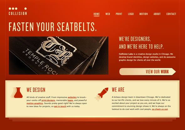
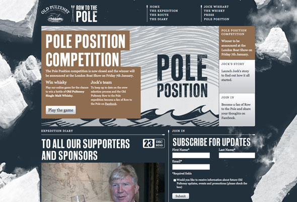
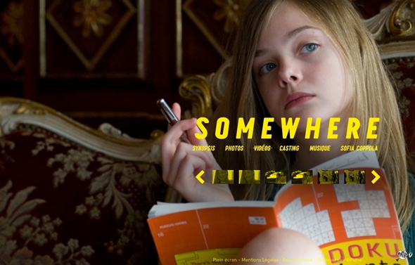
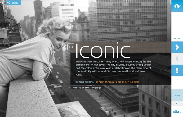
Finally, you can breathe a sigh of relief! CSS3 and HTML5 have been on the horizon of web design for the last couple of years, but now, in 2011, we see an explosion of these technologies. Designers are starting to move away from Flash technology. You already know that it does not always work well, new technologies are now available to your regular and potential visitors. In 2011, you will move away from Flash and learn all the magic of HTML5. Just take a look at the examples:

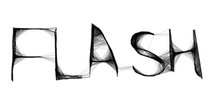
Now when you look at the examples, understand that Flash and HTML are not equal rivals. There is enough space for both in 2011. The problem is that designers in 2010 (and earlier) did not use Flash correctly. HTML5 removes some of the responsibility that we put on Flash’s shoulders; however, HTML5 cannot yet replace individual design elements that we can only get with Flash.
Perhaps even more exciting is the fact that CSS3 is fully available to us this year. Replace Photoshop (no-no-no, Adobe has not yet retired), because with CSS3 you can easily create a shadow for the text or transparency of the image. If you haven't started yet, then it's time to dive into learning CSS3 and HTML5.
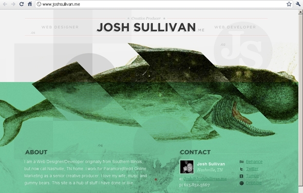
Simplicity. There is nothing as effective as a simple message on a calm background. Calmness can be achieved in several ways. Forget about black and white, and even shades of gray. Think of green yellow or even red as primary. However, limit your palette to two or three colors. Work with shades of your choice of colors for a change. After all, it's great when only a few flowers convey your placating message. See:

With the help of shades of green was created this lotion for twitter. Note: This site was created using XHTML / CSS and Javascript.
Red can be quite annoying if used incorrectly.
Smartphones, tablets, netbooks, oh God! The dizzying number of mobile gadgets available to the buyer in 2011. This means that web design should be cross-platform.
To create a website prepared for mobile platforms is not enough to remove the "whistles" from the design. Because of this, the design can turn out to be empty and faceless. Although it is possible that if you remove some of the chips from the design, your brand will not undergo visible changes. Fortunately, technology is helping us more and more, eliminating this burden.
Mobile web design has leaped forward with CSS3. One of the most important achievements is that you can design the design of the entire site and use the development tools to tailor it to the user's device.
It is very tempting to create a version of the site for a mobile platform, but this no longer satisfies the modern audience. Increasingly, mobile versions have the opportunity to visit the original site. If you do not have such an option or the original site is not optimized for mobile devices, you are not ready for 2011. "Weather forecasters" predict that sales of smartphones this year will exceed sales of personal computers. Prepare your design to meet potential demand.
Parallax scrolling is not just for old video games. As noted earlier, one of the trends for 2011 is the creation of a sense of depth. What can be more convenient for creating this sensation than parallax scrolling? He uses layers to create the illusion of three-dimensional space. The effect can be achieved with simple CSS tricks or with the sprite jQuery plugin. The most effective way to use multi-level scrolling as a secondary design element. For example, a hat, footer or background. By making it an integral part of navigation, you will be extremely disappointed by the user.
Technology has become much more tangible. Usability is transformed from the abstract to something tangible. The touchscreen is used by tablets, most smartphones and some desktops. Is your design adapted for finger control?
How many of your jobs are mouse oriented? As designers, we use the mouse directly. When we point to links, they are highlighted (Translator's note: “If the designer is not a complete eccentric, then they are highlighted”) . Oddly enough, the touchscreen has no guidance as such. How will your design show the user what is the link? What about drop down menus? It also does not take off when using the touchscreen.
How can a visitor view your site? Quite a controversial point, but for a touchscreen-oriented site, horizontal scrolling can be much more convenient than vertical. The concept of the magazine fits perfectly into this niche, where the visitor actually scrolls through the pages of your site.
Finally, consider the possibility of using a floating layout as part of your interactive design. In 2011, you will no longer deal with the screen resolution. Users can easily change the view from vertical to horizontal. Your design must be flexible to satisfy every whim, otherwise it will become fossil.

The child is looking at the iPad. Photo of Steve Payne, Flickr
No, I'm not talking about the ephemeral "I see your cup of coffee and the keyboard." The essence of the depth of perception - the volume, but such that some elements of your site seem closer than others. This creates an excellent 3D effect when done skillfully. Remember what it is to watch 3D blockbuster "Avatar"? Items literally jump out of the screen.
Although 3D technology hasn't really gotten to web design yet, you can recreate this volume.


The number of large backgrounds will increase in 2011. These images will be high resolution and will cover the entire site. Great photos are an easy way to capture an audience. Naturally the background photo should be related to the content. By placing a cute picture that will fall out of context, you will damage usability. Trends tell us that the best way out will be slightly transparent images that do not cast a shadow on the content, harmoniously fitting into it.
This is certainly not the most pressing issue in web design, but I really want to see more original domains. Once the coveted .com lost its appeal, first of all because to find a free domain you need to come up with your own language, like Klingon (indulgence of the translator, in the original - Na'Vi language) . In 2011, we will notice a more rare use of the .com domain and more frequent use of such fancy domains as .me and .us. Think of the possibilities and grab them before they disappear.
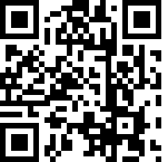
If you saw these square barcodes appearing on magazines, business cards and many more where, you know that they are the hot trend of 2011. How does this go into web design? Amazingly good, actually.
These bar codes are called QR, short for Quick Response. Just take a picture of the unique bar code with your phone, and how magic the site will be opened to which this bar code belongs. The convenience of QR codes is that there are billions of ways to use them. Place it on the site so that visitors have a link to the mobile version. You can also track your visitors through QR codes by placing a special referral code in the URL. When you comment on articles on a site like this, use the QR code as an avatar.
2011 is very “mobile” and it will be useful to use this relatively new technical piece.
Enterprising people from Google presented the usual user the ability to view the search results using a preview. Gone are the days when you need to click on the link to see the contents of the site. Now you just need to click on the "magnifying glass" or point to a link (this is if you do not have a touchscreen). Before you magically appears that which is on the other side of the click.
If your site uses flash, there will be problems with previews. The preview will not display flash design elements.
As the average user becomes more and more savvy in surfing, expect that in 2011 more people will use miniatures as a means of navigation. It's so tempting to evaluate the site for its miniature.

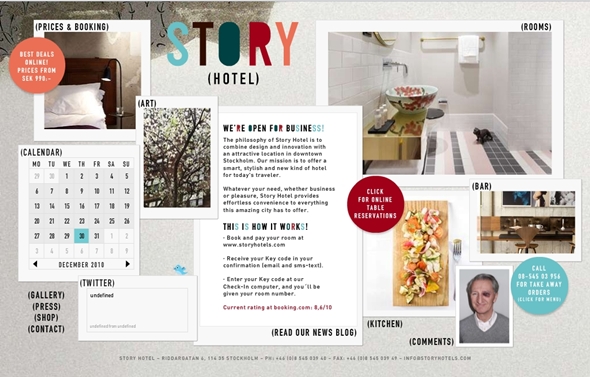
Last but not least, it is a constant connection. The Internet is inherently completely sterile environment. We make it human by talking about our lives in open conversation, expecting more personal details. A characteristic feature of blogs and portfolios in 2011 will be full integration with Twitter (this will no longer be just a link to a page in it), and people will increasingly tell you where they are now using Foursquare.

Do you agree or not? Is there anything to add? We'd love to hear from you!
Special thanks to MrTiM and v673 for pointing out errors and help in correcting the translation.
How to stay relevant designer in 2011? The main goal of the designer is not to blind, but to entice. Any designer can get "oohs" and "ahs" that are easily forgotten. The greatest designer is able to create an environment that enchants and captivates the user in such a way that he doesn’t even think about looking for the back button. Several elements are put together to create a beautiful world in which everything is there: harmony of color, intuitive design, easily accessible information and quick response. In addition, you should never underestimate the power of simplicity. Of course, this has always been the case, but in 2011 you are not only under the forgiveness of desktops and laptops. Now your design should cope with netbooks, smartphones and tablets. You are ready?
Take a look at the top 11 trends in 2011.
')
1. More CSS3 and HTML5
Finally, you can breathe a sigh of relief! CSS3 and HTML5 have been on the horizon of web design for the last couple of years, but now, in 2011, we see an explosion of these technologies. Designers are starting to move away from Flash technology. You already know that it does not always work well, new technologies are now available to your regular and potential visitors. In 2011, you will move away from Flash and learn all the magic of HTML5. Just take a look at the examples:
Now when you look at the examples, understand that Flash and HTML are not equal rivals. There is enough space for both in 2011. The problem is that designers in 2010 (and earlier) did not use Flash correctly. HTML5 removes some of the responsibility that we put on Flash’s shoulders; however, HTML5 cannot yet replace individual design elements that we can only get with Flash.
Perhaps even more exciting is the fact that CSS3 is fully available to us this year. Replace Photoshop (no-no-no, Adobe has not yet retired), because with CSS3 you can easily create a shadow for the text or transparency of the image. If you haven't started yet, then it's time to dive into learning CSS3 and HTML5.
2. Simple color schemes
Simplicity. There is nothing as effective as a simple message on a calm background. Calmness can be achieved in several ways. Forget about black and white, and even shades of gray. Think of green yellow or even red as primary. However, limit your palette to two or three colors. Work with shades of your choice of colors for a change. After all, it's great when only a few flowers convey your placating message. See:
With the help of shades of green was created this lotion for twitter. Note: This site was created using XHTML / CSS and Javascript.
Red can be quite annoying if used incorrectly.
3. Mobile Ready
Smartphones, tablets, netbooks, oh God! The dizzying number of mobile gadgets available to the buyer in 2011. This means that web design should be cross-platform.
To create a website prepared for mobile platforms is not enough to remove the "whistles" from the design. Because of this, the design can turn out to be empty and faceless. Although it is possible that if you remove some of the chips from the design, your brand will not undergo visible changes. Fortunately, technology is helping us more and more, eliminating this burden.
Mobile web design has leaped forward with CSS3. One of the most important achievements is that you can design the design of the entire site and use the development tools to tailor it to the user's device.
It is very tempting to create a version of the site for a mobile platform, but this no longer satisfies the modern audience. Increasingly, mobile versions have the opportunity to visit the original site. If you do not have such an option or the original site is not optimized for mobile devices, you are not ready for 2011. "Weather forecasters" predict that sales of smartphones this year will exceed sales of personal computers. Prepare your design to meet potential demand.
4. Parallax scrolling
Parallax scrolling is not just for old video games. As noted earlier, one of the trends for 2011 is the creation of a sense of depth. What can be more convenient for creating this sensation than parallax scrolling? He uses layers to create the illusion of three-dimensional space. The effect can be achieved with simple CSS tricks or with the sprite jQuery plugin. The most effective way to use multi-level scrolling as a secondary design element. For example, a hat, footer or background. By making it an integral part of navigation, you will be extremely disappointed by the user.
5. Design for touch screen, not for mouse.
Technology has become much more tangible. Usability is transformed from the abstract to something tangible. The touchscreen is used by tablets, most smartphones and some desktops. Is your design adapted for finger control?
How many of your jobs are mouse oriented? As designers, we use the mouse directly. When we point to links, they are highlighted (Translator's note: “If the designer is not a complete eccentric, then they are highlighted”) . Oddly enough, the touchscreen has no guidance as such. How will your design show the user what is the link? What about drop down menus? It also does not take off when using the touchscreen.
How can a visitor view your site? Quite a controversial point, but for a touchscreen-oriented site, horizontal scrolling can be much more convenient than vertical. The concept of the magazine fits perfectly into this niche, where the visitor actually scrolls through the pages of your site.
Finally, consider the possibility of using a floating layout as part of your interactive design. In 2011, you will no longer deal with the screen resolution. Users can easily change the view from vertical to horizontal. Your design must be flexible to satisfy every whim, otherwise it will become fossil.
The child is looking at the iPad. Photo of Steve Payne, Flickr
6. Perception of depth
No, I'm not talking about the ephemeral "I see your cup of coffee and the keyboard." The essence of the depth of perception - the volume, but such that some elements of your site seem closer than others. This creates an excellent 3D effect when done skillfully. Remember what it is to watch 3D blockbuster "Avatar"? Items literally jump out of the screen.
Although 3D technology hasn't really gotten to web design yet, you can recreate this volume.
7. Great Photobrounds
The number of large backgrounds will increase in 2011. These images will be high resolution and will cover the entire site. Great photos are an easy way to capture an audience. Naturally the background photo should be related to the content. By placing a cute picture that will fall out of context, you will damage usability. Trends tell us that the best way out will be slightly transparent images that do not cast a shadow on the content, harmoniously fitting into it.
8. Interesting domain names and their use.
This is certainly not the most pressing issue in web design, but I really want to see more original domains. Once the coveted .com lost its appeal, first of all because to find a free domain you need to come up with your own language, like Klingon (indulgence of the translator, in the original - Na'Vi language) . In 2011, we will notice a more rare use of the .com domain and more frequent use of such fancy domains as .me and .us. Think of the possibilities and grab them before they disappear.
9. QR: Quick Response
If you saw these square barcodes appearing on magazines, business cards and many more where, you know that they are the hot trend of 2011. How does this go into web design? Amazingly good, actually.
These bar codes are called QR, short for Quick Response. Just take a picture of the unique bar code with your phone, and how magic the site will be opened to which this bar code belongs. The convenience of QR codes is that there are billions of ways to use them. Place it on the site so that visitors have a link to the mobile version. You can also track your visitors through QR codes by placing a special referral code in the URL. When you comment on articles on a site like this, use the QR code as an avatar.
2011 is very “mobile” and it will be useful to use this relatively new technical piece.
10. Preview (thumbnails)
Enterprising people from Google presented the usual user the ability to view the search results using a preview. Gone are the days when you need to click on the link to see the contents of the site. Now you just need to click on the "magnifying glass" or point to a link (this is if you do not have a touchscreen). Before you magically appears that which is on the other side of the click.
If your site uses flash, there will be problems with previews. The preview will not display flash design elements.
As the average user becomes more and more savvy in surfing, expect that in 2011 more people will use miniatures as a means of navigation. It's so tempting to evaluate the site for its miniature.
11. Permanent Link / Life Streaming
Last but not least, it is a constant connection. The Internet is inherently completely sterile environment. We make it human by talking about our lives in open conversation, expecting more personal details. A characteristic feature of blogs and portfolios in 2011 will be full integration with Twitter (this will no longer be just a link to a page in it), and people will increasingly tell you where they are now using Foursquare.
And in conclusion
Do you agree or not? Is there anything to add? We'd love to hear from you!
Special thanks to MrTiM and v673 for pointing out errors and help in correcting the translation.
Source: https://habr.com/ru/post/111890/
All Articles