10 Tips for Improving Web Forms Usability
Web forms play a big role in the daily use of the Internet. If you develop websites, then most likely they are present in them: whether it is a simple feedback form or a feature-rich web application. Here are some tips to help you create user-friendly forms.
1. Clearly highlight the required fields
When a user submits a completed form and then finds out that he missed the required fields, this is annoying.
It is common to highlight the required fields with an asterisk (*) next to their name. Explicitly indicating whether a field is required or not is the correct solution.
')

Required fields on the Zappos.com registration form are marked with an asterisk (*). Optional fields are also clearly marked.
2. Use convenient and detailed error messages.
I am sure that you hate situations when an incorrect form is filled with error notifications saying: “You must fill in all the required fields” instead of providing more detailed information, for example: “You forgot to fill in the email address”.
Using real-time validation of input data is a good solution. For example, immediately after filling in the e-mail address, the web form should verify the correctness of the entered format, and if something is wrong, then notify the user immediately.

Yahoo! Registration Form provides real-time error information.
Read about best practices for using hints and error checking in web forms .
3. Use client-side data format validation (javascript)
Using JavaScript data validation saves user time and also reduces the load on the web server, freeing it from processing incoming form field values. Client side validation allows users to see that they made a mistake just now, and not after submitting the form. This is true for any fields that are not associated with your database. Such as checking the format of an email address or the number of digits in a phone number.

The registration form on SurveyGizmo lets you know if the format of the email address you entered is incorrect.
4. Visually highlight the fields to be filled so that the user is not lost.
Make sure that you can visually determine which field the user is filling in at the moment. This can be done using the focus: pseudo-class selector in CSS.
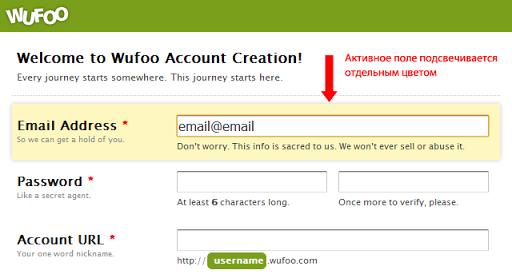
The Wufoo web form visually highlights the active elements with the background color.
At a minimum, implement the selected border for the fields - by default browsers will do this for you, but make sure that the color differs from the site design (background).
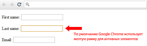
Google Chrome highlights the active item with a yellow frame. Firefox light blue.
5. Show progress results
If your web form is voluminous and consists of several pages (or has several steps), make sure that the user constantly receives information about the progress of the actions performed, about how much more time he may need to fill out. This is often found in cases of online survey (research) with a lot of questions or in the process of placing an order in the online store.
All you need is to write “Step 4 of 5” or something like that. If users continue to press the “continue” button, without clearly understanding when the last step will be, they will stop filling out the form earlier than you can imagine.

Ordering on Amazon has 4 pages. The form tells you where you are and how much is left to complete.
Of course, the best alternative would be to reduce your web form - if you can’t do it, then at least give the user information about how close it is to the completion of the actions performed.
6. Periodically save (cache) the form data
On forms with multiple pages or steps, you can often make a mistake. To avoid data loss, you need to implement a way to save user input for each session. This increases the reliability and the percentage that the form will be filled out even after such situations when the user leaves this page (for example, presses the button back in the browser). The need to re-fill all fields of the form can force the user to leave.
7. Do not use the standard text “Submit”
Instead of your button on the form being called “Submit”, use this text to remind the user of his actions. For example, “Register”, or even better - let the user find out about the benefits after filling out the form.
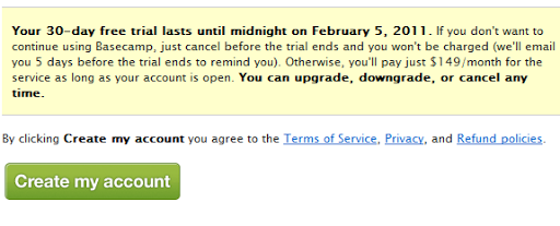
On the Basecamp registration form, the text “Submit” was replaced with the more useful one.
8. “Cancel” button makes you waver
Imagine that you are in a store buying a new shirt and the seller asks you: “Do you really want this particular shirt?”. Do you still buy it? Most likely no. Perhaps you will doubt, thinking that the seller found the shirt inappropriate.
The same happens with web forms: using the “undo” button can make your users think twice about what they fill out.
9. Show users the fields in the correct format.
If you ask users for certain information — such as a phone or credit card number — let them know what you expect. If the password must have a certain number of characters or it must contain a certain set of characters, clearly describe these requirements. This reduces ambiguity and speeds up the filling process.
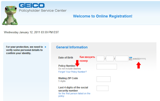
The Geico registration form provides unambiguous instructions on the format in which input is expected.
10. Single column form is the best solution.
According to cxpartners eye movement research , a user interaction design agency, scanning a form downward is more preferable than left to right. This reduces the amount of eye movement that needs to be performed to fill out the form.
Single column form
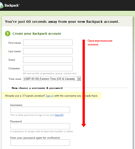
The Backpack registration form is single column.
Multi-column form
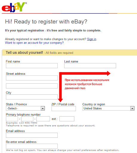
For comparison, on the eBay registration form, the user needs to fill out the form both from bottom to top and from left to right.
Examples of great web forms
Here are some excellently designed forms for inspiration.
Alexandru Cohaniuc
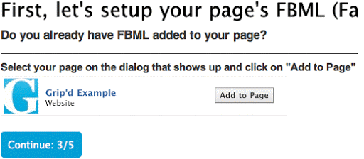
Grip'd Custom Facebook Tab Creator
Groupon
KISSMetrics

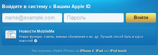
MobileMe Sign In

Source: https://habr.com/ru/post/111767/
All Articles