Choosing a way to evaluate content
 I am involved in creating a small web 2.0 project and I want to consult with habra people about how users evaluate content — for example, news or blog posts. Evaluations should complement the already working tags and page views counter.
Formulation of the problem:
The system is needed at least to find the most popular texts and display them on the face, but it would be good to implement filters and a part of navigation through it. Evaluation should be:
1) understandable to the user - exactly or at least intuitively;
2) on large numbers of objective - to reflect the real interests, tastes, views of the community);
3) multi-functional - through it you want to implement the selection of the most popular texts, filters, and part of the navigation.
After wandering through the famous web 2.0 sites, we found (and partially thought out ourselves) the following methods of assessment:
')
1. Binary - liked / disliked, + 1 / -1, respect / floppy (sorry for LJ-slang, I can not remember it)
Pros: ideally easy to understand and calculate.
Cons: does not reflect exactly what the text hooked the user, i.e. one-dimensional grading scale. Does not allow to express a spectrum of different emotions (and a good informative text, as a rule, gives exactly the spectrum). It does not give an opportunity to express intermediate states “rather well than bad”. In general, binary coding does not seem "human", even if the user sees it in terms of the type "like". Strongly biased - the user often does not know how to separate the quality of the news from the topic touched in it. For example, the news about the war in Iraq in such a system would be cruelly mined.
2. Point - from -10 to +10, from 0 to 100, etc.
Disadvantages: difficult to use, the act of assessment includes 2-3 calculations in the mind - although graphics can save it (for example, a color bar on ag.ru). Does not allow to express a range of emotions. Inobjective for the same reasons as the first method.
Pros: simple to calculate, there are intermediate states.
3. Color - say, green = good, red = bad, plus a few intermediate shades. Essentially the same as the points, but in the design to focus on color (the user will see not a rating of 65.3 points, but a light-green).
Minuses: Does not allow expressing a spectrum of emotions - entering several color scales will complicate the system too much. The influence of individual tastes (for example, I do not like green).
Pros: simplicity, clarity, "humanity."
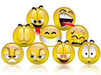
4. Smileys are simple : grades from “awful” >> 8 [[to “excellent” 8 =))). Must resemble the usual smilies on the forums.
Cons: does not express the spectrum of emotions.
Pros: clear, "humane", already familiar to the user.
5. Smiley expanded , or multidimensional - use well-painted faces for “sad”, “outrageous”, “curious”, “funny”, “nonsense”, “horror”, etc. (by the way, not the fact that “horror” is a negative emotion). To construct from these ratings a certain difficult rating.
Cons: the user must remember what a particular face means, because There is no sufficient set of generally accepted icons. It will be difficult to implement the selection of the "best" texts, you will have to take into account a lot of parameters.
Pros: when the user gets used, emoticons will be an excellent means of navigation. We move away from the shortcomings of one-dimensional scales - for example, it is easy to request “the most fun” or “most delusional” texts.
6. Emotions - the same concepts as in the extended emoticons, but the emphasis in the output to make a word, but not on the schedule.
Cons - semantic shades of words may vary depending on the content of the text and / or for different users. Difficult to select the "best" texts. It’s hard to read words, there are a lot of letters in them :)
Pluses - the same as in the extended emoticons.
The last four options seem more or less likeable, but we have not yet been able to choose one of them. We ask all those who have been involved in similar projects to share their comments and experiences in the comments on what to read about this.
PS Do not hit hard, this is my first habratopik.
Source: https://habr.com/ru/post/11156/
All Articles