Overview of the operating system Android 3.0 Honeycomb
More recently, hard workers from Google released a press release for their new Android 3.0 Honeycomb operating system, backed by a trailer . Not much time has passed, but we can not wait to introduce you to this OS.
')
Common features
Remember Matthias Duarte, who previously worked on the design of the webOS Palm? So, now he heads Google UX, and it is thanks to him that we can now enjoy the peculiar style of the new Android OS.
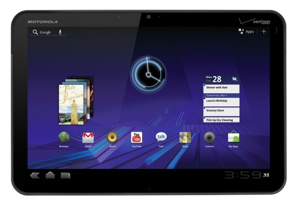
An original decision was made to do it all in dark blue. Lock the screen is nothing special (just roll the slider to the right "until it stops"). The next thing we see is the desktop, which also leaves a pleasant impression with its minimalist design. A long range of applications looks much more aesthetic than we could have seen it in previous OS variations. The text / voice search buttons are located in the upper left corner, and the home, and application switching buttons are located in the lower left. At the bottom right there is a clock, WiFi connection status and battery charge. In the upper right corner there is a button that quickly takes you to the list of all available applications, as well as the widget and wallpaper control button.
And now a little more in detail about each of the available widgets.
Maps
Honestly, you will not see anything new here; this is the same update version 5.0 (although now with an extended top panel and optimized for tablet users).
Gmail
For users of the iPad or Galaxy Tab there will not be anything new and complex here. The main window is divided into two columns. On the right is a list with all your messages, and on the left - the control menu. All standard features will be present here, so tablet users will not be deprived.
Gtalk
The same two columns that we could observe in the Gmail application: on the left are the column with contacts, and on the right - the settings for video chat. The picture looks a bit grainy when communicating, which, to be honest, is a bit unpleasant, but it will be hoped that this problem will disappear. Oh yes, now during the conversation you will be free to switch between cameras (which, as usual, there should be two - one in front, the other in the back).
Books
A big innovation from the time of the “second” Android, where instead of the books themselves, only the names were shown in the library. Now all your books will get their own "binding", will stand in a row and conveniently be placed in a special browser. If we compare this service with the iBooks service, then nothing particularly similar between them was noticed.
Browser
This is where the most interesting begins: the browser in the third version of Android is pretty similar to Chrome, which is not at all surprising. It will be equipped with tabs, incognito mode and bookmarks.
Keyboard
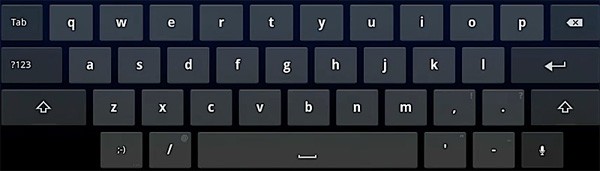
There are two differences between the Gingerbread and Honeycomb keyboards: the symbol enable button is now located above the “Shift” button, and the “Tab” key has moved to the upper left corner. Space and comma are now nearby for more convenient use. Also in one place the following keys were combined: slash from left to right, smiley, apostrophe, dash and voice button.
Total
Honeycomb - exclusive for tablets. We'll see if all the work done is not wasted, because this is indeed the best update of the Android OS for all the time it has existed.
Photo gallery №1 : User interface Android 3.0 Honeycomb
Photo Gallery # 2 : Motorola Xoom User Interface
Source: https://habr.com/ru/post/111468/
All Articles