Draw a chessboard using CSS3 gradients
Demo here
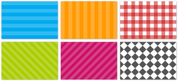
I think many of you are familiar with gradients in CSS3 and can use them to draw angular or radial gradients. But not everyone knows that with their help you can create other, frequently used design solutions. For example, checkered patterns or stripes.
The main idea of the method is as follows ( CSS3 Images spec ) - if several gradients have the same position, a sharp color transition occurs. For example, the gradient for horizontal stripes would be:
')
background-color: #0ae; background-image: -webkit-gradient(linear, 0 0, 0 100%, color-stop(.5, rgba(255, 255, 255, .2)), color-stop(.5, transparent), to(transparent)); background-image: -moz-linear-gradient(rgba(255, 255, 255, .2) 50%, transparent 50%, transparent); background-image: -o-linear-gradient(rgba(255, 255, 255, .2) 50%, transparent 50%, transparent); background-image: linear-gradient(rgba(255, 255, 255, .2) 50%, transparent 50%, transparent); Why do we use “transparent” rather than actual color? For flexibility. A background-color serves several purposes: it sets the color for a strip and serves as the main color in browsers that do not support the gradient properties. To control the size, you can use "background-size":
-webkit-background-size: 50px 50px; -moz-background-size: 50px 50px; background-size: 50px 50px; To create a picnic-style gradient, you can simply lay horizontal stripes on the vertical ones:
background-color: white; background-image: -webkit-gradient(linear, 0 0, 0 100%, color-stop(.5, transparent), color-stop(.5, rgba(200, 0, 0, .5)), to(rgba(200, 0, 0, .5))), -webkit-gradient(linear, 0 0, 100% 0, color-stop(.5, transparent), color-stop(.5, rgba(200, 0, 0, .5)), to(rgba(200, 0, 0, .5))); background-image: -moz-linear-gradient(transparent 50%, rgba(200, 0, 0, .5) 50%, rgba(200, 0, 0, .5)), -moz-linear-gradient(0deg, transparent 50%, rgba(200, 0, 0, .5) 50%, rgba(200, 0, 0, .5)); background-image: -o-linear-gradient(transparent 50%, rgba(200, 0, 0, .5) 50%, rgba(200, 0, 0, .5)), -o-linear-gradient(0deg, transparent 50%, rgba(200, 0, 0, .5) 50%, rgba(200, 0, 0, .5)); background-image: linear-gradient(transparent 50%, rgba(200, 0, 0, .5) 50%, rgba(200, 0, 0, .5)), linear-gradient(0deg, transparent 50%, rgba(200, 0, 0, .5) 50%, rgba(200, 0, 0, .5)); The most difficult thing was to draw a chessboard. I still have not managed to find a way to draw the right chessboard, not at an angle of 45 °, without additional gradients. But it will be quite easy to do when they introduce support for angular gradients (now they are not even in the specification):
background-image: -webkit-gradient(linear, 0 0, 100% 100%, color-stop(.25, #555), color-stop(.25, transparent), to(transparent)), -webkit-gradient(linear, 0 100%, 100% 0, color-stop(.25, #555), color-stop(.25, transparent), to(transparent)), -webkit-gradient(linear, 0 0, 100% 100%, color-stop(.75, transparent), color-stop(.75, #555)), -webkit-gradient(linear, 0 100%, 100% 0, color-stop(.75, transparent), color-stop(.75, #555)); background-image: -moz-linear-gradient(45deg, #555 25%, transparent 25%, transparent), -moz-linear-gradient(-45deg, #555 25%, transparent 25%, transparent), -moz-linear-gradient(45deg, transparent 75%, #555 75%), -moz-linear-gradient(-45deg, transparent 75%, #555 75%); background-image: -o-linear-gradient(45deg, #555 25%, transparent 25%, transparent), -o-linear-gradient(-45deg, #555 25%, transparent 25%, transparent), -o-linear-gradient(45deg, transparent 75%, #555 75%), -o-linear-gradient(-45deg, transparent 75%, #555 75%); background-image: linear-gradient(45deg, #555 25%, transparent 25%, transparent), linear-gradient(-45deg, #555 25%, transparent 25%, transparent), linear-gradient(45deg, transparent 75%, #555 75%), linear-gradient(-45deg, transparent 75%, #555 75%); If you know other interesting solutions created using CSS3 without using images, write about them in the comments. Thank.
Source: https://habr.com/ru/post/111228/
All Articles