Draw a button in SVG
Currently I am working on a single web application, and now I wanted to update the current, rather clumsy interface to something more modern, more beautiful. I decided to start with the buttons as from the most technically loaded part: they need not only to replace the appearance, but also to add an indication of pressing and event handling. Immediately there was a problem: how to ensure scaling? You can't do it with a regular raster picture, since users can use different fonts (both type and size), and the background image will not be adapted for them. It would be logical to try to use SVG for this purpose, which I did.
Unfortunately, in the end I came to the conclusion that the game was not worth the candle: there were too many problems trying to implement this idea. However, I do not consider this time lost: I have acquired new knowledge and skills and now I would like to share it with the community in order to make life easier for those who decide to repeat my path. I plan to describe my sufferings in two articles: in the first, work on the SVG picture itself, in the second, the technique of introducing the resulting picture as buttons, the problems that arise and their solution or workarounds. Who is interested in the first part, please under the cat.
First I want to warn you that the SVG area is completely new to me, and I did not have the opportunity to fully explore all the conceivable functions and all sly tricks. Accordingly, if the text contains the phrase “it is impossible to do this,” consider it simply as an abbreviated form from “I have not found a way to do this either in the standard or in textbooks or in Google”. :-) Naturally, I will be very grateful to all amendments and clarifications.
Now let's get down to the TZ: I want to have a beautiful scalable image that could be used as a button on web pages. As a basis for experimental design, I chose the button I liked from the site One day files :
')

After a bit of picking up a picture, I compiled its vector description: on the border is a gray rectangle with rounded edges, inside is a vertical gradient consisting of two linear regions (50% / 50%). It turned out the most elementary task for the firstclass of the SVG study; the solution might look like this:
(To save space, I’ll omit the XML header and the definition of the <svg> tag .)
However, it is not so simple. Here's what it looks like:

The sharp-eyed comrades must have already seen that something is wrong here. For the rest, I will replace the border color with red and enlarge the image so that it can be better seen:

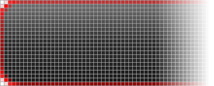
First, the border turned out to be some kind of slurred, blurred and darker than expected. Secondly, the corner parts of the border are clearly thicker than the sides. Third, the transitions to the rounding are not smooth, but angular.
The trouble is that the vector coordinates are not in the centers of pixels, but “in between” between them. Naturally, when drawing such a line is “blurred” between two adjacent positions along its entire length, and one of the “halves” of the line is outside the figure and is not displayed. If we had a regular rectangle, we could declare this feature by adjusting the color to a brighter one (to compensate for the blur) or by setting the border to two pixels in general. However, in our case, the problem does not solve it, the rounded corners spoil everything: they are entirely in the field of visibility, therefore the transition will remain angular and the thickness of the line in the roundings will remain “full-fledged”, unlike the lateral borders. How to be? You can try to move the coordinates by half a pixel, this will solve the problem of “inter-pixel”. But in this case we will not be able to correctly set the width and height: it is impossible to specify the value “one hundred percent minus one pixel”. To set some 95% is meaningless: for small buttons the difference of 5% will be too small, for large ones it will be too large. If you specify all dimensions only in pixels, then we will not be able to provide the necessary scaling mode: the thickness of the border will immediately be bound to the image size and will change proportionally. As a result, if we stretch the image horizontally, leaving the height unchanged (a typical use of buttons on a web page), the side borders will become thicker than the top and bottom, which looks very ugly.
The main problem here is that we are trying to combine the percentage and pixel coordinates, the scalable part with the fixed part of the image, which is not accepted in SVG. Moreover, as it turned out, the percentage coordinates can be specified only for figures. The <path> tag does not support them in principle (despite the assurances of the textbooks that all the figures are just special cases <path> ). Well, let's try to get along with ordinary figures, and the transform attribute will help us in this. The trick is that we set the initial coordinate to 100%, specify the fixed width and height in pixels, and drag the resulting shape (outside the drawing) back into the image, shifting it to the desired number of pixels. For example, to draw a 5 × 10 rectangle in the lower left corner, you can use the following code:
Unfortunately, even this trick does not help to draw the entire border at once with a single <rect> tag , but we can, by combining simple shapes, draw a mask for the area where the border should pass, and then perform the fill. The specific method of drawing a mask, of course, can vary, but I did this: with two rectangular frames, shifted by half-pixel, I outlined a common rectangle of the border. Then he cut out the corner sections, put circles in their place and, finally, cut off the extra parts of these circles, leaving only one-fourth to round the corners. Here is the final code:
Of course, it would be more logical to use a mask or trimming through <clipPath> as cutting the necessary quarters from the circles, but it turned out that with this nested use the Opera of versions lower than 11 starts to bounce: the initial drawing is performed correctly, but if you drag another window over it, Image update is incorrect. It turned out to be easier to abandon the nested masks and tile them with regular rectangles than to butt with this glitch.
Actually, the button is almost ready. It remains only to hang the text, but trouble got in here. First, it’s the main one: what should the font size be? There was no simple solution to this issue, and since it is directly related to the integration of the SVG image with the HTML page, I will defer this consideration of this problem until the next article, but for the sake of illustrative example I will leave the font size default. I also wanted to get a centered text, but even such a simple task was beyond the power of some browsers (we will not point with a finger, although this is Firefox), which do not know how to tweak the font base, so you have to do with centering only horizontally.
In the final picture, I also added, with the help of scripting, a highlight when hovering the mouse and pressing a button, and also translated part of the descriptions into styles. With this, no difficulties arose, everything worked right away, as it should, therefore I will not begin to clutter the text with the description of these things: they are in any textbook. The code of the resulting button can be found here .
For those who want to see how it looks in kind, you can try on a live example (of course, requires a browser with support for SVG).
Thank you for your attention, ready to catch tomatoes. :-)
UPD: The second part of the article
Unfortunately, in the end I came to the conclusion that the game was not worth the candle: there were too many problems trying to implement this idea. However, I do not consider this time lost: I have acquired new knowledge and skills and now I would like to share it with the community in order to make life easier for those who decide to repeat my path. I plan to describe my sufferings in two articles: in the first, work on the SVG picture itself, in the second, the technique of introducing the resulting picture as buttons, the problems that arise and their solution or workarounds. Who is interested in the first part, please under the cat.
First I want to warn you that the SVG area is completely new to me, and I did not have the opportunity to fully explore all the conceivable functions and all sly tricks. Accordingly, if the text contains the phrase “it is impossible to do this,” consider it simply as an abbreviated form from “I have not found a way to do this either in the standard or in textbooks or in Google”. :-) Naturally, I will be very grateful to all amendments and clarifications.
Now let's get down to the TZ: I want to have a beautiful scalable image that could be used as a button on web pages. As a basis for experimental design, I chose the button I liked from the site One day files :
')
After a bit of picking up a picture, I compiled its vector description: on the border is a gray rectangle with rounded edges, inside is a vertical gradient consisting of two linear regions (50% / 50%). It turned out the most elementary task for the first
<defs> <linearGradient id="btnGrad" x1="0%" y1="0%" x2="0%" y2="100%"> <stop offset="0%" stop-color="#777777" /> <stop offset="50%" stop-color="#303030" /> <stop offset="100%" stop-color="#1c1c1c" /> </linearGradient> </defs> <rect style="fill: url(#btnGrad); stroke: #7f7f7f; stroke-width: 1px;" x="0px" y="0px" width="100%" height="100%" rx="5px" /> (To save space, I’ll omit the XML header and the definition of the <svg> tag .)
However, it is not so simple. Here's what it looks like:
The sharp-eyed comrades must have already seen that something is wrong here. For the rest, I will replace the border color with red and enlarge the image so that it can be better seen:
First, the border turned out to be some kind of slurred, blurred and darker than expected. Secondly, the corner parts of the border are clearly thicker than the sides. Third, the transitions to the rounding are not smooth, but angular.
The trouble is that the vector coordinates are not in the centers of pixels, but “in between” between them. Naturally, when drawing such a line is “blurred” between two adjacent positions along its entire length, and one of the “halves” of the line is outside the figure and is not displayed. If we had a regular rectangle, we could declare this feature by adjusting the color to a brighter one (to compensate for the blur) or by setting the border to two pixels in general. However, in our case, the problem does not solve it, the rounded corners spoil everything: they are entirely in the field of visibility, therefore the transition will remain angular and the thickness of the line in the roundings will remain “full-fledged”, unlike the lateral borders. How to be? You can try to move the coordinates by half a pixel, this will solve the problem of “inter-pixel”. But in this case we will not be able to correctly set the width and height: it is impossible to specify the value “one hundred percent minus one pixel”. To set some 95% is meaningless: for small buttons the difference of 5% will be too small, for large ones it will be too large. If you specify all dimensions only in pixels, then we will not be able to provide the necessary scaling mode: the thickness of the border will immediately be bound to the image size and will change proportionally. As a result, if we stretch the image horizontally, leaving the height unchanged (a typical use of buttons on a web page), the side borders will become thicker than the top and bottom, which looks very ugly.
The main problem here is that we are trying to combine the percentage and pixel coordinates, the scalable part with the fixed part of the image, which is not accepted in SVG. Moreover, as it turned out, the percentage coordinates can be specified only for figures. The <path> tag does not support them in principle (despite the assurances of the textbooks that all the figures are just special cases <path> ). Well, let's try to get along with ordinary figures, and the transform attribute will help us in this. The trick is that we set the initial coordinate to 100%, specify the fixed width and height in pixels, and drag the resulting shape (outside the drawing) back into the image, shifting it to the desired number of pixels. For example, to draw a 5 × 10 rectangle in the lower left corner, you can use the following code:
<rect x="0px" y="100%" width="5px" height="10px" transform="translate(0, -10)" /> Unfortunately, even this trick does not help to draw the entire border at once with a single <rect> tag , but we can, by combining simple shapes, draw a mask for the area where the border should pass, and then perform the fill. The specific method of drawing a mask, of course, can vary, but I did this: with two rectangular frames, shifted by half-pixel, I outlined a common rectangle of the border. Then he cut out the corner sections, put circles in their place and, finally, cut off the extra parts of these circles, leaving only one-fourth to round the corners. Here is the final code:
<mask id="boundRect"> <rect style="fill: none; stroke: #ffffff; stroke-width: 1px;" x="0.5px" y="0.5px" width="100%" height="100%" /> <rect style="fill: none; stroke: #ffffff; stroke-width: 1px;" x="-0.5px" y="-0.5px" width="100%" height="100%" /> <g style="fill: #000000;"> <rect x="0px" y="0px" width="5px" height="5px" transform="translate(0, 0)" /> <rect x="0px" y="100%" width="5px" height="5px" transform="translate(0, -5)" /> <rect x="100%" y="0px" width="5px" height="5px" transform="translate(-5, 0)" /> <rect x="100%" y="100%" width="5px" height="5px" transform="translate(-5, -5)" /> </g> <g style="fill: #ffffff;"> <circle cx="5px" cy="5px" r="5px" transform="translate(0, 0)" /> <circle cx="5px" cy="100%" r="5px" transform="translate(0, -5)" /> <circle cx="100%" cy="5px" r="5px" transform="translate(-5, 0)" /> <circle cx="100%" cy="100%" r="5px" transform="translate(-5, -5)" /> </g> <g style="fill: #000000;"> <circle cx="5px" cy="5px" r="4px" transform="translate(0, 0)" /> <circle cx="5px" cy="100%" r="4px" transform="translate(0, -5)" /> <circle cx="100%" cy="5px" r="4px" transform="translate(-5, 0)" /> <circle cx="100%" cy="100%" r="4px" transform="translate(-5, -5)" /> <rect x="1px" y="5px" width="9px" height="5px" transform="translate(0, 0)" /> <rect x="5px" y="1px" width="5px" height="9px" transform="translate(0, 0)" /> <rect x="1px" y="100%" width="9px" height="5px" transform="translate(0, -10)" /> <rect x="5px" y="100%" width="5px" height="9px" transform="translate(0, -10)" /> <rect x="100%" y="5px" width="9px" height="5px" transform="translate(-10, 0)" /> <rect x="100%" y="1px" width="5px" height="9px" transform="translate(-10, 0)" /> <rect x="100%" y="100%" width="9px" height="5px" transform="translate(-10, -10)" /> <rect x="100%" y="100%" width="5px" height="9px" transform="translate(-10, -10)" /> </g> </mask> Of course, it would be more logical to use a mask or trimming through <clipPath> as cutting the necessary quarters from the circles, but it turned out that with this nested use the Opera of versions lower than 11 starts to bounce: the initial drawing is performed correctly, but if you drag another window over it, Image update is incorrect. It turned out to be easier to abandon the nested masks and tile them with regular rectangles than to butt with this glitch.
Actually, the button is almost ready. It remains only to hang the text, but trouble got in here. First, it’s the main one: what should the font size be? There was no simple solution to this issue, and since it is directly related to the integration of the SVG image with the HTML page, I will defer this consideration of this problem until the next article, but for the sake of illustrative example I will leave the font size default. I also wanted to get a centered text, but even such a simple task was beyond the power of some browsers (we will not point with a finger, although this is Firefox), which do not know how to tweak the font base, so you have to do with centering only horizontally.
In the final picture, I also added, with the help of scripting, a highlight when hovering the mouse and pressing a button, and also translated part of the descriptions into styles. With this, no difficulties arose, everything worked right away, as it should, therefore I will not begin to clutter the text with the description of these things: they are in any textbook. The code of the resulting button can be found here .
For those who want to see how it looks in kind, you can try on a live example (of course, requires a browser with support for SVG).
Thank you for your attention, ready to catch tomatoes. :-)
UPD: The second part of the article
Source: https://habr.com/ru/post/110869/
All Articles