Smooth animation on iPhone and iPad
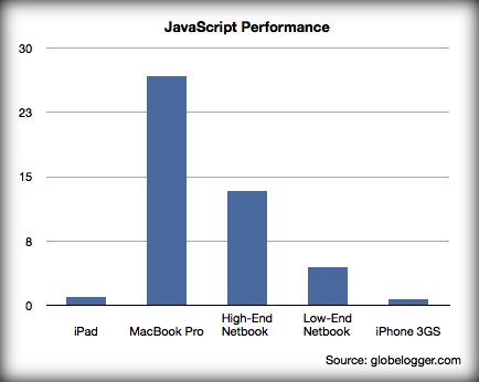
Everyone knows how popular mobile browsing has become. On modern devices, the web is less and less inferior to the desktop original. However, there is one stumbling block: speed. Even at the output we get a beautifully rendered web page, rendering performance and JavaScript leaves much to be desired.

This is especially noticeable on all kinds of slideshows: on mobile and tablets, they slow down, buggy, flicker and in every way spoil the experience. Today we will make the animation work perfectly on the iPhone and iPad.
To understand what is at stake, it’s enough to open any page with animation in Mobile Safari, but at least the jquery.cycle homepage . On the computer, everything is smooth and wonderful, and on the iPhone - the slowing darkness. On real sliders with large photos, the situation is even worse.
')
One would think that a small device can not squeeze more, but it is not. Some interfaces, in particular, the Sencha framework and iPad magazines, manage to work without brakes. How do they do it? Hardware acceleration to the rescue!
There are wonderful CSS3 transform and transition properties. The first controls the transformation of the element, the second controls the CSS animation. In particular, using the transform property, you can move an element along the X or Y axis, and using the transition, you can animate this shift. The difference from the margin by the properties margin-left / margin-top and left / top is that the element itself will not shift, but its “graphic display” on the page. In this way, it will be possible to avoid the redrawing of the page layout at each shift, as well as to reduce the use of JavaScript.
The parameter we need is called translate3d. And it so happened that only he really influences something: at least on firmware 4.1, using simple translateX did not bring success. So, if we animated jQuery while animating in the usual way and called the animate method:
Now you just need to set the necessary property in CSS, set the time and type of animation:
The browser will do the rest. This method, of course, does not open up to America, but it didn’t remove all the jitters and jams on the iPhone. Unless there is a small wink at the start of the animation, but this is fixable. You just need to explicitly set the specified properties in CSS with the initial values of transform:
One should also not abuse these properties and expose them to all elements and, especially, pictures. Mobile Safari may simply crash. And so, using this simple method, you can achieve the perfect work of your site on mobile devices that support hardware acceleration.
Page with demo
Archive with demo
I wrote two plugins using this method: a slider with a touch control and a slideshow. The slider is almost ready, you need to finish the slideshow, but you can use it. Documentation and description page did not have time to do. I think someone will come in handy for development.
Demo slider and slideshow
Archive with them
You can call the slider with the mobileMode: 'touchMargin' parameter and see what it would look like, use the left property.
In addition, it is worth mentioning an interesting jQuery Enhanced Animate plugin that allows you to convert animation of some properties into webkit animation on the fly. The work of the plugin is not perfect, but it deserves attention.

This is especially noticeable on all kinds of slideshows: on mobile and tablets, they slow down, buggy, flicker and in every way spoil the experience. Today we will make the animation work perfectly on the iPhone and iPad.
To understand what is at stake, it’s enough to open any page with animation in Mobile Safari, but at least the jquery.cycle homepage . On the computer, everything is smooth and wonderful, and on the iPhone - the slowing darkness. On real sliders with large photos, the situation is even worse.
')
One would think that a small device can not squeeze more, but it is not. Some interfaces, in particular, the Sencha framework and iPad magazines, manage to work without brakes. How do they do it? Hardware acceleration to the rescue!
There are wonderful CSS3 transform and transition properties. The first controls the transformation of the element, the second controls the CSS animation. In particular, using the transform property, you can move an element along the X or Y axis, and using the transition, you can animate this shift. The difference from the margin by the properties margin-left / margin-top and left / top is that the element itself will not shift, but its “graphic display” on the page. In this way, it will be possible to avoid the redrawing of the page layout at each shift, as well as to reduce the use of JavaScript.
The parameter we need is called translate3d. And it so happened that only he really influences something: at least on firmware 4.1, using simple translateX did not bring success. So, if we animated jQuery while animating in the usual way and called the animate method:
$('#slide').click(function() {
$(this).stop().animate({'margin-left': 650}, 1000);
});
Now you just need to set the necessary property in CSS, set the time and type of animation:
$('#slide').click(function() {
$(this).css({
'-webkit-transform': 'translate3d(650px, 0px, 0px)',
'-webkit-transition': '-webkit-transform 1s linear',
});
});
The browser will do the rest. This method, of course, does not open up to America, but it didn’t remove all the jitters and jams on the iPhone. Unless there is a small wink at the start of the animation, but this is fixable. You just need to explicitly set the specified properties in CSS with the initial values of transform:
#slide {
-webkit-transform: translate3d(0px, 0px, 0px);
-webkit-transition: -webkit-transform 1s linear;
}
One should also not abuse these properties and expose them to all elements and, especially, pictures. Mobile Safari may simply crash. And so, using this simple method, you can achieve the perfect work of your site on mobile devices that support hardware acceleration.
Page with demo
Archive with demo
I wrote two plugins using this method: a slider with a touch control and a slideshow. The slider is almost ready, you need to finish the slideshow, but you can use it. Documentation and description page did not have time to do. I think someone will come in handy for development.
Demo slider and slideshow
Archive with them
You can call the slider with the mobileMode: 'touchMargin' parameter and see what it would look like, use the left property.
In addition, it is worth mentioning an interesting jQuery Enhanced Animate plugin that allows you to convert animation of some properties into webkit animation on the fly. The work of the plugin is not perfect, but it deserves attention.
Source: https://habr.com/ru/post/110748/
All Articles