Trends in icon design 2010
 Creating icons is a fairly conservative design direction. Often, a new and original icon works much worse than the standard and familiar ones. But the industry does not stand still - new devices with new interfaces appear, and ways of working with them are changing. It all happens rather slowly, but trends can be highlighted.
I will say a few words about the method of identifying trends. I work in a company that deals with icons and interfaces, so I need to keep track of new devices, programs and their interfaces. Plus, some conclusions can be drawn from what our customers want, which particular icons they order.
Icons are no longer small
Long ago, the icons were very small, and the pixels were very large. The size 16x16 was a standard, and sometimes it was necessary to draw icons 12x12 or even a tiny 8x8 pixels. The design of the icon is sometimes even called “digital thumbnail”. The 32x32 badges were considered large and time consuming.
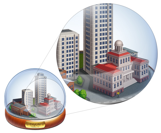
Now everything has changed - the resolution and screen size have grown. It is very difficult to see small icons, and it’s impossible to get into them with a cursor or a finger (unless it’s about Windows Mobile and the stylus) . Badges have become big. Very large. Now the maximum icon size in Mac OS X is 512 × 512 px. At first it was not clear - why such a big picture? But with the advent of screens with a resolution above 300 dpi, it became clear that icons of this size are needed.
')

These are the pictures inside the Dashboard icon from Mac OS X Snow Leopard
In fact, the icon became an illustration (sometimes quite complex, with a plot and several plans) . In modern industry, no one cares anymore whether lines fall into pixels. Increasingly, icons are drawn using 3d-editors, and sometimes even use photos.
Very high detail
Previously, icon designers had a problem - how to put the depicted objects in a small square so that it looked realistic, the perspective was respected, and it could all be discerned with the naked eye? In the icons, as a rule, they used no more than three objects and identified the characteristic features by which the object could be identified. There were masters who could put a cowboy on 32x32 icon on a horse or even a naked woman in full growth.

Vintage icons from Pixture Studio and Iconfactory
Now everything has changed. Icons have become large, you can work out the details indefinitely. This is laborious, but the result is an icon - a work of art.
Icon for mobile application from SoftFacade studio
See the tiny black man on the little yellow crosswalk?
Touch-screen button icons
Touch-interfaces are widely used, mainly due to the advent of the iPhone and iPad. Styluses are a thing of the past, and everyone clicks on the screen with his fingers. Previously, there was no difference between the “mouse icon” and the “finger icon”.

Icons are the same size, but in a magical way, icons for iOS appear larger than icons for Mac OS X
Icons for iPhone have the form of a square and occupy all the space allotted to them. It is easy to guess that this was done in order to make it easier to get into them with your finger - the square always has a large area. The icon has “its own space”, which unambiguously makes it clear to the user - click here. So it turned out a new style of icons, which over time can become a standard for touch-screen.
A slightly different approach was used by the developers of the Android platform. They also invented their own style for icons that need to be pressed with a finger. Here are the application icons, according to the instructions :
- Modern, minimalistic, matte, tangible and textural
- Frontal projection, illuminated from above, intact, limited color palette
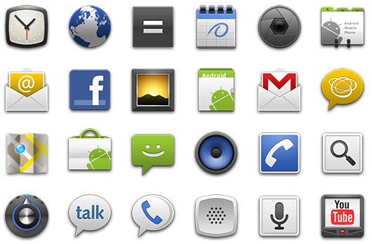
Android application icons
The rules are pretty blurry. On the one hand, they give more freedom to designers. On the other hand, making unprofessional and inappropriate icons becomes easier. By the way, almost all application icons in Android magically also “strive for the square.”
Realism in fashion
One of the main trends in the design of icons is the desire for realism. The stronger the objects in the icons are similar to the objects of the real world, and the higher the detail is, the better. The correct perspective, shadows, glare, material properties - all this must be taken into account.

Icons from the Iconfactory studio

Icons from the studio Turbomilk
Pictograms are relevant and do not go out of fashion.
Surprisingly, the good old "flat" pictograms are becoming increasingly relevant. Everyone is already a little tired of the brilliance, translucency, glare and other attributes of realism. The pictograms are simple and clear, there is nothing superfluous in them. Such a concentrate of meaning. The increase in the size of the icons also played a role - the pictograms also became larger and more complex in composition.

Icons from Iconwerk Studio
In the near future we will see a lot of icons in the interfaces. Most major players plan to use or already use this style of icons.
Some metaphors are outdated and will soon disappear forever.
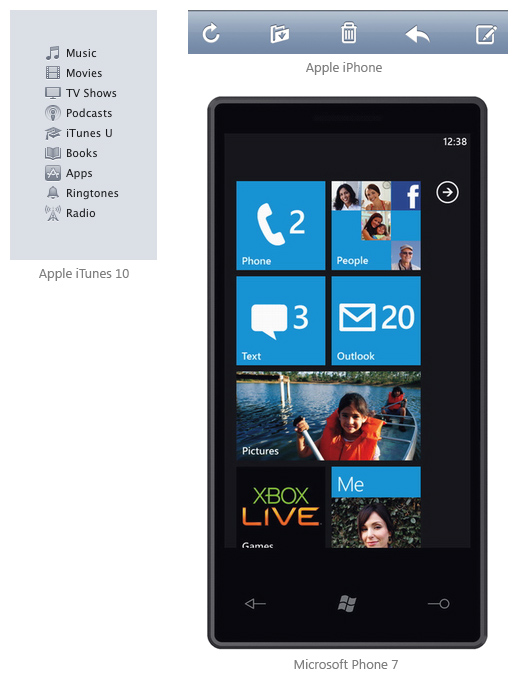
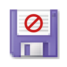
The most vivid example is, of course, a metaphor for the Save action - a floppy disk. All of us have long ceased to use floppy disks, but the metaphor was very stable. I skimmed through the programs I use every day and did not find a single toolbar with a floppy disk (I searched more carefully - I found it in the Microsoft Office and in the wilds Adobe Creative Suite) . Plus, our customers have not asked us to draw this magnetic storage medium for a very long time.
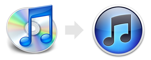
I am sure that soon we will bid farewell to the CD, as now not many people use CDs, especially when it comes to music. The new iTunes 10 music harvester icon is a clear confirmation of this.
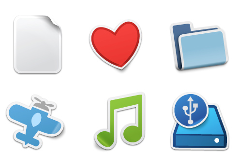
I wonder what metaphors will disappear in the future? Hard drives, files, folders?
Unusual style will always be in demand.
Despite the fact that the icon designer is almost an engineer, there is a place for creativity in this craft. The same realistic icons (or flat icons) get bored, and the soul asks for an unusual unique style. If you come up with a good stylistic device and at the same time preserve the unity of the set, then the original icons, which only you have, will be the reward.
Designer David Lanham from Iconfactory is an unsurpassed master of styling. His icon sets are very unusual, but at the same time, metaphors are easy to read.
Sticker Icon Set
Somatic Icon Set
Source: https://habr.com/ru/post/109511/
All Articles