Introduced CSS Grid Alignment Level 3

Two days ago I presented the task of building with CSS by Habré. The task attracted little attention from the developers and several different solutions were presented, including those that almost exactly solve the problem.
Having promised to present the original solution, I was a little bit harsh, because this solution represents the use of the new W3C CSS Grid Alignment Level 3 standard, which was presented at the beginning of November at the TPAC 2010 event.
')
When publishing a task on Habré, I wanted to look at the solutions from developers and try to understand how the new standard can make life easier for all of us.
CSS Grid Alignment Level 3
First, it is worth explaining what the standard is. CSS Grid Alignment Level 3 is a new layout model proposed in the framework of the CSS3 standard. In theory, the new standard should offer a simplified, standardized way to build various, including complex, models of web page layout.
If you take a look at the options for solving the problem proposed by me, you will see a lot of hacks and the use of CSS operators not for their intended purpose. For the solution, float: left, negative margin, position: relative, overflow: hidden were used. For developers, this has become so commonplace that I am sure many consider such decisions when building a page layout model as normal.
However, I think many would like to see with the development of web standards more simple, intuitive ways to solve the problem. And CSS Grid Alignment Level 3 offers one such way. Consider an example:

Such an arrangement can be obtained using the following code, using the new standard:

What would you do to solve this problem of layout without a new standard? Calculation of interest, work with margin, float, etc. The new standard offers a completely different style.
You define a container as a grid with a set of columns and rows, and you nest nested blocks on the grid indicating the direct values of these columns and rows. Visually and simply! Most importantly, nested blocks are not tied to absolute or relative sizes, they are tied only in the internal layout of the container and if you double the width of the second virtual column of the container in half you will not have to change anything more.
Also note that with the new CSS standard Grid Alignment Level 3 you don’t have to follow the order of the nested blocks, the layout does not depend on the order of the tags in the markup.
Adaptation for free space
An important feature of the new standard is support for adaptation to the free space on the page. In other words, a flexible solution to the problem of rubber layout has been proposed.
The example shows the layout, which assumes that the first column will have a minimum width equal to the minimum content, the maximum width equal to the maximum content, the second column will be rubber ranging from the minimum content to the maximum possible value.

The code in this case will be as follows:

Pay attention to grid-row-align and grid-column-align - this is an opportunity to specify the alignment of the block inside the grid.
What are fr and minmax?
The basis of adaptation for free space is the division of shares between blocks that claim this free space. In this case, specifying the minmax function allows you to specify the minimum and maximum size values that the element should occupy.
For example, minmax (300px, 500px). These are the absolute values of the function. Greater flexibility is given by the relative min-content and max-content, which take the values of the minimum width of the element in the block and the maximum.
Even more flexibility comes from the use of a new dimension dimension - a fraction. The fraction is the fraction of free space among all the blocks that claim this place. That is, there are two such blocks, then 1fr for a block is half of the free space.
Thus, the following example tells us that there should be 4 columns in the grid:
- 100 pixels
- one share of free space
- width required for maximum content
- flexible column with a minimum width of the minimum content, maximum - one share of free space

Since two columns 2 and 4 are involved in the division of free space, half of the free space after deducting 100 pixels of the first column and the width of the maximum content in the third column will be offered for the second one.
HTML independence
The text of the standard examines an example that shows the importance of the independence of the layout result from the order of the blocks in the HTML markup. For example, the two options below are the result of changing CSS, but not HTML markup.


See the 2.3 Source Independence section for details.
The solution of the problem
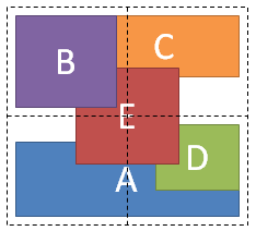
How does the solution of the problem presented by me earlier with the help of the new standard look like?

In fact - very clear and elegant:

Consider what is defined here:
- a grid with 2 columns and 2 rows is defined, and both the rows and the columns should occupy equal shares with respect to the free space;
- for block A it is said that it is located in the first column with a stretch to the second, in the second line. Plus, block A should be aligned at the bottom of the line;
- for block B, it is said that it is located in the first column of the first row, and it is assigned a layer number = 10;
- for block C, it is said that it is located in the second column of the first line, and it is aligned to the top of the line, plus a negative margin is applied to it;
- for block D, it is said that it is located in the second column of the second row, moreover, it is aligned with the right edge of the column and the top of the row;
- for block E, it is said that it is located in the first column of the first row, while it is stretched into two rows and two columns, while aligning itself with the center of the columns and the center of the rows. In addition, it is assigned a layer number = 5.
Conclusion
Standard CSS Grid Alignment Level 3 while laid out in the first draft edition. You can't even try it, because there are no implementations in browsers yet. But in my opinion, this standard looks really useful innovation, which solves the obvious problems faced by web developers today.
Perhaps not all parts of the standard look equally good. Something will change, including the feedback from developers. Let's wait for the development of the standard.
Source: https://habr.com/ru/post/109276/
All Articles