Bringing the design of the Jira to a readable look
To make it easier to work with the Jira bugtracker, install user-styles by writing your development server in them. 
There is a similar problem with Trac bugtracker. In their default design, information relating to different blocks of meaning (user messages and system) is typed in similar windows without borders. Information from different windows is confused with each other, so even before correcting errors, it is necessary to turn on the brain in order to begin to distinguish between blocks, carefully reading the scattered words. After some time, the user is tempted, he has a trained eye with a half-look learns to recognize the blocks in the Jir. There is pride in the profession, and outside observers begin to respectfully call such a user a professional. Imagine why? Due to the fact that in Djir and Trakke, by default there is a tangled, unfriendly presentation of information. All you need to do is visually identify the block boundaries and types of information that you already have in the layout. But until now, the role of the script and parser is performed by a professional who soon writes in the summary: yes, I really work in Djir, Trak, I have a parser for their encoding information.
After a break from working with Jira, this became especially noticeable to me, and I thought: why give reason for pride? Let's make Djiru easier, so that even a child can begin to understand where some text is written - where the title is, and where the custom text begins. Professionals will be evaluated not by how he holds a pen or typed, but by their informative work.
Simply put, for Jira need another skin (theme, design) or sufficient settings in the admin panel. The search showed that the styles settings for the admin are limited, and there are no skins for Jira; maybe in plugins this is resolved?
')
There is a plugin system in Djir, but viewing their names did NOT show that someone solved the problem. Studying plugins API documentation is too heavy artillery for a simple task. (If anyone knows the normal skins implemented in the plugins - please inform.) Users? In userstyles.org there are styles a year ago that do not correspond to the problem. There is one fresh style that approximately solves a similar problem - to make data types visually distinct.
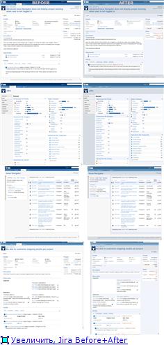
And we approached the need to write crutches - user styles for this important working tool. Styles were made rather hastily, on a compromise between time and depth of knowledge of CSS classes on the site of the Gira server. Undoubtedly, stylization can be done in dozens of other ways and half of them will be better. But in any case, with such stylization the site of Jira will be more convenient than without it. Compare between "was" and "became."
Examples are taken from the project of Jira herself at jira.atlassian.com , at the same address you can see for example the effect of the work of these styles. In order to adapt the styles to your project, it is necessary after the installation of styles in the specifier @ -moz-document domain ('jira.atlassian.com')
{...} replace (or add, @ -moz-document domain ("my_site.com"), domain ("jira.atlassian.com") {...}) server name to your development server.
Install plugin for Greasemonkey (FF, Chrome, can be installed as user style for any browser, including IE) - userstyles.org/styles/40625 .
There is a similar problem with Trac bugtracker. In their default design, information relating to different blocks of meaning (user messages and system) is typed in similar windows without borders. Information from different windows is confused with each other, so even before correcting errors, it is necessary to turn on the brain in order to begin to distinguish between blocks, carefully reading the scattered words. After some time, the user is tempted, he has a trained eye with a half-look learns to recognize the blocks in the Jir. There is pride in the profession, and outside observers begin to respectfully call such a user a professional. Imagine why? Due to the fact that in Djir and Trakke, by default there is a tangled, unfriendly presentation of information. All you need to do is visually identify the block boundaries and types of information that you already have in the layout. But until now, the role of the script and parser is performed by a professional who soon writes in the summary: yes, I really work in Djir, Trak, I have a parser for their encoding information.
After a break from working with Jira, this became especially noticeable to me, and I thought: why give reason for pride? Let's make Djiru easier, so that even a child can begin to understand where some text is written - where the title is, and where the custom text begins. Professionals will be evaluated not by how he holds a pen or typed, but by their informative work.
Simply put, for Jira need another skin (theme, design) or sufficient settings in the admin panel. The search showed that the styles settings for the admin are limited, and there are no skins for Jira; maybe in plugins this is resolved?
')
There is a plugin system in Djir, but viewing their names did NOT show that someone solved the problem. Studying plugins API documentation is too heavy artillery for a simple task. (If anyone knows the normal skins implemented in the plugins - please inform.) Users? In userstyles.org there are styles a year ago that do not correspond to the problem. There is one fresh style that approximately solves a similar problem - to make data types visually distinct.
And we approached the need to write crutches - user styles for this important working tool. Styles were made rather hastily, on a compromise between time and depth of knowledge of CSS classes on the site of the Gira server. Undoubtedly, stylization can be done in dozens of other ways and half of them will be better. But in any case, with such stylization the site of Jira will be more convenient than without it. Compare between "was" and "became."
Examples are taken from the project of Jira herself at jira.atlassian.com , at the same address you can see for example the effect of the work of these styles. In order to adapt the styles to your project, it is necessary after the installation of styles in the specifier @ -moz-document domain ('jira.atlassian.com')
{...} replace (or add, @ -moz-document domain ("my_site.com"), domain ("jira.atlassian.com") {...}) server name to your development server.

Install plugin for Greasemonkey (FF, Chrome, can be installed as user style for any browser, including IE) - userstyles.org/styles/40625 .
Source: https://habr.com/ru/post/109139/
All Articles