How we drew the interface for the "Artist"
Some time ago, our colleague in the workshop, a talented programmer and just a good man, Dmitry Ryzhkov won with his drawing program My Little Artist a solid prize in the competition for the best application for Intel Atom . Encouraged by the success, Dmitry decided to continue the development of the project, having made a commercial project out of it, and asked our studio to help with such a difficult task as an interface. We gladly set to work.
The first version of the program looked like it should be a non-commercial application that won the competition.
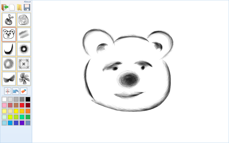
')
But, as you know, for a commercial product, the appearance is not the last thing. So, we create the interface of the drawing program “chose, clicked, drew for advanced dummy users”.
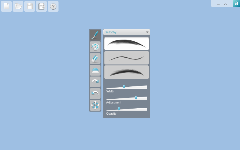
The work took our designer Nikita Temryazansky. What comes first to the designer? That's right, the tool he uses is Photoshop / Illustrator.

It became better than it was. But Photoshop actually turned out, and we do not need a clone. Especially since the program is designed mainly for fans who this similarity does not help. It is necessary to work with the appearance.
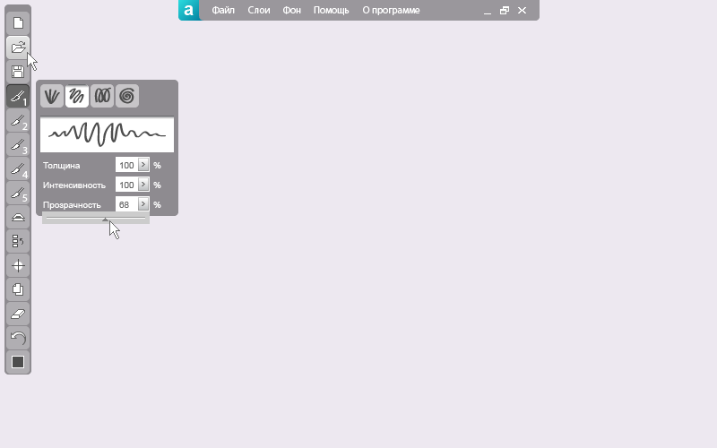
It got even better. But this left vertical panel, it is rigidly fixed? Maybe try to untie her? Let it appear by pressing the right mouse button in the place where the cursor is located, so that the painter “does not run” on the screen and “does not tear himself away” from the process. And after selecting the required parameter let the panel disappear. Because The application is intended mainly for users of netbooks, whose screen resolution is small, this solution will allow you to use the workspace to the maximum.
Now the panel is "untied" from the left edge. Is it advisable to arrange icons in a single column at such a height? We try two columns. At the same time we will move the top menu to the right and to save the working space we will make it hiding / opening.
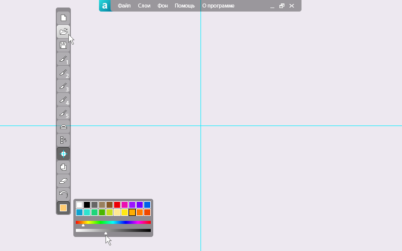
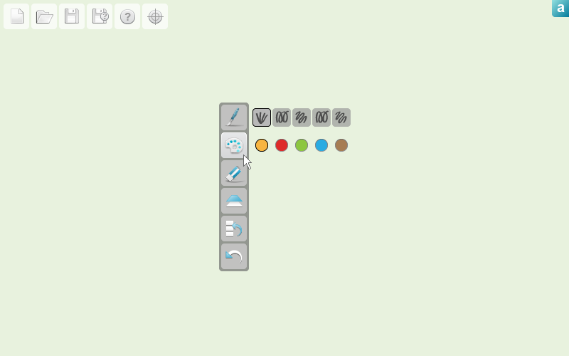
Good. And why do you need duplication of functions in two menus? We leave in the vertical menu only working tools for drawing, the rest is brought up. And something icons are not enough and everything is also corporately strict. After all, this program is likely to want to use and children. Enlarge and make icons kinder.
Fine. A useful feature appeared above the menu - “the last five selected colors”. In general, the concept is ready. Start grinding. In the work menu there is an alien element - the button “Create a new document”. Removing it, we get odd, which spoils the two-column menu. Switch to the top menu. There is not a single item that could not be clearly depicted using the icon. And if the icons are compact, they will not interfere, and the interface will look more holistic. Redoing, at the same time moving up the icon "eye", responsible for mirroring. We change its design to a more obvious one.
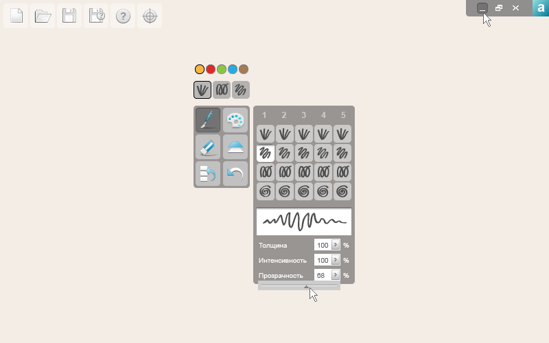
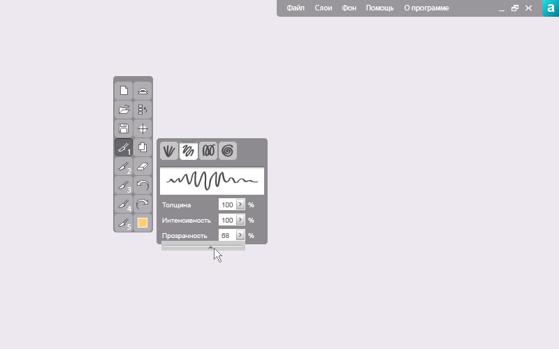
By the way, the two-column menu has ceased to like, there are only 6 items. Let's try to return one column. There are “hot” colors, why not add “hot” brushes.
That's better. We also return the Mirror modes icon to the workspace. Again, we change her design to an even more understandable one. Undo is, Redo is not. Do we need history? For this class of programs is irrelevant. History remove, add Redo.

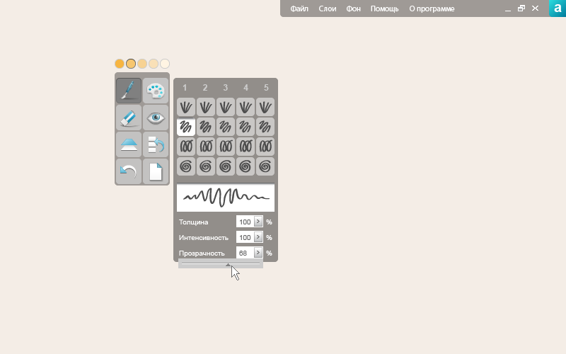
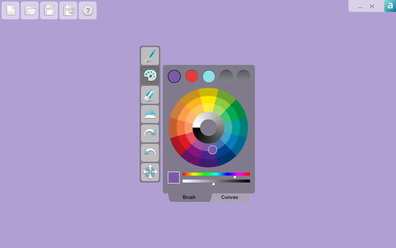
The working prototype is ready and suits both sides. Now the joint work at the interface of design and software technologies. In the final version had to redo the brush. It turned out to be difficult to adequately depict the brush sample on small square icons, so we replaced them with large rectangular ones. Accordingly, the “hot” brushes had to be removed.
We were very interested in working on this project. Although we have a lot of experience in developing website design and Internet services, and we had to draw icons on several occasions, we made the interface for desktop applications for the first time. Dmitry was pleased with the result, we - with cooperation, and users will have to try and evaluate the joint fruit of our cooperation.
By the way, specially for habrovchan Dmitry and I prepared a surprise. You can download the program for free from here . Perhaps you will like it, or your children will be happy to draw different funny pictures. In any case, it would be interesting to hear your feedback and suggestions, which can help in the further development of the project. Thank.
The first version of the program looked like it should be a non-commercial application that won the competition.
')
But, as you know, for a commercial product, the appearance is not the last thing. So, we create the interface of the drawing program “chose, clicked, drew for advanced dummy users”.
The work took our designer Nikita Temryazansky. What comes first to the designer? That's right, the tool he uses is Photoshop / Illustrator.
It became better than it was. But Photoshop actually turned out, and we do not need a clone. Especially since the program is designed mainly for fans who this similarity does not help. It is necessary to work with the appearance.
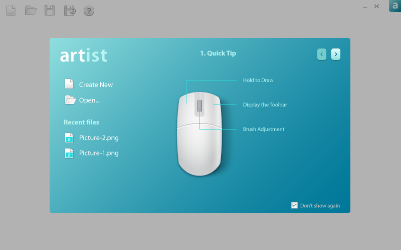
It got even better. But this left vertical panel, it is rigidly fixed? Maybe try to untie her? Let it appear by pressing the right mouse button in the place where the cursor is located, so that the painter “does not run” on the screen and “does not tear himself away” from the process. And after selecting the required parameter let the panel disappear. Because The application is intended mainly for users of netbooks, whose screen resolution is small, this solution will allow you to use the workspace to the maximum.
Now the panel is "untied" from the left edge. Is it advisable to arrange icons in a single column at such a height? We try two columns. At the same time we will move the top menu to the right and to save the working space we will make it hiding / opening.
Good. And why do you need duplication of functions in two menus? We leave in the vertical menu only working tools for drawing, the rest is brought up. And something icons are not enough and everything is also corporately strict. After all, this program is likely to want to use and children. Enlarge and make icons kinder.
Fine. A useful feature appeared above the menu - “the last five selected colors”. In general, the concept is ready. Start grinding. In the work menu there is an alien element - the button “Create a new document”. Removing it, we get odd, which spoils the two-column menu. Switch to the top menu. There is not a single item that could not be clearly depicted using the icon. And if the icons are compact, they will not interfere, and the interface will look more holistic. Redoing, at the same time moving up the icon "eye", responsible for mirroring. We change its design to a more obvious one.
By the way, the two-column menu has ceased to like, there are only 6 items. Let's try to return one column. There are “hot” colors, why not add “hot” brushes.
That's better. We also return the Mirror modes icon to the workspace. Again, we change her design to an even more understandable one. Undo is, Redo is not. Do we need history? For this class of programs is irrelevant. History remove, add Redo.
The working prototype is ready and suits both sides. Now the joint work at the interface of design and software technologies. In the final version had to redo the brush. It turned out to be difficult to adequately depict the brush sample on small square icons, so we replaced them with large rectangular ones. Accordingly, the “hot” brushes had to be removed.
We were very interested in working on this project. Although we have a lot of experience in developing website design and Internet services, and we had to draw icons on several occasions, we made the interface for desktop applications for the first time. Dmitry was pleased with the result, we - with cooperation, and users will have to try and evaluate the joint fruit of our cooperation.
By the way, specially for habrovchan Dmitry and I prepared a surprise. You can download the program for free from here . Perhaps you will like it, or your children will be happy to draw different funny pictures. In any case, it would be interesting to hear your feedback and suggestions, which can help in the further development of the project. Thank.
Source: https://habr.com/ru/post/108866/
All Articles