Photos as content

Translation of the article by the famous usability specialist Jakob Nielsen:
Our research on eye movement revealed significant differences in the approach of people to images on sites :
- Some types of images are completely ignored . This is typical for large quality images that are used only for decorative purposes.
- Other images are considered carefully as important content. Photos of goods and photos of real people (as opposed to photo models from photo stocks) often fall into this category.
I spent countless pages talking about the first type of images. But, unfortunately, many sites are still more obsessed with beauty than the desire to understand that this is not necessary. And the visual bells and whistles continue to annoy users: even with high-speed Internet and short download times, users still prefer sites that focus on the information they need:
- In e-commerce, these are photos of products that help users understand the difference between two similar things.
- On personal websites, users want to see the face of the person behind the site. For example, posting an author's photo is one of the key usability tips for blogs.
To illustrate all of the above, let's take a look at a few examples from the eye movement studies that we conducted this year.
')
Photos of people - Good (if these are real people)
It has long been the norm to place portraits of the management team on corporate sites so that users associate real faces of people with opposite faceless corporations.
FreshBooks.com went even further and posted photos of all their employees on the site:
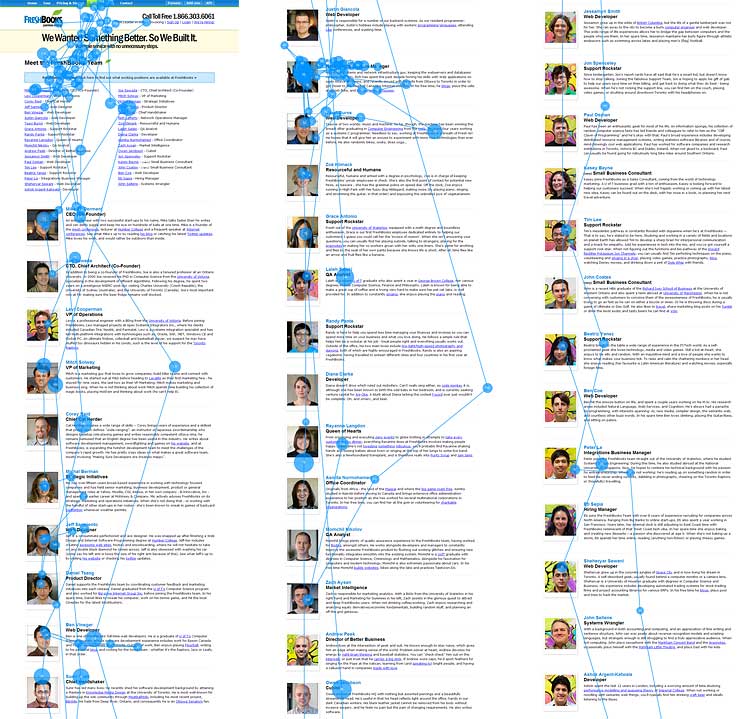
In fact, this is all one sooo long page, divided into three parts to fit here. In the original, the page was 9,335 pixels high and our test users scrolled almost to the end. This example shows that people sometimes scroll down rather long pages, but usually paying less and less attention to the information below.
On this page, users spent 10% more time looking at photos of employees than biographies, although the latter occupied 316% more space. Obviously, users were in a hurry and wanted to quickly review the command on the site FreshBooks.com, and browsing through photos is much faster than reading entire paragraphs.
The key point is that the photos are real people, really working in the company .
And, on the contrary, people completely ignore the images of “ordinary people” from photobanks :
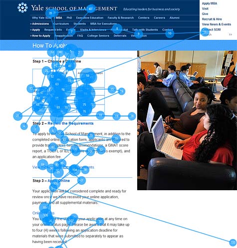
I believe that this photo from the Yale School of Management actually shows real students (the photo from the drain would hardly be so cropped or it would have slouching models like a guy in a blue shirt). But nevertheless, the photo on this page is only to fill the empty space . Users here to understand the application process for admission, and not to assess the degree of slouch student.
Most likely, the dean or another manager asked the designer to “revive” the page, so that the university looked more impressive and attracted more applicants. But on the Internet, pictures only for "revitalization" are ignored.
As we discussed at the Brand as Experience seminar, a way to encourage a customer to order is to make him an attractive offer, which means focusing on meeting customer needs. This lesson remains relevant both for non-profit organizations and for universities, even if they do not perceive their audience as clients.
Product details on the photo - Good
Compare these two examples of the list of products from Pottery Barn and Amazon.com:

The thumbnails of photo frames are more extensively studied by users, while thumbnails of flat-panel TVs are largely ignored. In fact, on the full version of the Amazon page (only the upper part is shown now), only 18% of the viewing time is spent on the photo, while 82% of the attention is paid to the text . On average, the miniatures of each product are 0.9 gaze fixations, while text descriptions attract an average of 4.4 fixations.
The difference between these screenshots is obvious: the photos of the TV can not help us in choosing one or another product. A guy in a canoe against a football player? I watch football more often than boating and therefore I will buy a TV showing a football player?
This is an excellent example of why it is not always good to copy the design of the largest sites. The range of products on Amazon.com is incredibly huge, so they use the most standardized way to display products without optimizing for a specific category. On the contrary, Pottery Barn is sharpened for a narrow range and therefore more detailed photos are on its pages.
Large Images - Good (when required)
In our research, product pages with detailed information about a particular product, users paid even more attention to product photos. People often wanted to see alternative product photos and clicked the "zoom in" link.
Back in 2005, “Insufficient increase in photos” was number 10 in my TOP10 errors in web design. That is, when the user clicks on the "zoom in" link, he was shown the image can be only 20% more. And it should be at least 2 times the original size, preferably even more. Unfortunately, this error still occurs after 5 years.
Yes, users do not like big photos that interfere with them on the way (an example from Yale above shows how not to do it). But when users themselves request an enlarged version, this is a completely different case:
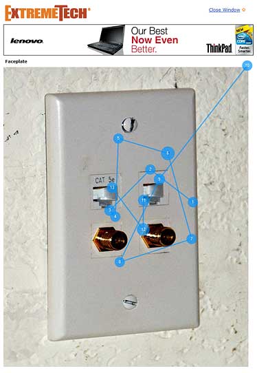
Notice how the close-up of the front panel with ExtremeTech.com attracted 12 fixations of gaze (the photo on the site was twice as large as here).
Information Carrying Images - Good
The common thing in all these examples (and even in thousands of our studies) is that users pay attention only to information-carrying images that are relevant to the task. And users completely ignore decorative pictures that do not carry additional information. So many uninformative "dummies", which are already enough on the Internet.
Invest in good photos: a great photographer will seriously add value to your website.
Summary
Users pay close attention to photos and images that contain relevant information and ignore the colorful pictures used only to “revive” the web page.
PS From myself I would like to add a note in defense of minimalism on modern websites. Gentlemen customers, you do not need to ask to add and add graphic elements to a good “clean” work, just to have beautiful pictures. This article confirms that no one is looking at them.
Source: https://habr.com/ru/post/108257/
All Articles