Create a landing page: checklist for beginners
If you are an expert in developing user interfaces and usability, if the number of landing pages you have developed is more than 10, if you have already read hundreds of articles on this topic with recommendations from professionals, our post is not for you. It is more likely for those who are just starting ...

Recently, we have been creating many landing pages, so we have compiled for ourselves a small list of questions that must be answered before we consider the page ready for access to the large Internet. There is nothing new in these questions, they just help to collect all the tips on the development of the landing page, which are in the network, in one document, and not to miss anything important.
')
1. Is there a product image on the landing page?
On the page there must be an image of the product being promoted or a picture that reflects the essence of the service The picture is what will add emotions to the page and improve the impression about it.
2. The title on the landing page is clear, unambiguous and reflects the essence of our offer to potential customers?
The header is the first message the client sees. In the first 2-3 seconds the headline should tell the main thing - what do you suggest using this page.
3. Does the content of the landing page match the content of the contextual ads / banners / links that lead to it?
4. On the landing page posted reviews of existing customers?
5. Are there certificates, licenses, icons of professional communities and associations on the landing page?
Imagine yourself in the place of a client who has reached the landing page, where you need to fill out some form, leave your contact details or order a product. The client doubts that he is scared, with the help of these elements we give him confidence in the choice made.
6. Is there a clear call to action on the landing page?
If we want your visitors to perform a specific action, we need to tell them directly and unambiguously. We try to use calling language: “Fill out the form now”, “Order a call”, “Register for a seminar”. If possible, the call to action on the page should be one.
7. Is there a valid call-to-action argument on the landing page?
We supplement these appeals with convincing arguments that will help dispel the last doubts of a potential buyer: “5% discount only until the end of the day,” “number of seats is limited,” etc.
8. Are web analytics systems (Google Analytics or Yandex.Metrica, LiveInternet) installed on your landing page?
Why do we need to collect and analyze data on the behavior of visitors on the site today, no one needs to explain to anyone :)
9. Is a font smaller than 10 points used for the main texts on the landing page?
And this is the first question that must be answered "no." No one likes to strain to read a voluminous text written in small gray font. Even the designer who painted it. The text on the page should be read without eye strain. Well readable size not less than 11 points. Short sentences. Small paragraphs.
10. Is the registration form placed right on the landing page?
It should be right here, at least the first 2-3 fields. Do not forget that with each transition and clicking on the button "next" we lose up to 30% of visitors.
11. Are all form fields really necessary?
Worse than the form consisting of several steps - only huge forms that frighten the user with one of its kind. No need to ask users more than we really need.
12. Does the landing page have a navigation bar with links to which the user can click?
If there are links, think again - are they really necessary. It is better to open additional information in pop-up windows in order not to lead the visitor off the page.
13. Are there texts / graphics on the page that are not related to the page proposal?
Texts and pictures not related to the offer and not reflecting the essence of the service only distract attention and blur the clarity of our message to users. They should not be on the landing page.
Well, after the answers to all these questions are received, we consider the landing page ready. Provided that the answers are all correct of course. But this is only the beginning. After launch, you need to test different options for calls to action, arguments, the location of key blocks on the landing page. It is very difficult to say right away that it will work well at this particular moment, which is why an experiment, an experiment, and once again an experiment.
Here are a few landings, developed by us for our projects or for clients:
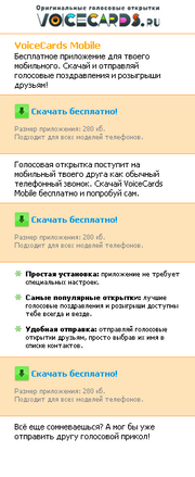
For java-applications of voice cards Voicecards.ru : http://www.java.voicecards.ru

For the same java-application, mobile version: http://p.voicecards.ru
For a bank collecting applications for potential customers for loans: http://www.kreditsrochno.ru

If you know more important questions that can be included in the checklist - write in the comments.
Recently, we have been creating many landing pages, so we have compiled for ourselves a small list of questions that must be answered before we consider the page ready for access to the large Internet. There is nothing new in these questions, they just help to collect all the tips on the development of the landing page, which are in the network, in one document, and not to miss anything important.
')
I. First impression
1. Is there a product image on the landing page?
On the page there must be an image of the product being promoted or a picture that reflects the essence of the service The picture is what will add emotions to the page and improve the impression about it.
2. The title on the landing page is clear, unambiguous and reflects the essence of our offer to potential customers?
The header is the first message the client sees. In the first 2-3 seconds the headline should tell the main thing - what do you suggest using this page.
3. Does the content of the landing page match the content of the contextual ads / banners / links that lead to it?
Ii. We fight for trust
4. On the landing page posted reviews of existing customers?
5. Are there certificates, licenses, icons of professional communities and associations on the landing page?
Imagine yourself in the place of a client who has reached the landing page, where you need to fill out some form, leave your contact details or order a product. The client doubts that he is scared, with the help of these elements we give him confidence in the choice made.
Iii. It's time to act
6. Is there a clear call to action on the landing page?
If we want your visitors to perform a specific action, we need to tell them directly and unambiguously. We try to use calling language: “Fill out the form now”, “Order a call”, “Register for a seminar”. If possible, the call to action on the page should be one.
7. Is there a valid call-to-action argument on the landing page?
We supplement these appeals with convincing arguments that will help dispel the last doubts of a potential buyer: “5% discount only until the end of the day,” “number of seats is limited,” etc.
Iv. Keep your finger on the pulse
8. Are web analytics systems (Google Analytics or Yandex.Metrica, LiveInternet) installed on your landing page?
Why do we need to collect and analyze data on the behavior of visitors on the site today, no one needs to explain to anyone :)
V. Take care of customers' vision
9. Is a font smaller than 10 points used for the main texts on the landing page?
And this is the first question that must be answered "no." No one likes to strain to read a voluminous text written in small gray font. Even the designer who painted it. The text on the page should be read without eye strain. Well readable size not less than 11 points. Short sentences. Small paragraphs.
Vi. We look at the form
10. Is the registration form placed right on the landing page?
It should be right here, at least the first 2-3 fields. Do not forget that with each transition and clicking on the button "next" we lose up to 30% of visitors.
11. Are all form fields really necessary?
Worse than the form consisting of several steps - only huge forms that frighten the user with one of its kind. No need to ask users more than we really need.
VII. Nothing extra
12. Does the landing page have a navigation bar with links to which the user can click?
If there are links, think again - are they really necessary. It is better to open additional information in pop-up windows in order not to lead the visitor off the page.
13. Are there texts / graphics on the page that are not related to the page proposal?
Texts and pictures not related to the offer and not reflecting the essence of the service only distract attention and blur the clarity of our message to users. They should not be on the landing page.
Well, after the answers to all these questions are received, we consider the landing page ready. Provided that the answers are all correct of course. But this is only the beginning. After launch, you need to test different options for calls to action, arguments, the location of key blocks on the landing page. It is very difficult to say right away that it will work well at this particular moment, which is why an experiment, an experiment, and once again an experiment.
Here are a few landings, developed by us for our projects or for clients:
For java-applications of voice cards Voicecards.ru : http://www.java.voicecards.ru
For the same java-application, mobile version: http://p.voicecards.ru
For a bank collecting applications for potential customers for loans: http://www.kreditsrochno.ru
If you know more important questions that can be included in the checklist - write in the comments.
Source: https://habr.com/ru/post/108020/
All Articles