Css-ballun without graphics
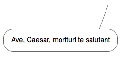
Several times at work, I came across the need to impose balloons (clouds, phylacters). If someone doesn’t know, these are the things with which the comics sound characters in the comics. In the interfaces of the sites they are usually used for all sorts of tooltips to the elements.
Mounting a regular balun of a rather trivial appearance (a rectangular block with a triangle to the right), I wondered if it was impossible to somehow make this up without the help of graphics? In principle, drawing an arrow with CSS using the border * property is not difficult.
')
The bottom line is that an elephant frame is set for a block with zero height and width, then from the side where the arrow points to the frame width is zero, the transparent side color is set to two side frames (a filter is used for IE) and there is one visible frame, which represents is an arrow. The way works reinforced everywhere.
But what if you want an arrow you want to assign a tenyushka? Or do the whole balloon make a frame of one or two pixels?
The following decision comes to mind.
css
.b-ungle {
position: absolute;

width: 20px;
height: 20px;
overflow: hidden;
}
.b-ungle__rotate {
position: absolute;

width: 20px;
height: 20px;

-webkit-transform: rotate(45deg);
-khtml-transform: rotate(45deg);
-moz-transform: rotate(45deg);
-ms-transform: rotate(45deg);
-o-transform: rotate(45deg);
transform: rotate(45deg);
}
html
<div class="b-ungle">
<div class="b-ungle__rotate"></div>
</div>
Translated into human language: one block is taken, width-height is given to it. Another block, absolutely positioned, is embedded in it. Which is then rotated by 45 degrees with the transform css-property (as well as its derivatives for Mozilla and Webcam). Next is to move the internal block using the css-properties top, right, bottom, left, and the trick is done. You can paint on a nested block at least a frame, even a shadow, at least an indecent word. And all the excess is cut off using overflow: hidden; at the external unit.
But what about IE? And for IE there are a lot of frameworks with which you can emulate many of the features of CSS 3, including the transform property. I must admit, however, that IE, with its filters, rotates the block slightly differently than those browsers that use the transform property, so under IE you may have to move the internal block a little differently than for other browsers. However, the usual thing.
It seemed to work out pretty well, but the awl in the fifth point does not give a bad head a rest. There was an idea to make a balloon with a normal elongated pointer. And then turn the square clockwise is a simple matter.
Said - done . I will not load with details that all curious people can easily extract from the code, I can only say that because of IE, I had to pretty much tinker and complicate the initially simple block structure. The rest is the same. One block turns, the other cuts off all unnecessary.
Advantages of the method
- no need to mess around with png (the arrow fits nicely on any background),
- the length of the diagonal line is easily calculated by the formula the square of the hypotenuse is equal to the sum of the squares of the legs,
- it is possible to think a little more and
- in most modern browsers everything will be displayed correctly.
The disadvantages of the method
- the .htc file is used, which means that if javascript is turned off in IE, there will be no corner,
- in the Opera of the ninth version of the corner also may not be,
- because of IE and its eccentricities with filters, the html-code is a bit much,
- the designer will easily draw a balloon that cannot be folded this way,
- in IE, rounded corners are not visible (but this is fixable if desired).
I do not know whether anyone will seriously use this method. Even I was puzzled by them mainly in order to stretch my brains. But it may be the idea itself that anyone will fit for any insidious purposes. I also fully admit that on the Internet I was not the first to think of the above, therefore I do not pretend to be innovative for the first time.
Alternative ways to comment:
- fatal nicolasgallagher.com/pure-css-speech-bubbles/demo ,
- jkeks www.lullabot.com/articles/announcing-beautytips-jquery-tooltip-plugin ,
- SamDark rmcreative.ru .
Examples of using balloons:
- z-store.ru (in the top menu),
- cnews.ru (in the news list on the right),
- games.rambler.ru (when you hover on the game block),
- news.yandex.ru (quote block),
- business lynch studio Artemy Lebedev ,
- facebook.com ("business cards" user).
P. S:
Bonus tracks for aspirated my mnogabukviyo:
- Darth Wader vs. Luk skywalker
- Steeve Jobs vs. Bill Gates
Source: https://habr.com/ru/post/107259/
All Articles