Habr in small windows - now from 420 pixels
Thanks to the rubberiness of the Habr design and the completion of the work on the Habr Prettifier / spmbt stylist , which is needed to achieve compactness and readability of pages, the site has gained the ability to fully work in fairly narrow windows - from 420 pixels wide (any non-IE6-7 browser and plugin are needed Stylish stylist or GreaceMonkey plugin, or NinjaKit for Safari / Win, or setting custom styles in Opera, IE8 or Safari.) The result shows on a screencast (Youtube) that you can use Habrom in such small windows.

Acquaintance with the code, a couple of screenshots and installation in Stylish or GreaceMonkey.
The best way to demonstrate full-fledged work in a narrow window is a walk through the site, taken on video.
The window size is about 440-480 pixels. It has no particular practical significance: there are no smartphones or tablets with a similar screen width. But improvements under this width will be useful in such cases:
1. The site display achieved for the narrow screen mode is useful for wider windows of 640-1024 pixels, and this is quite practical for netbooks.
2. A mode is possible when a site looks on a half-screen of a netbook, and on the other half, for example, mail.
3. It is possible to have a very narrow browser window on a regular monitor for rational use of screen area.
')
This is a refinement of habr.ru site styles, started over a year ago by Almalexa : Habrahabr - Prettifier (by the link author - Almalexa; his styles only work under Firefox and are the prototype of the stylist described here). The name emphasizes that the modification should be pleasant (prettify - English “to preen") in use. The author argued that initially the goal was also a compact display, but then, as can be seen, a reasonable compromise was chosen between the density of information and its readability.
I used the stylist for several months, but one day to save the scrolling of the mouse wheel, it was decided to modify the stylist in the comment display section. It's nice to start not from scratch, but “standing on the shoulders of giants.” It did not happen in one day, but after a couple of weeks I already had a fairly readable version of the display of comments. I wanted to fulfill my other wishes for the type of site. Much (70%) was borrowed from the basic styles of Almalexa. The work before me was great and thorough. Other differences will be explained by differences in taste and experimentation, which in some details has not yet been completed, but the most difficult is over and the version can be recommended for installation.
Finally, when reaching cross-browser compatibility, the code had to use css hacks to combine the styles into 1 file. But now you can simply install the user-style, without thinking about the type of browser.
“Discoveries” about how best to refine the styles happen regularly, every 1-3 days. For example, scalable images were made in the list of comments, because scalability in the list of strangers was already from Habr, and in articles - from AlmAlexa. Below is a list of features that exist at the time of this writing.
To make one boring stylist for one’s own needs is not as interesting as making something unusual on the basis of it that is interesting if not with an application, then with an idea. And so, the site’s supercompactness (the ability to work in a window with an internal width of 420 pixels), which he was capable of without losing acquired aesthetic (hopefully) properties — the reason why even those who won't install will want to see it.
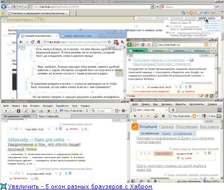 - rice. 1 (or click if it does not open for viewing) .
The most convenient way to start is to observe the behavior of the site on the video presentation (below).
Have we seen a lot of sites that have a standard menu and navigation that occupy 20 pixels of the screen in height? We show on the screencast work with such a compact menu. For particularly small windows through Stylish connects Netbook Addon, which translates the right menu down and even more compresses empty fields, limits the indentation of heavily embedded comments.
Video presentation - how Prettifier / spmbt looks in different browsers (it’s better not to look from this page, because here the scale is reduced, but right away on the Youtube page ). The display of the interface goes in very narrow windows the size of a regular video frame and smaller. Firefox - about 5 minutes, then a little more (for dubbing - be careful: Kukin!).
Who has no desire or ability to watch 8 minutes extravaganza screencast - a few photos.
Set the browser window to a width of 420 pixels, set the stylist Prettifier / spmbt and Addon to it - Netbook Addon . We will go to the main page habr.ru. What we see? Yes, now this is the main page.
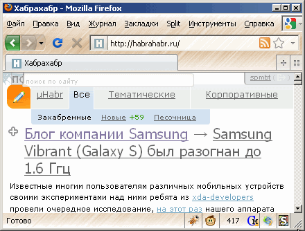 fig.2 or click
Where is the site and user menu? They are hidden in the upper corners in the form of gray translucent buttons. It is worth pointing the mouse button - a menu appears.
 fig.3 or click
Such a small size of the navigation allowed to make the buttons constantly visible in the style of the Habr button hanging on the right to update comments. In the user menu, new menu items and submenus from other Habro-extensions, such as the crea7or articles filter, get along together (if configured).
*) site navigation takes 20 pixels of height, always on the screen at the corners of the window.
*) compact page headers.
*) date and author - at the beginning of the article (the author would not hurt at the bottom, but there is no duplicate in styles; of two evils we take the least)
*) flexibility of displaying navigation paths in the right menu: if width permits - in 1 line.
*) scaling of pictures across the width of the window (the legacy of Habr and AlmAlexa).
*) font sizes - not less than 9 pixels (for non-blurring and readability).
*) large fonts for important indicators.
*) A number of design reworkings from AlmAlexa (buttons, switch pictures, search field, footer, comment rating arrows).
*) work with authorization or without.
*) cross-browser compatibility (only IE6-7 is ignored, the rest cover about 95% of users).
(mode without right column)
*) The translation mode of the right column to the bottom of the page ( Netbook Addon ), made by a separate style in Stylish, which can work even without the main Prettifier / spmbt style.
*) compaction of empty spaces and fields in the Netbook Addon mode, correctness of displaying the site with an internal window width of 420 pixels ..
*) limit the growth of comment indents (after level 10) in Netbook Addon mode. Tree branch dividers (thick horizontal lines deeper than level 10) for orienteering without indents.
*) contrast and volume separator of the article and comments ("sleeper").
*) sizes of fonts, drawings and restriction of the pre tag in Mikrohabr.
(comments area)
*) compact comments.
*) The pallor of the author, the date, avatar, arrows, asterisks creates a white interval and does not distract from reading. The contrast of the title - mouseover.
*) UFO profound utterances turn into a very inconspicuous low gray stripe that does not distract from reading.
*) tree separators in the comments: if the next comment is not the answer to the previous one, we see a thin strip - a horizontal separator.
*) vertical branches of the comment tree: if there is another discussion thread below, a vertical bar leading to it is visible on the left.
The stylist is compatible with the newly released crea7or unwanted articles filter. In the personal pane, the filter settings are correctly displayed; next to the authors and blogs, there are buttons to enable the filter.
Used in conjunction with extensions Habratulz and Karma Viewer (as edited by spmbt).
Works in all modern browsers; tested and configured in IE8 (there is something with the wrong display, no rounding and everything else from CSS3, but you can work).
Various edits of site developers in styles can lead to display errors over time, which will be corrected and, if possible, will be corrected if possible.
There are (wherever without them) such "flaws" of the structure of the pages, under which it is impossible to fully fulfill the desired, using only styles. To get the result, and not to go beyond the limits of the styles in the scripts, we make compromises.
1. The main reason for which you have to compromise is that the displaced absolute blocks fall out of the main flow of the document. The markup for them no longer allocates space for rubber page transformations; space should be provided for most practical cases.
1.a. I wanted to have the date, the author and the original in the title of the article. The receiving method is absolutely positioned fields of the date, author, original. With very narrow windows so that the fields do not run into other texts, we try to press their starting points to the left edge of the page. Therefore, we see a jumble of 2-3 fields at the beginning of the articles.
1.b. Other evaluation fields need to be at the bottom of the article, but in order for them not to take up space, drag them out to the background of the comment delimiter. Again, for narrow windows you have to push the margins along the left edge into 2 lines or more, and not build them into 1 chain. In the QA section, it is generally not possible to place the evaluation fields on the background of the comment delimiter due to the “clarify the question” block.
1.in. Evaluation fields are not always placed in 1 line and are transferred to the beginning of the second line. So that they are thrown "stepwise", clinging to the protrusions of the upper line, such projections are consciously installed.
2. The operation mode of the site with the right panel retracted downwards is accompanied by measures to save empty fields: they are compacted to reduce the occurrence of conflicts of blocks of variable size.
3. (Code.) Some styles are left in the inheritance from the author of the original without thorough analysis of the need to preserve them. Periodic revisions of the code gradually eliminate the remaining excess of styles (and new ones are created).
3.a. (Code.) The styles have very long enumerations of selectors instead of using the method of excluding certain styles from the general. This is due to the fact that in such cases the site did not have full coverage of the overall style of the child classes. (For example, the page types in the body tag.)
4. If the name of the company's blog is very long, it does not fit on line 1. There is a “pocket” to hide the end of the name, but if it falls on the 2nd line, it is mixed with the subsequent heading.
1. If the Firefox setting “Settings ... Content - Default font: Advanced ... Smallest font size - (not 'no')” is used, then minimum fonts in some places (comment date and other fragments with float: left) begin to increase and "Swim" down. This is a browser bug; style settings could not overcome it. For different settings of the minimum font, different padding-top for texts is needed, no line-height and vertical-align help.
2. Invented how to put the author at the bottom of the article, too - by mouse-over, but in Webcite it works with artifacts - there is a residual width of the field of assessments during mouse assignment, poor-quality redrawing during mouseout.
3. (Habr's bugs.) The first letter in the mail always has the class my-reply , so it is impossible to specify by the style whether it is its own or not.
3a Not covering page types with classes. For example, there are no QA classes in the body, a habrenty, a select class, a list difference class and a single article, a number of other classes, which would significantly reduce the code and fix bugs.
4. In FF, the standard style of input buttons does not change - as if somewhere it is “overrun” in plug-ins by a higher priority rule (where?).
5. On Safari5.02 / Win, the stylist is launched through the NinjaKit0.8 plugin. In it, the code is triggered at the time of onload, so the first 2 seconds the Habr page is visible with the usual styles. You can put the styles in the user style of the browser, then it will work immediately. But it is not clear how in Safari to make styles only for this site (similar to @ -moz-document domain ()).
6. In Chrome, the HabraTopicFilter crea7or plug-in in the title “filter” crawls out of the line, but is functional.
7. The “Whois” tab looks fine only with wide windows (its position is associated with JS, inflexible, so it’s better not to touch without JS).
8. There is no special bugtracker for the stylist. Therefore, those who want to improve something somewhere, pointing out the bugs - we can contact through the LAN.
9. There is no css hack to distinguish Chrome 6.0.472.63 (534.3) and above and Safari 5.02 (533.18.5), and one element looks different in them. In Chrome, the list of “The best in 24 hours” looked better, you need to find a line and remove: ".live.dailybest dl.air-comment> dd {margin: 0! Important;}" from the list of styles in Chrome by editing the installed extension in stylish.
9a. In Chrome 6 and 7, the layout is also slightly different, in the menu (the words “Settings”, “Filter”) you have to compromise - put words not in one line (Only for Webcam Kit).
10. IE8 does not distinguish between the specifier "[attribute = value]", so it cannot display the single word "enter" in the menu, as all other browsers show. We'll have to guess that we must move the mouse to the empty right corner to log in.
Rather obvious actions for an experienced user are described, but so that they are clear to everyone, all operations for each browser are described in detail.
*) Firefox . Having installed the Stylish or GreaceMonkey plugins, go to the installation page and press one of the two buttons depending on the available plug-in (preferably Stylish). Or create a new style in Stylish and copy the text of the CSS file into it. (Tested in FF v.3.6.10)
*) Google Chrome (checked in 6.0.472.63, 7.0.517.41). We put the Stylish plugin, go to the style installation page , then follow the browser instructions. To improve the look of the “Best for 24 hours” list (see bug # 9), we edit the text of the styles using the standard means of the Stylish plugin: chrome: // extensions / - Stylish - Settings - Habr-Prettifier: Edit, then look for and delete from the input field “ Code "line" .live.dailybest dl.air-comment> dd {margin: 0! Important;} ", then the button" Save ".
For the next 3 browsers, not the entire file (!) Is used, but only the main part, between the lines "@ -moz-document domain (" habrahabr.ru ") {" (approximately 9th from the beginning) and "}" (approximately 8th from the end) without these lines themselves.
*) Opera (tested at 10.60, 10.51, 10.10). “Tools” - General settings - Advanced - Content - Settings for sites - Add - Basic - Site: habrahabr.ru - View - My style sheet: (Specify the path to a style file containing not all the content but between "@ -moz -document domain ("habrahabr.ru") {"and"} ", the closing bracket - approximately on the 8th line from the end). “OK”, “Close”, “OK”. Reload this page habr.ru. How to walk through the menu in the Opera is shown in the pictures.
*) Safari (checked at 5.02 (533.18.5)). Settings ... - Add-ons - Stylesheet - Other ... - (Select a file with saved styles; close the "Settings" window). Reload this page habr.ru.
This style will be applied to the page of any site, so when browsing other sites in Safari, this style in the settings is better off - there is a possibility of distorting the elements of other sites, if the class name accidentally coincides and some rule works. Unfortunately, in the browser there is no possibility to set a style specifically for the selected site, as does Stylish.
It is possible to set styles for a given site in another way - through the NinjaKit plugin. But it has a flaw: styles work 1-2 seconds after loading each page, and before that, natural, non-transformed styles of the site are visible, which, of course, is inconvenient. In a similar installation method in Firefox via GreaceMonkey, this is not observed.
*) IE8 . Set the mode to "IE8" (not "compatibility mode" with the previous version). "Tools" - Internrt Options - General - Accessibility (the last button on the tab) - User style sheet: (Specify the path to the style file containing not all the content, but located between "@ -moz-document domain (" habrahabr.ru ") {"and"} ", closing bracket - approximately on the 8th line from the end). “OK”, “Apply” (or “OK”, “OK”).
The note about the desirability of disabling styles specified in this way is the same as for Safari.
In IE8, the rounding of borders, gradients, shadows, inline-block styles in the right column, some ways of positioning elements (for example, the date and the author of the article - in the traditional place) will not be displayed. In general, using a stylist in IE is no less comfortable than in other browsers.
To move the right column down, and for the main text to get different "sealing bonuses" (listed above in the "Features" section), there are 2 ways:
1) put the second style (Habr Netbook Addon) in Stylish and connect both. It is convenient to compare different connection combinations and quickly change them. Sometimes there are minor markup errors from on-off styles, then the page needs to be reloaded. To avoid - Addon turn on second and turn off first.
2) remove only 1 space character in the main style file (in the line like "/ * for netbooks (sidebar below) * /" is the penultimate character). This opens 3 KB of commented text that makes up the content of a separate add-on. (It will not work in a standard installation, because it deletes comments. Instead of the code without comments, you must first place the source code file for the Habr.)
Conclusion In total, the stylist has compromises and shortcomings, the number of which is reasonably minimized, so that all other actions on styles are perceived as a single design concept. It is slightly different than the original design, not for everyone better than other alternatives. But together they make a choice.
Thanks to the authors of the project for the fact that the style system, the architecture of the pages allows you so flexibly to change the final presentation.
If you look at the search engine requests for the words "browser themes", then, oddly enough, 80% refers to the design styles of pages of a site (and not the skin of the browser). And only the Vkontakte website is mentioned on this subject. Especially for IE browsers. This work helps to dilute the monotony of the mentions of the site, in which the cross-browser compatibility of the solution should help.
Acquaintance with the code, a couple of screenshots and installation in Stylish or GreaceMonkey.
The best way to demonstrate full-fledged work in a narrow window is a walk through the site, taken on video.
The window size is about 440-480 pixels. It has no particular practical significance: there are no smartphones or tablets with a similar screen width. But improvements under this width will be useful in such cases:
1. The site display achieved for the narrow screen mode is useful for wider windows of 640-1024 pixels, and this is quite practical for netbooks.
2. A mode is possible when a site looks on a half-screen of a netbook, and on the other half, for example, mail.
3. It is possible to have a very narrow browser window on a regular monitor for rational use of screen area.
')
What is a Prettifier?
This is a refinement of habr.ru site styles, started over a year ago by Almalexa : Habrahabr - Prettifier (by the link author - Almalexa; his styles only work under Firefox and are the prototype of the stylist described here). The name emphasizes that the modification should be pleasant (prettify - English “to preen") in use. The author argued that initially the goal was also a compact display, but then, as can be seen, a reasonable compromise was chosen between the density of information and its readability.
Revision history
I used the stylist for several months, but one day to save the scrolling of the mouse wheel, it was decided to modify the stylist in the comment display section. It's nice to start not from scratch, but “standing on the shoulders of giants.” It did not happen in one day, but after a couple of weeks I already had a fairly readable version of the display of comments. I wanted to fulfill my other wishes for the type of site. Much (70%) was borrowed from the basic styles of Almalexa. The work before me was great and thorough. Other differences will be explained by differences in taste and experimentation, which in some details has not yet been completed, but the most difficult is over and the version can be recommended for installation.
Finally, when reaching cross-browser compatibility, the code had to use css hacks to combine the styles into 1 file. But now you can simply install the user-style, without thinking about the type of browser.
“Discoveries” about how best to refine the styles happen regularly, every 1-3 days. For example, scalable images were made in the list of comments, because scalability in the list of strangers was already from Habr, and in articles - from AlmAlexa. Below is a list of features that exist at the time of this writing.
To make one boring stylist for one’s own needs is not as interesting as making something unusual on the basis of it that is interesting if not with an application, then with an idea. And so, the site’s supercompactness (the ability to work in a window with an internal width of 420 pixels), which he was capable of without losing acquired aesthetic (hopefully) properties — the reason why even those who won't install will want to see it.
- rice. 1 (or click if it does not open for viewing) .The most convenient way to start is to observe the behavior of the site on the video presentation (below).
The layout of the site.
Have we seen a lot of sites that have a standard menu and navigation that occupy 20 pixels of the screen in height? We show on the screencast work with such a compact menu. For particularly small windows through Stylish connects Netbook Addon, which translates the right menu down and even more compresses empty fields, limits the indentation of heavily embedded comments.
Video presentation - how Prettifier / spmbt looks in different browsers (it’s better not to look from this page, because here the scale is reduced, but right away on the Youtube page ). The display of the interface goes in very narrow windows the size of a regular video frame and smaller. Firefox - about 5 minutes, then a little more (for dubbing - be careful: Kukin!).
Who has no desire or ability to watch 8 minutes extravaganza screencast - a few photos.
Set the browser window to a width of 420 pixels, set the stylist Prettifier / spmbt and Addon to it - Netbook Addon . We will go to the main page habr.ru. What we see? Yes, now this is the main page.
fig.2 or clickWhere is the site and user menu? They are hidden in the upper corners in the form of gray translucent buttons. It is worth pointing the mouse button - a menu appears.
fig.3 or clickSuch a small size of the navigation allowed to make the buttons constantly visible in the style of the Habr button hanging on the right to update comments. In the user menu, new menu items and submenus from other Habro-extensions, such as the crea7or articles filter, get along together (if configured).
Features.
*) site navigation takes 20 pixels of height, always on the screen at the corners of the window.
*) compact page headers.
*) date and author - at the beginning of the article (the author would not hurt at the bottom, but there is no duplicate in styles; of two evils we take the least)
*) flexibility of displaying navigation paths in the right menu: if width permits - in 1 line.
*) scaling of pictures across the width of the window (the legacy of Habr and AlmAlexa).
*) font sizes - not less than 9 pixels (for non-blurring and readability).
*) large fonts for important indicators.
*) A number of design reworkings from AlmAlexa (buttons, switch pictures, search field, footer, comment rating arrows).
*) work with authorization or without.
*) cross-browser compatibility (only IE6-7 is ignored, the rest cover about 95% of users).
(mode without right column)
*) The translation mode of the right column to the bottom of the page ( Netbook Addon ), made by a separate style in Stylish, which can work even without the main Prettifier / spmbt style.
*) compaction of empty spaces and fields in the Netbook Addon mode, correctness of displaying the site with an internal window width of 420 pixels ..
*) limit the growth of comment indents (after level 10) in Netbook Addon mode. Tree branch dividers (thick horizontal lines deeper than level 10) for orienteering without indents.
*) contrast and volume separator of the article and comments ("sleeper").
*) sizes of fonts, drawings and restriction of the pre tag in Mikrohabr.
(comments area)
*) compact comments.
*) The pallor of the author, the date, avatar, arrows, asterisks creates a white interval and does not distract from reading. The contrast of the title - mouseover.
*) UFO profound utterances turn into a very inconspicuous low gray stripe that does not distract from reading.
*) tree separators in the comments: if the next comment is not the answer to the previous one, we see a thin strip - a horizontal separator.
*) vertical branches of the comment tree: if there is another discussion thread below, a vertical bar leading to it is visible on the left.
Compatibility.
The stylist is compatible with the newly released crea7or unwanted articles filter. In the personal pane, the filter settings are correctly displayed; next to the authors and blogs, there are buttons to enable the filter.
Used in conjunction with extensions Habratulz and Karma Viewer (as edited by spmbt).
Works in all modern browsers; tested and configured in IE8 (there is something with the wrong display, no rounding and everything else from CSS3, but you can work).
Various edits of site developers in styles can lead to display errors over time, which will be corrected and, if possible, will be corrected if possible.
Compromises.
There are (wherever without them) such "flaws" of the structure of the pages, under which it is impossible to fully fulfill the desired, using only styles. To get the result, and not to go beyond the limits of the styles in the scripts, we make compromises.
1. The main reason for which you have to compromise is that the displaced absolute blocks fall out of the main flow of the document. The markup for them no longer allocates space for rubber page transformations; space should be provided for most practical cases.
1.a. I wanted to have the date, the author and the original in the title of the article. The receiving method is absolutely positioned fields of the date, author, original. With very narrow windows so that the fields do not run into other texts, we try to press their starting points to the left edge of the page. Therefore, we see a jumble of 2-3 fields at the beginning of the articles.
1.b. Other evaluation fields need to be at the bottom of the article, but in order for them not to take up space, drag them out to the background of the comment delimiter. Again, for narrow windows you have to push the margins along the left edge into 2 lines or more, and not build them into 1 chain. In the QA section, it is generally not possible to place the evaluation fields on the background of the comment delimiter due to the “clarify the question” block.
1.in. Evaluation fields are not always placed in 1 line and are transferred to the beginning of the second line. So that they are thrown "stepwise", clinging to the protrusions of the upper line, such projections are consciously installed.
2. The operation mode of the site with the right panel retracted downwards is accompanied by measures to save empty fields: they are compacted to reduce the occurrence of conflicts of blocks of variable size.
3. (Code.) Some styles are left in the inheritance from the author of the original without thorough analysis of the need to preserve them. Periodic revisions of the code gradually eliminate the remaining excess of styles (and new ones are created).
3.a. (Code.) The styles have very long enumerations of selectors instead of using the method of excluding certain styles from the general. This is due to the fact that in such cases the site did not have full coverage of the overall style of the child classes. (For example, the page types in the body tag.)
4. If the name of the company's blog is very long, it does not fit on line 1. There is a “pocket” to hide the end of the name, but if it falls on the 2nd line, it is mixed with the subsequent heading.
Unresolved bugs.
1. If the Firefox setting “Settings ... Content - Default font: Advanced ... Smallest font size - (not 'no')” is used, then minimum fonts in some places (comment date and other fragments with float: left) begin to increase and "Swim" down. This is a browser bug; style settings could not overcome it. For different settings of the minimum font, different padding-top for texts is needed, no line-height and vertical-align help.
2. Invented how to put the author at the bottom of the article, too - by mouse-over, but in Webcite it works with artifacts - there is a residual width of the field of assessments during mouse assignment, poor-quality redrawing during mouseout.
3. (Habr's bugs.) The first letter in the mail always has the class my-reply , so it is impossible to specify by the style whether it is its own or not.
3a Not covering page types with classes. For example, there are no QA classes in the body, a habrenty, a select class, a list difference class and a single article, a number of other classes, which would significantly reduce the code and fix bugs.
4. In FF, the standard style of input buttons does not change - as if somewhere it is “overrun” in plug-ins by a higher priority rule (where?).
5. On Safari5.02 / Win, the stylist is launched through the NinjaKit0.8 plugin. In it, the code is triggered at the time of onload, so the first 2 seconds the Habr page is visible with the usual styles. You can put the styles in the user style of the browser, then it will work immediately. But it is not clear how in Safari to make styles only for this site (similar to @ -moz-document domain ()).
6. In Chrome, the HabraTopicFilter crea7or plug-in in the title “filter” crawls out of the line, but is functional.
7. The “Whois” tab looks fine only with wide windows (its position is associated with JS, inflexible, so it’s better not to touch without JS).
8. There is no special bugtracker for the stylist. Therefore, those who want to improve something somewhere, pointing out the bugs - we can contact through the LAN.
9. There is no css hack to distinguish Chrome 6.0.472.63 (534.3) and above and Safari 5.02 (533.18.5), and one element looks different in them. In Chrome, the list of “The best in 24 hours” looked better, you need to find a line and remove: ".live.dailybest dl.air-comment> dd {margin: 0! Important;}" from the list of styles in Chrome by editing the installed extension in stylish.
9a. In Chrome 6 and 7, the layout is also slightly different, in the menu (the words “Settings”, “Filter”) you have to compromise - put words not in one line (Only for Webcam Kit).
10. IE8 does not distinguish between the specifier "[attribute = value]", so it cannot display the single word "enter" in the menu, as all other browsers show. We'll have to guess that we must move the mouse to the empty right corner to log in.
Styler Installation Methods
Rather obvious actions for an experienced user are described, but so that they are clear to everyone, all operations for each browser are described in detail.
*) Firefox . Having installed the Stylish or GreaceMonkey plugins, go to the installation page and press one of the two buttons depending on the available plug-in (preferably Stylish). Or create a new style in Stylish and copy the text of the CSS file into it. (Tested in FF v.3.6.10)
*) Google Chrome (checked in 6.0.472.63, 7.0.517.41). We put the Stylish plugin, go to the style installation page , then follow the browser instructions. To improve the look of the “Best for 24 hours” list (see bug # 9), we edit the text of the styles using the standard means of the Stylish plugin: chrome: // extensions / - Stylish - Settings - Habr-Prettifier: Edit, then look for and delete from the input field “ Code "line" .live.dailybest dl.air-comment> dd {margin: 0! Important;} ", then the button" Save ".
For the next 3 browsers, not the entire file (!) Is used, but only the main part, between the lines "@ -moz-document domain (" habrahabr.ru ") {" (approximately 9th from the beginning) and "}" (approximately 8th from the end) without these lines themselves.
*) Opera (tested at 10.60, 10.51, 10.10). “Tools” - General settings - Advanced - Content - Settings for sites - Add - Basic - Site: habrahabr.ru - View - My style sheet: (Specify the path to a style file containing not all the content but between "@ -moz -document domain ("habrahabr.ru") {"and"} ", the closing bracket - approximately on the 8th line from the end). “OK”, “Close”, “OK”. Reload this page habr.ru. How to walk through the menu in the Opera is shown in the pictures.
*) Safari (checked at 5.02 (533.18.5)). Settings ... - Add-ons - Stylesheet - Other ... - (Select a file with saved styles; close the "Settings" window). Reload this page habr.ru.
This style will be applied to the page of any site, so when browsing other sites in Safari, this style in the settings is better off - there is a possibility of distorting the elements of other sites, if the class name accidentally coincides and some rule works. Unfortunately, in the browser there is no possibility to set a style specifically for the selected site, as does Stylish.
It is possible to set styles for a given site in another way - through the NinjaKit plugin. But it has a flaw: styles work 1-2 seconds after loading each page, and before that, natural, non-transformed styles of the site are visible, which, of course, is inconvenient. In a similar installation method in Firefox via GreaceMonkey, this is not observed.
*) IE8 . Set the mode to "IE8" (not "compatibility mode" with the previous version). "Tools" - Internrt Options - General - Accessibility (the last button on the tab) - User style sheet: (Specify the path to the style file containing not all the content, but located between "@ -moz-document domain (" habrahabr.ru ") {"and"} ", closing bracket - approximately on the 8th line from the end). “OK”, “Apply” (or “OK”, “OK”).
The note about the desirability of disabling styles specified in this way is the same as for Safari.
In IE8, the rounding of borders, gradients, shadows, inline-block styles in the right column, some ways of positioning elements (for example, the date and the author of the article - in the traditional place) will not be displayed. In general, using a stylist in IE is no less comfortable than in other browsers.
Work without the right column
To move the right column down, and for the main text to get different "sealing bonuses" (listed above in the "Features" section), there are 2 ways:
1) put the second style (Habr Netbook Addon) in Stylish and connect both. It is convenient to compare different connection combinations and quickly change them. Sometimes there are minor markup errors from on-off styles, then the page needs to be reloaded. To avoid - Addon turn on second and turn off first.
2) remove only 1 space character in the main style file (in the line like "/ * for netbooks (sidebar below) * /" is the penultimate character). This opens 3 KB of commented text that makes up the content of a separate add-on. (It will not work in a standard installation, because it deletes comments. Instead of the code without comments, you must first place the source code file for the Habr.)
Conclusion In total, the stylist has compromises and shortcomings, the number of which is reasonably minimized, so that all other actions on styles are perceived as a single design concept. It is slightly different than the original design, not for everyone better than other alternatives. But together they make a choice.
Thanks to the authors of the project for the fact that the style system, the architecture of the pages allows you so flexibly to change the final presentation.
If you look at the search engine requests for the words "browser themes", then, oddly enough, 80% refers to the design styles of pages of a site (and not the skin of the browser). And only the Vkontakte website is mentioned on this subject. Especially for IE browsers. This work helps to dilute the monotony of the mentions of the site, in which the cross-browser compatibility of the solution should help.
Source: https://habr.com/ru/post/107175/
All Articles