Good user interface, clarity and parallel display of information
Translation of the article by Mark Miller: Great User Interfaces, Clarity, and Information in Parallel
Previous translations:
In the last article, we talked about how you can change the design in order to emphasize the importance of information. In this article we will discuss another, equally important way to achieve clarity - the parallel display of information .
This concept was first described in the amazing book by Edward Tufti :
')
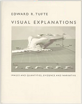
Title: Visual Explanations: Images and Quantities, Evidence and Narrative
ISBN: 0961392126
Despite the fact that both the book and its title look terribly dry, there are genuinely ingenious ideas inside.
The principle of parallel display of information is quite simple - it is much easier for a person to perceive data when they are presented side by side than if they were consistently following each other. It is very important to know and take into account when creating an interface because the main purpose of the software - the presentation of large amounts of data in a very limited size (screen, etc.) - often leads to a consistent display of information.
Consider, for example, modal dialog boxes — our faithful satellites since the window interface appeared. Answer a few simple questions:
If at least one of the questions you answered positively - you are a victim of a consistent presentation of information.
Here are some examples of this view:
In previous articles, the parallel display of information has already been used to more clearly show:
Design inefficiency
(in the article “Why is it so difficult to make a good user interface?” ):
Incorrect ratio of visual weight and importance of information.
(in the article “Good user interface, clarity and relevance of information” ):
Like using too many expressiveness control methods can lead to excessive visual noise.
(in the article “Good user interface, clarity and expressiveness” ):

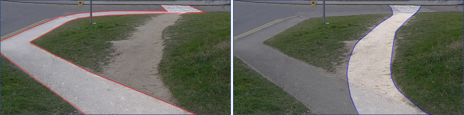
Let's compare the parallel and sequential display of information in order to understand their main differences.
Parallel display is more efficient due to the fact that information is perceived with the help of eyes, which can quickly and easily move forward and backward. All data is visible at the same time , the observer completely controls the speed and order of their perception. Sequential display can make it difficult for an observer to perceive it, because the information can be displayed too quickly or slowly , or because the sequence of its display will simply be inconvenient for it.
The previous paragraph is an example of sequential display of information .
Let's present the same information in parallel :
It should be noted that sometimes, when displaying information sequentially, we can control the speed of appearance and change of data using the Next and Back buttons in the setup wizard, scrolling when displaying text, etc. But you have to pay for this opportunity with additional unnecessary actions : clicking the mouse, pressing the keys, etc., which is less effective and less fast compared to simply changing the direction of gaze with parallel display.
Let's try to take a serial interface and turn it into a parallel one. For example, take modal dialog boxes and “smooth out” them so that all the necessary data and controls are available at the same time. It is very difficult to do, it is always necessary to carefully design the layout of the interface and select the really necessary information. Sometimes you need to create new, non-standard user interface elements. Consider a real example from the software world.
Suppose we need to create an interface that allows the user to swap the parameters in the method declaration. Using the traditional approach to creating an interface, you can create something like a Visual Studio 2008 dialog:
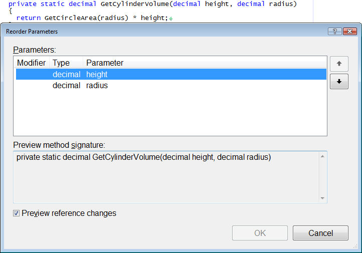
Consider the dialogue more closely, it has positive and negative sides. Advantages:
But there are also disadvantages:
Is there a way to preserve all the advantages of such an interface and smooth out the disadvantages? Can I completely get rid of the dialog box and retain the ability to preview changes? Of course yes. Here is what we do:
This interface might look like this:
On the one hand (purely positive), we got rid of the modal dialogue closing the code, and added an interactive reordering of the parameters without using the mouse (which gives an efficiency gain) without changing the usual way of presenting data (which has a positive effect on clarity).
On the other hand (and, oddly enough, it is also positive) the absence of the dialog box and the preservation of the familiar work environment does not lead to unexpected results, even when someone first encounters this functionality. By adding a hint with the key assignment and the name of the current operation, we help to understand what is happening and how it can be controlled.
Thus, “smoothing” the user interface may require effort, including the creation of new interaction concepts, but the costs are more than compensated for by increased efficiency and clarity.
Previous translations:
- Why is it so hard to make a good user interface?
- Good user interface, clarity and relevance of information
- Good user interface, clarity and expressiveness.
In the last article, we talked about how you can change the design in order to emphasize the importance of information. In this article we will discuss another, equally important way to achieve clarity - the parallel display of information .
This concept was first described in the amazing book by Edward Tufti :
')
Title: Visual Explanations: Images and Quantities, Evidence and Narrative
ISBN: 0961392126
Despite the fact that both the book and its title look terribly dry, there are genuinely ingenious ideas inside.
The principle of parallel display of information is quite simple - it is much easier for a person to perceive data when they are presented side by side than if they were consistently following each other. It is very important to know and take into account when creating an interface because the main purpose of the software - the presentation of large amounts of data in a very limited size (screen, etc.) - often leads to a consistent display of information.
Consider, for example, modal dialog boxes — our faithful satellites since the window interface appeared. Answer a few simple questions:
- Have you ever dragged a dialog box in order to see what was hidden by it?
- Have you ever pressed the “Cancel” button just to access the information hidden by the dialogue, for example, to copy something to the clipboard?
- Have you ever pressed the “Back” button in your browser in order to catch a glimpse of the previous page and immediately click “Next”?
- Have you ever scrolled the document up only to see the information necessary to understand what was currently displayed?
If at least one of the questions you answered positively - you are a victim of a consistent presentation of information.
Here are some examples of this view:
- podcasts
- PowerPoint presentations
- stacked modal dialogs
- setup wizards
- long paragraphs of text
In previous articles, the parallel display of information has already been used to more clearly show:
Design inefficiency
(in the article “Why is it so difficult to make a good user interface?” ):
Incorrect ratio of visual weight and importance of information.
(in the article “Good user interface, clarity and relevance of information” ):
Like using too many expressiveness control methods can lead to excessive visual noise.
(in the article “Good user interface, clarity and expressiveness” ):
Let's compare the parallel and sequential display of information in order to understand their main differences.
Parallel display is more efficient due to the fact that information is perceived with the help of eyes, which can quickly and easily move forward and backward. All data is visible at the same time , the observer completely controls the speed and order of their perception. Sequential display can make it difficult for an observer to perceive it, because the information can be displayed too quickly or slowly , or because the sequence of its display will simply be inconvenient for it.
The previous paragraph is an example of sequential display of information .
Let's present the same information in parallel :
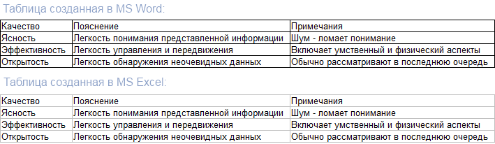
| Opportunities | Consistent | Parallel |
| Feed rate control | Not | Yes |
| Management of information order | Not | Yes |
| Simultaneous viewing of information | Not | Yes |
It should be noted that sometimes, when displaying information sequentially, we can control the speed of appearance and change of data using the Next and Back buttons in the setup wizard, scrolling when displaying text, etc. But you have to pay for this opportunity with additional unnecessary actions : clicking the mouse, pressing the keys, etc., which is less effective and less fast compared to simply changing the direction of gaze with parallel display.
Let's try to take a serial interface and turn it into a parallel one. For example, take modal dialog boxes and “smooth out” them so that all the necessary data and controls are available at the same time. It is very difficult to do, it is always necessary to carefully design the layout of the interface and select the really necessary information. Sometimes you need to create new, non-standard user interface elements. Consider a real example from the software world.
Suppose we need to create an interface that allows the user to swap the parameters in the method declaration. Using the traditional approach to creating an interface, you can create something like a Visual Studio 2008 dialog:
Consider the dialogue more closely, it has positive and negative sides. Advantages:
- The dialogue is located under the body of the method, the signature of which is to be changed, at the same time we see both the method code and the dialog itself. This is a parallel mapping.
- You can preview the changes before applying them. This is also a parallel display.
But there are also disadvantages:
- The dialogue still closes a significant portion of the code in the document. When you can see only a portion of the available information, this is a sequential display.
- The way user and application interact . The user worked with the source code using the keyboard - he changed it directly, and here he has to combine the use of several controls (grids, buttons, checkboxes) and mouse clicks in order to change the code. It slows down speed and reduces efficiency.
Is there a way to preserve all the advantages of such an interface and smooth out the disadvantages? Can I completely get rid of the dialog box and retain the ability to preview changes? Of course yes. Here is what we do:
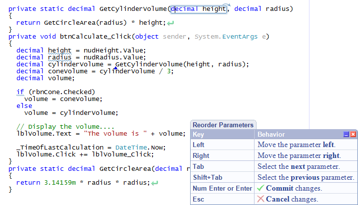
- We will transfer controls to the same interface level with which the interaction takes place - to the source code level.
- Add the ability to interactively change the order of parameters that can be controlled using the keyboard, without using unnecessary controls.
This interface might look like this:
On the one hand (purely positive), we got rid of the modal dialogue closing the code, and added an interactive reordering of the parameters without using the mouse (which gives an efficiency gain) without changing the usual way of presenting data (which has a positive effect on clarity).
On the other hand (and, oddly enough, it is also positive) the absence of the dialog box and the preservation of the familiar work environment does not lead to unexpected results, even when someone first encounters this functionality. By adding a hint with the key assignment and the name of the current operation, we help to understand what is happening and how it can be controlled.
Thus, “smoothing” the user interface may require effort, including the creation of new interaction concepts, but the costs are more than compensated for by increased efficiency and clarity.
Source: https://habr.com/ru/post/106866/
All Articles