Good user interface, clarity and expressiveness.
Another translation of the article by Mark Miller:
Great User Interfaces, Clarity, and Emphasis
Previous translations:
In the previous article, we made an important conclusion to achieve clarity in the user interface:
The visual weight must match the importance of the information .
')
The essence of this conclusion - do not neglect the importance of information, choosing the methods of its display. Discussing here the ways to control expressiveness, it should be remembered that our goal is to get an easy and elegant interface, to express in it what Edward Tafty calls the “least effective difference” . (From the translator: in Russian you can read here and here ).
Taffy himself explains it this way - “ It’s necessary to make visual distinctions as imperceptible as possible, for which, however, the difference will be perfectly clear.
Contrast
The easiest and most powerful way to control expressiveness is to use contrast . Below is another screenshot of Adobe Lightroom:
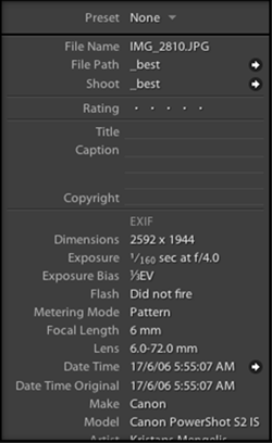
Notice that the less important explanatory text on the left is a little less contrast than the more important data on the right.
Saturation
Color can convey value, especially when used rarely. In a sea of mostly black and white data, highly saturated information will be very prominent.
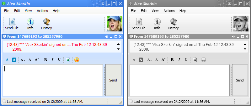
In Trillian, an instant messaging program, there is a very interesting opportunity - displaying non-focused windows with semi-significant or with shades of gray. In the example below, the left window is active, and the right one lost input focus:
Transparency
Transparency is closely related to saturation and contrast. As the transparency of graphic elements increases, their contrast and saturation will drop. Transparency can be used to point to partially available items.
Below are two screenshots from Visual Studio loaded with Refactor! Pro . The red arrow explains which command (in this case, refactoring) has just been executed. The arrow on the left screenshot is completely opaque, strongly distracts attention, it is difficult to ignore. But the arrow on the right is translucent, its appearance is much easier to ignore, but, if necessary, the text that it contains is easy to read.
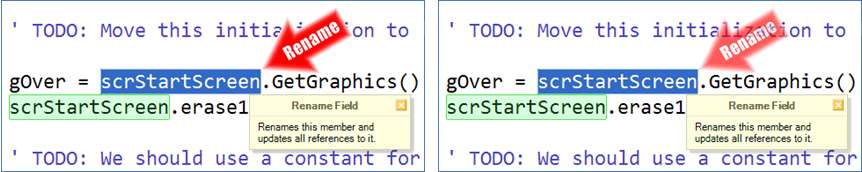
When we first started releasing Refactor! Pro shooters were completely opaque and we received many complaints from users that shooters were too distracting them. By the next release, we made the arrows transparent and the number of complaints dropped to almost zero, although we still received several emails that said that such alerts were useless. Thus, controlling transparency, we can take a distracting interface element that contains useful (but perhaps rarely necessary) information and turn it into something useful that will be intuitively perceived properly.
Font
Using boldface, you can draw attention to the basic meaning of something, as it is done in the Microsoft Word tooltip, which explains the purpose of the Change Case command.

Below is a screenshot of several checkboxes - pay attention to how quickly you can find the desired control by just a quick look at the description.
The ability to focus on parts of the control text is very important for creating a good interface, and this task can be solved with the help of DevExpress controls .
Size matters
Changing the font size can be quite useful for bringing a look to something. You can combine the increased text size with reduced contrast to bring the view to more important data, as done on the Recent Files feature of the DXCore settings page:
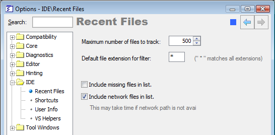
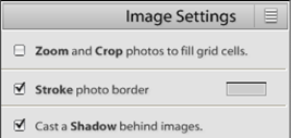
The header of the “Recent files” settings page is displayed using a larger font size, which allows novice users to notice it more easily. However, the contrast between the title and the background is small, which allows users who see this page not for the first time to ignore the title and go directly to the controls. Another example of using this approach is the text “Image settings” in the screenshot of the “Font” section above.
Conclusion
The essence of clarity, in terms of expressiveness and design, is to selectively use only a few (usually one in general) of the following ways to emphasize the importance of information :
I did not mention the font in the number of ways, since in some way the font is a variety of size. It is necessary to avoid creating both an interface displaying less important data with high contrast, and such strict (to the point of absurdity) following the rules outlined in this article, when your interface reminds you of a ransom letter.

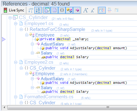
Let's present a tree list containing some information, in which each node of the tree contains data that differ in importance from the data in its ancestors and descendants. Following the approaches outlined in the article, for each level of nesting should be selected its own contrast and font size. An illustration of this approach can be seen in one of the CodeRush modules, which displays all references to a character (of the decimal type in this example):
The main problem in the implementation of this approach is that, by overly separating information by levels of importance and applying its own type of expressiveness for each level (clear and understandable by itself), you can easily get visual noise that will interfere with easy, intuitive perception of information. Therefore, along with the fact that it is necessary to take into account the level of importance of information when choosing how to display it,
it is equally important not to overdo it and not to generate too many levels, which may introduce unnecessary noise into the interface.
Great User Interfaces, Clarity, and Emphasis
Previous translations:
- Why is it so hard to make a good user interface?
- Good user interface, clarity and relevance of information
In the previous article, we made an important conclusion to achieve clarity in the user interface:
The visual weight must match the importance of the information .
')
The essence of this conclusion - do not neglect the importance of information, choosing the methods of its display. Discussing here the ways to control expressiveness, it should be remembered that our goal is to get an easy and elegant interface, to express in it what Edward Tafty calls the “least effective difference” . (From the translator: in Russian you can read here and here ).
Taffy himself explains it this way - “ It’s necessary to make visual distinctions as imperceptible as possible, for which, however, the difference will be perfectly clear.
Contrast
The easiest and most powerful way to control expressiveness is to use contrast . Below is another screenshot of Adobe Lightroom:
Notice that the less important explanatory text on the left is a little less contrast than the more important data on the right.
Saturation
Color can convey value, especially when used rarely. In a sea of mostly black and white data, highly saturated information will be very prominent.
In Trillian, an instant messaging program, there is a very interesting opportunity - displaying non-focused windows with semi-significant or with shades of gray. In the example below, the left window is active, and the right one lost input focus:
Transparency
Transparency is closely related to saturation and contrast. As the transparency of graphic elements increases, their contrast and saturation will drop. Transparency can be used to point to partially available items.
Below are two screenshots from Visual Studio loaded with Refactor! Pro . The red arrow explains which command (in this case, refactoring) has just been executed. The arrow on the left screenshot is completely opaque, strongly distracts attention, it is difficult to ignore. But the arrow on the right is translucent, its appearance is much easier to ignore, but, if necessary, the text that it contains is easy to read.
When we first started releasing Refactor! Pro shooters were completely opaque and we received many complaints from users that shooters were too distracting them. By the next release, we made the arrows transparent and the number of complaints dropped to almost zero, although we still received several emails that said that such alerts were useless. Thus, controlling transparency, we can take a distracting interface element that contains useful (but perhaps rarely necessary) information and turn it into something useful that will be intuitively perceived properly.
Font
Using boldface, you can draw attention to the basic meaning of something, as it is done in the Microsoft Word tooltip, which explains the purpose of the Change Case command.
Below is a screenshot of several checkboxes - pay attention to how quickly you can find the desired control by just a quick look at the description.
The ability to focus on parts of the control text is very important for creating a good interface, and this task can be solved with the help of DevExpress controls .
Size matters
Changing the font size can be quite useful for bringing a look to something. You can combine the increased text size with reduced contrast to bring the view to more important data, as done on the Recent Files feature of the DXCore settings page:
The header of the “Recent files” settings page is displayed using a larger font size, which allows novice users to notice it more easily. However, the contrast between the title and the background is small, which allows users who see this page not for the first time to ignore the title and go directly to the controls. Another example of using this approach is the text “Image settings” in the screenshot of the “Font” section above.
Conclusion
The essence of clarity, in terms of expressiveness and design, is to selectively use only a few (usually one in general) of the following ways to emphasize the importance of information :
- contrast
- saturation
- transparency
- the size
I did not mention the font in the number of ways, since in some way the font is a variety of size. It is necessary to avoid creating both an interface displaying less important data with high contrast, and such strict (to the point of absurdity) following the rules outlined in this article, when your interface reminds you of a ransom letter.
Let's present a tree list containing some information, in which each node of the tree contains data that differ in importance from the data in its ancestors and descendants. Following the approaches outlined in the article, for each level of nesting should be selected its own contrast and font size. An illustration of this approach can be seen in one of the CodeRush modules, which displays all references to a character (of the decimal type in this example):
The main problem in the implementation of this approach is that, by overly separating information by levels of importance and applying its own type of expressiveness for each level (clear and understandable by itself), you can easily get visual noise that will interfere with easy, intuitive perception of information. Therefore, along with the fact that it is necessary to take into account the level of importance of information when choosing how to display it,
it is equally important not to overdo it and not to generate too many levels, which may introduce unnecessary noise into the interface.
Source: https://habr.com/ru/post/106862/
All Articles