Good user interface, clarity and relevance of information
Translation of the article by Mark Miller: Great UI, Clarity, and Information Relevance
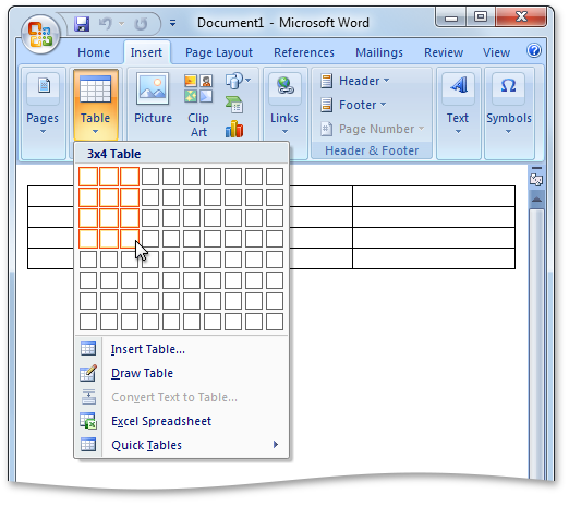
Let's create a 3x4 table in MS Word:
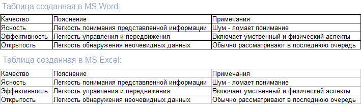
Now fill the table with data:

')
Let's stop and ask ourselves the question: “What is wrong here?”
Before answering it, it is worth noting that in the table above there are a number of graphic elements that work together to transmit information. Data is displayed as text:

And the lines separating the data:

Note that in Word, both the lines separating the data and the data itself are shown with almost the same width . The thickness of the line corresponds to the thickness of the strokes used to display the text, and the contrast of the lines also corresponds to the contrast of the text.
However, the lines and data in this case are not at all equal in terms of the attitude towards the viewer. The viewer is much more interested in the data, and not in the lines separating them.
Let's look at the same spreadsheet in Excel:

Notice that something interesting happened when creating the same table in Excel. The lines are less contrasting than the data itself.
Which table do you find easier to read?
Let's create the opposite Excel version of this table. Namely, reduce the visual weight of the data and increase the visual weight of the least important dividing lines:

How much easier is it to read this table compared to the Microsoft Excel table above?
So, we note two important points:
Realizing these two points, we can draw another conclusion, perhaps the most important for achieving clarity in the user interface:
Visual weight must be relevant information.
This rule is crucial , easy to follow and yet often violated. My point of view, which I presented in the previous article , is that the constant violation of this rule can be explained by the lack of preparation.
Here’s what Visual Basic code looks like in Visual Studio 2008:
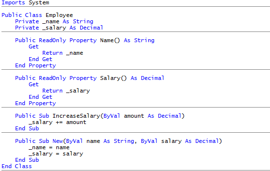
Horizontal lines carry little information. And even despite the fact that they are displayed on top and in gray, their contrast and corresponding visual weight far exceed their purpose.
Here is the same picture with one small change:
Now it is much easier to see the necessary data.
Consider a screenshot from Adobe Lightroom:
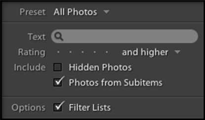
Note that the text on the left is less significant than the data on the right, and is displayed with less contrast, allowing your eyes to quickly find the information you need.
In future articles, we will focus on ways to control expressiveness and consider the concept of interface clarity in more detail.
Let's create a 3x4 table in MS Word:
Now fill the table with data:
')
Let's stop and ask ourselves the question: “What is wrong here?”
Before answering it, it is worth noting that in the table above there are a number of graphic elements that work together to transmit information. Data is displayed as text:
And the lines separating the data:
Note that in Word, both the lines separating the data and the data itself are shown with almost the same width . The thickness of the line corresponds to the thickness of the strokes used to display the text, and the contrast of the lines also corresponds to the contrast of the text.
However, the lines and data in this case are not at all equal in terms of the attitude towards the viewer. The viewer is much more interested in the data, and not in the lines separating them.
Let's look at the same spreadsheet in Excel:
Notice that something interesting happened when creating the same table in Excel. The lines are less contrasting than the data itself.
Which table do you find easier to read?
Let's create the opposite Excel version of this table. Namely, reduce the visual weight of the data and increase the visual weight of the least important dividing lines:
How much easier is it to read this table compared to the Microsoft Excel table above?
So, we note two important points:
- Not all information is equally relevant to the viewer.
- We control the expressiveness of information.
Realizing these two points, we can draw another conclusion, perhaps the most important for achieving clarity in the user interface:
Visual weight must be relevant information.
This rule is crucial , easy to follow and yet often violated. My point of view, which I presented in the previous article , is that the constant violation of this rule can be explained by the lack of preparation.
Here’s what Visual Basic code looks like in Visual Studio 2008:
Horizontal lines carry little information. And even despite the fact that they are displayed on top and in gray, their contrast and corresponding visual weight far exceed their purpose.
Here is the same picture with one small change:
Now it is much easier to see the necessary data.
Consider a screenshot from Adobe Lightroom:
Note that the text on the left is less significant than the data on the right, and is displayed with less contrast, allowing your eyes to quickly find the information you need.
In future articles, we will focus on ways to control expressiveness and consider the concept of interface clarity in more detail.
Source: https://habr.com/ru/post/106414/
All Articles