A conceptual approach to presenting information in online stores. Part 1
Greetings to you, Habra community. So, what will be discussed in the post. Many of you may mistakenly conclude that the post will be about design, usability and the like. But! Speech in the post will go exactly about how and what information to present to potential buyers. On the conceptual approach to online shopping.
The post came out is not at all small! A lot of text, requires reflection, and, perhaps (as I always get), difficult to understand. But I do not want to break the whole post into 2-3-4 parts. It is better to spend time and read everything at once, then it will be clearer. Especially since, nevertheless, the topic was planned for 3 posts. This is the 1st and all 3 will be great.
Footnote: I apologize for the complex style of presentation, and possibly spelling errors !!! You need to understand that everything is fictional and everything is just an idea, but it is based on my personal experience in e-commerce. Maybe this is a look into the future, maybe not. This is a concept, and I ask the commentators to be aware of this. Also note that I didn’t try at all with a little tweaking of design refinement (especially icons) unfortunately there’s no time for that.
In May of this year, I started practicing e-commerce development consulting services. I found people who were somehow interested and advised them. Developed a scheme for the design of online stores, e-commerce models (advertising campaign, development, additional services, etc ..) During this time I came to some interesting conclusions and got tremendous experience in combat conditions. On the basis of all this, I drew some conclusions, and several ideas emerged in my head that I want to share. The fact is that I partially implemented these ideas for my clients. But not fully, and this will be a completely different post and later.
')
So, what ideas do I pursue? Submission of information: 1) methods of withdrawal of goods; 2) a clear and understandable state of the goods (warehouse, stock, ...); 3) ease of sorting; 4) user-customizable display of product groups; 5) the use of elements of infographics (to simplify the perception of information: charts, diagrams, icons, etc.); 6) grouping similar goods; 7) basket display mechanism. And, of course, the basic idea: each group of goods has its own information feed! And partly UserInterfaceControl (maybe I’m wrong, but I’ve already seen it somewhere). The bottom line is that the user can determine for himself what he wants to see.
So. There is a shop.
On the example of the 1st, I will show the main idea, on the example of the 2nd, I will show only that moment, that for different products there are nuances of presenting information
The simplest, it would seem at first glance, the type of online stores. I agree, their dime a dozen. But it is by his example that the easiest way to show what I mean. Although the rest of the stores are no less relevant.
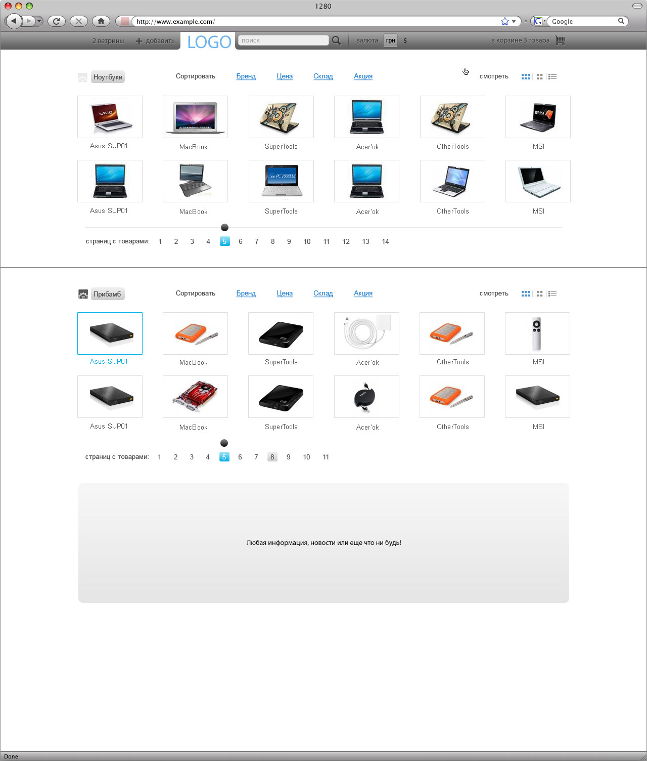
So, the main page output products. What is important is the possibility of simple and clear sorting and display of goods. Also an opportunity to choose what exactly interests (group of goods).
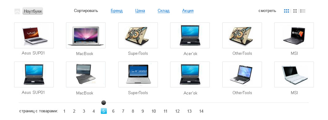
There is a block, it has three main zones: navigation, content, listing (paging). Let's take them apart.
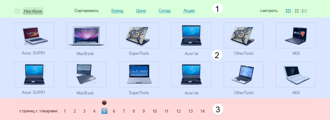
1 - Navigation panel. It can be immediately divided into 3 parts: product group, sorting, output / display method.
Product group: the user can determine what he needs. For example, he wants only laptops, laptops and batteries or something else to be displayed in this block.

Product group: this screen shows that the “Laptops” group is selected, and a barely visible icon next to it (well, I didn’t think of anything except to put this particular icon :)) What is it for? To select a product group displayed in this block.

Sorting. Again, the user has a choice, and quite convenient. Well, the links “Warehouse” and “Action”, I think, are understandable, and without popups ... although “Promotions” can also be divided according to the type ... But this is really not necessary.
Moreover, if the site has ad units like the same outlet ...
... why not give the user the opportunity to choose the subject of ad units? For example, leave one block uncontrollable, the second with the possibility of changing the subject. Just a big block (where there are a lot of pictures in turn) I would give a choice of user.
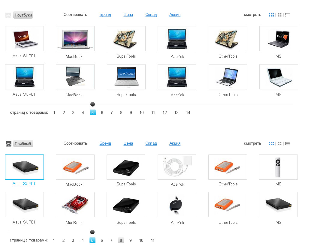
2 - Content in the block. As you can see, there are 3 types of display, 1st and 2nd - the same thing in essence, they differ only in the size of items (goods) for convenience. Let's look at them.
Conclusion cubes (I do not even know how to call it correctly):
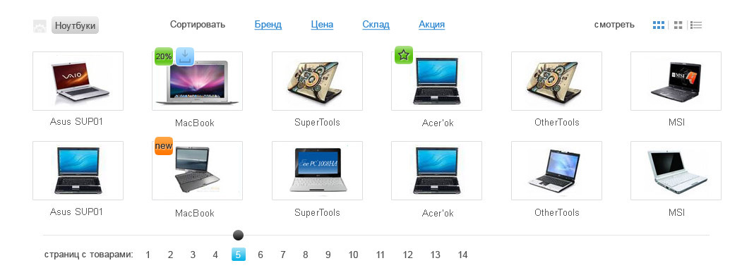
Small icons on the product, indicating additional options - whether it is a stock, or whether it is not in stock. Or the fact that they are sales leaders, or something else. In fact, this is the lion's share of work for a competent designer. + The “Help” section is appropriate on the pages of the online store. You can make them not small, whatever.
When you click on the product, we see the following: important details of the product and, again, the icons ... icons ... icons ...
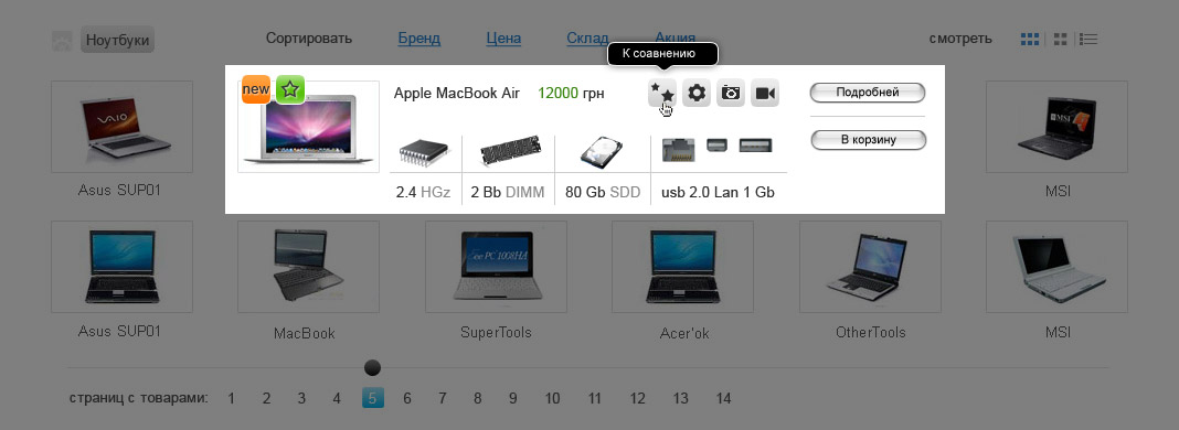
By the way, I can’t help but smack, damn it, it looks disgusting when the price on the site is highlighted with a _red_ (frightening) color!
4 gray icons suggest quick access to view a particular product information. For example, where the gear - those. Description, photo-icon - respectively, photo. Video ... Strange, but I still do not understand why there are no videos on the sites? In our time, "the most that" to use video content! Whatever you sell! A good example of the presentation of information from Dorokhov , namely here ! Video spurs quite well to the purchase. In addition, the video gives a sickly idea of proportions and partially replaces the need for tactile sensations, and everyone who has ever sold something knows how important it is!
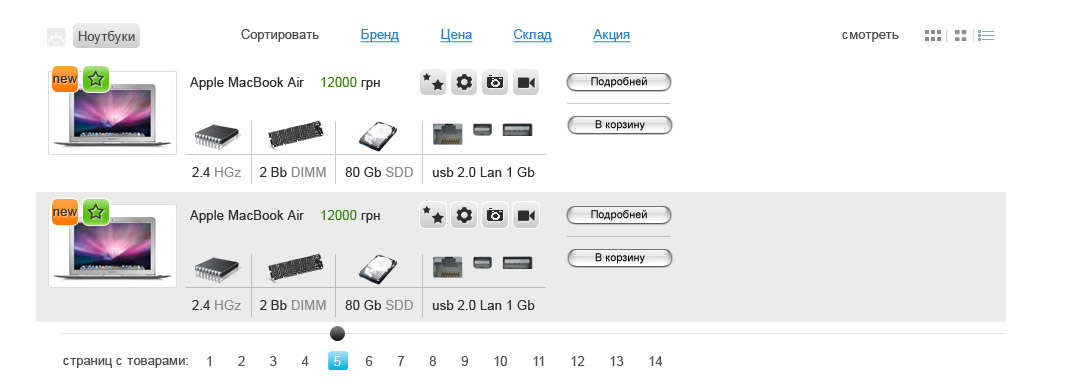
But back to our store. The third output of goods is a tabular output. I used the same layout as when clicking on the product in the previous version.
3 - Also important is the fact that I was thinking about the concept of an e-store design that does not have browser scrolls. That is, stupid in the browser window. But then I dropped this idea, but one of the elements remained, and you most likely noticed it, but did not understand why it is needed. This is a listing (paging) of pages with goods. He is needed for one simple reason. There are a lot of goods, and they need to be flipped, but how much I was interested in, I asked each friend, many customers in online stores, watched my acquaintances ... Vertical list - people involuntarily do not pay attention to the bottom positions. Still, it is better to list the goods fit in the field of view. But again, this is not 100% verified, just observations, and too few people (the number of observations of their behavior) for normal statistics.
But paging is still needed, because on the main page of the site you can place not 1, but 2, or 3-4 blocks.
That's how I see it. :) But there is also a cunning plan in this, which I will reveal later when we come to the analysis of the main page and the basket. And now - view product units.
View of a single unit is a very interesting thing. The fact is that if this is a kind of petty stuff, for example, an HDMI to VGA adapter, then, of course, absolutely nothing needs to be invented. Gallery photos? What for? That is, everything is simple: the output of one photo, description and price. There’s really nothing to illustrate ... But the conclusion, for example, is a unit of a laptop ... Then there’s nothing to do, but I want to think how and what.
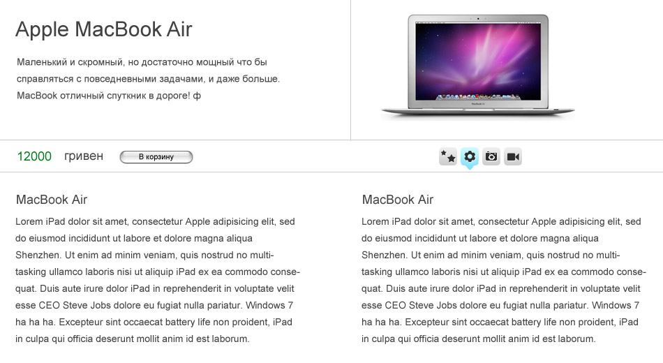
In fact, everything is quite prosaic and everything is solved at the designer’s level. It's simple. There is a photo of the goods, there is a small (!) Marketing description, and below them is a mini panel. Price, “to cart” and icons: you can replace them with tabs, and anything. All that a person needs is immediately. Want to dig deeper? Please, have icons / tabs, study. But ... There is one more thing.
Promotional information is quite an important thing, as it is an additional sales incentive. And it would be quite competent in this case to put up, above all else.
But I had the idea to express the action differently. Add a bag without a price or with a price of 0 hryvnia, as a gift to the product.

Well, now you can see the layout of the main page or a little more about the interface of the store.
As you can see, on the top panel on the right there is an opportunity to add storefronts, blocks with content. That's exactly why I needed paging in this concept, although, again, everything is relative. Because as users it may not be necessary, and maybe simply is not so important ... In any case, it is possible to add them.
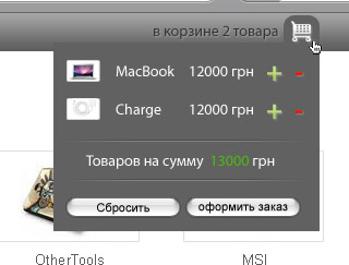
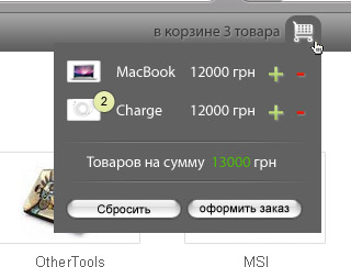
And now a little about the basket. The fact is that I can not understand how it is, why in the baskets of online stores, and without exception, a simple construction of the recalculation is used?
Think about it yourself, why? Given the specifics of the product, for example, we take professional cameras or laptops. This is quite an expensive technique. Well, to whom, having entered the order in the basket, will it suddenly occur to order 5-10 laptops? Yes, no one! I am sure of all 100, as I worked in sales. And the corporate sector always negotiates live when it comes to large numbers. But! Someone will surely argue, they say, even if they do not use it, but the opportunity should be! And I agree with that, but, again ... No one will buy 10 laptops, or 5 expensive pro-cameras! Do you understand what I mean?
What do I suggest in contrast to this? Everything is simple ... "+" - yes, the usual plus sign. Next, I will illustrate this when considering a basket.
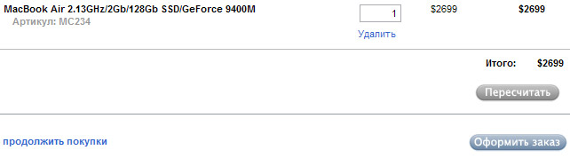
Basket. I honestly do not understand why making a separate page for the basket. Combined version: I would understand if there are more goods in the basket, for example, 10 - then go to a separate page. But, again, I rarely met this, I work in online stores and with online stores.
As you can see, everything is quite simple, "+" - add the same product, "-" delete. And the user can add any number of such products. Just appear near the product a small quantity designation.
So it's as if simple enough, and at the same time, everything you need is there. But I deliberately kept silent about one detail ... At the beginning of the post I spoke about the way in which information was presented, that each product has its own nuances of withdrawal. Here I am wondering, did anyone have a question about the withdrawal of goods in cubes, when pressed, and in tabular form? :)
And the essence of something in general is this. I repeat: each type of goods has its own nuances of withdrawal. Notice, I chose the laptop shop.
And what do we see in this illustration?
As for me, we see a rather gross marketing mistake. Why? Again, the nuances of the specifics of the product. This is a notebook store. What is important to know the buyer, even if he himself is not very interested in this, but what can he catch? From experience I will say that the survivability of the battery seriously catches. And in the block in the illustration above there is data about the processor, memory, hard disk and connectors. Yes, they also pay attention to this, but the battery and screen size are still champions as selection criteria. Anyway. Therefore, a more acceptable form would be:
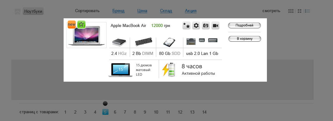
Agree, it immediately catches the eye and it really needs a laptop buyer. This is one of the most important details when choosing a laptop - the battery.
Already heard from SEOs that a lot of Ajax, etc. it's bad, I heard a lot of skepticism about the fact that such a megazatratno in development, etc. But! First, it is not. And secondly, I ask you once again to take into account that this is only my thoughts so far, but in part they have all already been implemented in the work. And where I noticed an increase in conversion, I began to think about this concept in general.
As you probably noticed, I paid little attention to a separate page output unit. But it is not. In the next post on the example of the notebook page, camera page, I will tell you how to arrange the output of information in a more convenient way, and also on these examples I will tell how you can use infographics and why I generally recommend using it.
Also in the next post we will discuss another important moment for online stores: the product comparison page. Because I have not yet met the normal mechanism for comparing products and would like to share my ideas on this matter.
Product Comparison Page
Product Page - Laptop
Product Page - Camera
Unless of course it is interesting to you!
The post came out is not at all small! A lot of text, requires reflection, and, perhaps (as I always get), difficult to understand. But I do not want to break the whole post into 2-3-4 parts. It is better to spend time and read everything at once, then it will be clearer. Especially since, nevertheless, the topic was planned for 3 posts. This is the 1st and all 3 will be great.
Footnote: I apologize for the complex style of presentation, and possibly spelling errors !!! You need to understand that everything is fictional and everything is just an idea, but it is based on my personal experience in e-commerce. Maybe this is a look into the future, maybe not. This is a concept, and I ask the commentators to be aware of this. Also note that I didn’t try at all with a little tweaking of design refinement (especially icons) unfortunately there’s no time for that.
Foreword
In May of this year, I started practicing e-commerce development consulting services. I found people who were somehow interested and advised them. Developed a scheme for the design of online stores, e-commerce models (advertising campaign, development, additional services, etc ..) During this time I came to some interesting conclusions and got tremendous experience in combat conditions. On the basis of all this, I drew some conclusions, and several ideas emerged in my head that I want to share. The fact is that I partially implemented these ideas for my clients. But not fully, and this will be a completely different post and later.
')
So, what ideas do I pursue? Submission of information: 1) methods of withdrawal of goods; 2) a clear and understandable state of the goods (warehouse, stock, ...); 3) ease of sorting; 4) user-customizable display of product groups; 5) the use of elements of infographics (to simplify the perception of information: charts, diagrams, icons, etc.); 6) grouping similar goods; 7) basket display mechanism. And, of course, the basic idea: each group of goods has its own information feed! And partly UserInterfaceControl (maybe I’m wrong, but I’ve already seen it somewhere). The bottom line is that the user can determine for himself what he wants to see.
Input data
So. There is a shop.
- Laptops
Assortment:Laptops, Accessories
On the example of the 1st, I will show the main idea, on the example of the 2nd, I will show only that moment, that for different products there are nuances of presenting information
Laptops
The simplest, it would seem at first glance, the type of online stores. I agree, their dime a dozen. But it is by his example that the easiest way to show what I mean. Although the rest of the stores are no less relevant.
So, the main page output products. What is important is the possibility of simple and clear sorting and display of goods. Also an opportunity to choose what exactly interests (group of goods).
There is a block, it has three main zones: navigation, content, listing (paging). Let's take them apart.
1 - Navigation panel. It can be immediately divided into 3 parts: product group, sorting, output / display method.
Product group: the user can determine what he needs. For example, he wants only laptops, laptops and batteries or something else to be displayed in this block.
Product group: this screen shows that the “Laptops” group is selected, and a barely visible icon next to it (well, I didn’t think of anything except to put this particular icon :)) What is it for? To select a product group displayed in this block.
Sorting. Again, the user has a choice, and quite convenient. Well, the links “Warehouse” and “Action”, I think, are understandable, and without popups ... although “Promotions” can also be divided according to the type ... But this is really not necessary.
Moreover, if the site has ad units like the same outlet ...
... why not give the user the opportunity to choose the subject of ad units? For example, leave one block uncontrollable, the second with the possibility of changing the subject. Just a big block (where there are a lot of pictures in turn) I would give a choice of user.
2 - Content in the block. As you can see, there are 3 types of display, 1st and 2nd - the same thing in essence, they differ only in the size of items (goods) for convenience. Let's look at them.
Conclusion cubes (I do not even know how to call it correctly):
Small icons on the product, indicating additional options - whether it is a stock, or whether it is not in stock. Or the fact that they are sales leaders, or something else. In fact, this is the lion's share of work for a competent designer. + The “Help” section is appropriate on the pages of the online store. You can make them not small, whatever.
When you click on the product, we see the following: important details of the product and, again, the icons ... icons ... icons ...
By the way, I can’t help but smack, damn it, it looks disgusting when the price on the site is highlighted with a _red_ (frightening) color!
4 gray icons suggest quick access to view a particular product information. For example, where the gear - those. Description, photo-icon - respectively, photo. Video ... Strange, but I still do not understand why there are no videos on the sites? In our time, "the most that" to use video content! Whatever you sell! A good example of the presentation of information from Dorokhov , namely here ! Video spurs quite well to the purchase. In addition, the video gives a sickly idea of proportions and partially replaces the need for tactile sensations, and everyone who has ever sold something knows how important it is!
But back to our store. The third output of goods is a tabular output. I used the same layout as when clicking on the product in the previous version.
3 - Also important is the fact that I was thinking about the concept of an e-store design that does not have browser scrolls. That is, stupid in the browser window. But then I dropped this idea, but one of the elements remained, and you most likely noticed it, but did not understand why it is needed. This is a listing (paging) of pages with goods. He is needed for one simple reason. There are a lot of goods, and they need to be flipped, but how much I was interested in, I asked each friend, many customers in online stores, watched my acquaintances ... Vertical list - people involuntarily do not pay attention to the bottom positions. Still, it is better to list the goods fit in the field of view. But again, this is not 100% verified, just observations, and too few people (the number of observations of their behavior) for normal statistics.
But paging is still needed, because on the main page of the site you can place not 1, but 2, or 3-4 blocks.
That's how I see it. :) But there is also a cunning plan in this, which I will reveal later when we come to the analysis of the main page and the basket. And now - view product units.
View of a single unit is a very interesting thing. The fact is that if this is a kind of petty stuff, for example, an HDMI to VGA adapter, then, of course, absolutely nothing needs to be invented. Gallery photos? What for? That is, everything is simple: the output of one photo, description and price. There’s really nothing to illustrate ... But the conclusion, for example, is a unit of a laptop ... Then there’s nothing to do, but I want to think how and what.
In fact, everything is quite prosaic and everything is solved at the designer’s level. It's simple. There is a photo of the goods, there is a small (!) Marketing description, and below them is a mini panel. Price, “to cart” and icons: you can replace them with tabs, and anything. All that a person needs is immediately. Want to dig deeper? Please, have icons / tabs, study. But ... There is one more thing.
Promotional information is quite an important thing, as it is an additional sales incentive. And it would be quite competent in this case to put up, above all else.
But I had the idea to express the action differently. Add a bag without a price or with a price of 0 hryvnia, as a gift to the product.
Well, now you can see the layout of the main page or a little more about the interface of the store.
As you can see, on the top panel on the right there is an opportunity to add storefronts, blocks with content. That's exactly why I needed paging in this concept, although, again, everything is relative. Because as users it may not be necessary, and maybe simply is not so important ... In any case, it is possible to add them.
And now a little about the basket. The fact is that I can not understand how it is, why in the baskets of online stores, and without exception, a simple construction of the recalculation is used?
Think about it yourself, why? Given the specifics of the product, for example, we take professional cameras or laptops. This is quite an expensive technique. Well, to whom, having entered the order in the basket, will it suddenly occur to order 5-10 laptops? Yes, no one! I am sure of all 100, as I worked in sales. And the corporate sector always negotiates live when it comes to large numbers. But! Someone will surely argue, they say, even if they do not use it, but the opportunity should be! And I agree with that, but, again ... No one will buy 10 laptops, or 5 expensive pro-cameras! Do you understand what I mean?
What do I suggest in contrast to this? Everything is simple ... "+" - yes, the usual plus sign. Next, I will illustrate this when considering a basket.
Basket. I honestly do not understand why making a separate page for the basket. Combined version: I would understand if there are more goods in the basket, for example, 10 - then go to a separate page. But, again, I rarely met this, I work in online stores and with online stores.
As you can see, everything is quite simple, "+" - add the same product, "-" delete. And the user can add any number of such products. Just appear near the product a small quantity designation.
So it's as if simple enough, and at the same time, everything you need is there. But I deliberately kept silent about one detail ... At the beginning of the post I spoke about the way in which information was presented, that each product has its own nuances of withdrawal. Here I am wondering, did anyone have a question about the withdrawal of goods in cubes, when pressed, and in tabular form? :)
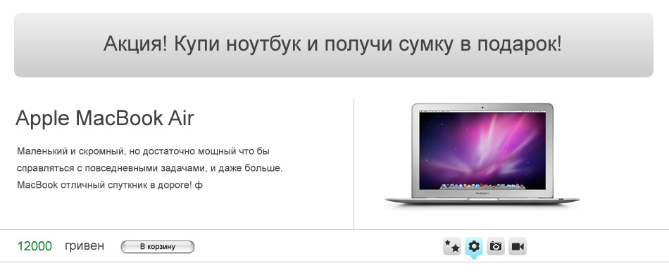
And the essence of something in general is this. I repeat: each type of goods has its own nuances of withdrawal. Notice, I chose the laptop shop.
And what do we see in this illustration?
As for me, we see a rather gross marketing mistake. Why? Again, the nuances of the specifics of the product. This is a notebook store. What is important to know the buyer, even if he himself is not very interested in this, but what can he catch? From experience I will say that the survivability of the battery seriously catches. And in the block in the illustration above there is data about the processor, memory, hard disk and connectors. Yes, they also pay attention to this, but the battery and screen size are still champions as selection criteria. Anyway. Therefore, a more acceptable form would be:
Agree, it immediately catches the eye and it really needs a laptop buyer. This is one of the most important details when choosing a laptop - the battery.
Afterword
Already heard from SEOs that a lot of Ajax, etc. it's bad, I heard a lot of skepticism about the fact that such a megazatratno in development, etc. But! First, it is not. And secondly, I ask you once again to take into account that this is only my thoughts so far, but in part they have all already been implemented in the work. And where I noticed an increase in conversion, I began to think about this concept in general.
As you probably noticed, I paid little attention to a separate page output unit. But it is not. In the next post on the example of the notebook page, camera page, I will tell you how to arrange the output of information in a more convenient way, and also on these examples I will tell how you can use infographics and why I generally recommend using it.
Also in the next post we will discuss another important moment for online stores: the product comparison page. Because I have not yet met the normal mechanism for comparing products and would like to share my ideas on this matter.
Announcement
Product Comparison Page
Product Page - Laptop
Product Page - Camera
Unless of course it is interesting to you!
Source: https://habr.com/ru/post/105831/
All Articles