Why is it so hard to make a good user interface?
Mark Miller's article translation: Why is Great UI so hard to achieve?
This morning, when I refueled my car with gasoline, I was suddenly struck by another proof that most user interfaces do not satisfy the three main indicators of a good interface: clarity , efficiency (efficiency) and openness (discoverability).
One of the most common mistakes that occurs in the physical world around us is the buttons located on the devices as if they would be pressed with the same frequency . This can be determined immediately - such buttons have the same size, and in some cases the buttons that need to be pressed more often than others are the smallest and located in hard-to-reach places.
')
Returning to the buttons, here is part of the interface that I watched today at the gas station:
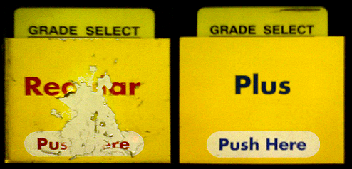
On the left is the fuel pump button, which allows you to choose the most popular grade of gasoline in the United States. On the right is a button for selecting a less popular and more expensive type of gasoline. Erosion on the left can be viewed as an indicator of the frequency and location of a button click. It is clear that people who pressed the button on the left would like to see it larger than the area “Push Here” offered by it.
Let's change this interface, but at the same time save its essence:
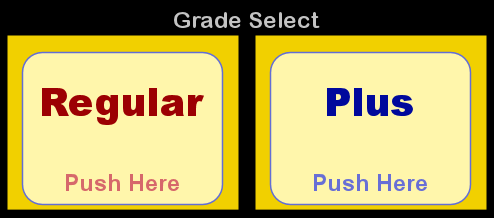
Here is a list of changes (we will explain the reasons for such changes in future articles):
Thus, we have clear evidence that some buttons are pressed more often than others. At the same time, we can conclude that the creators of this interface were hardly aware of this fact.
One of my all-time favorite big buttons is the spacebar on modern computer keyboards. Of course, the position and size of this key originates from the time of vintage typewriters . Unfortunately, the QWERTY configuration, which now prevails, is far from perfect because the most frequently used keys are located in hard- to -reach places on the keyboard. This was done because the people who at the very beginning used typewriters with pre-QWERTY key configuration worked so quickly that the letter levers were often wedged between the typewriters.
I cannot express my desire to attend that meeting in 1874, when some people decided to move the keys in such a way that it was harder to reach them. This decision alone should be considered the most expensive user interface design error ever made in terms of loss of productivity.
But still, the space key has survived, it is large and it is easy to press it with any of the thumbs. And so I really like this key.
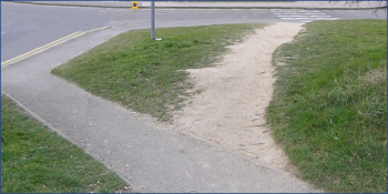
Imagine that you need to get to that crossroad on the right. Which way do you prefer?
The designer's idea is highlighted in red on the left. On the right, a more efficient path is shown in blue.
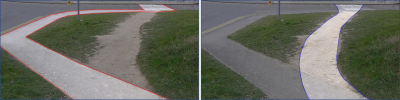
We are dealing with evidence that people choose efficiency, rather than a better asphalt surface.
You are watching TV . You need to switch the channel and still change the volume. Which remote control would you prefer to hold in your hand?
Which remote would you choose to change the volume?

On the white remote on the right, the channel toggle buttons on the top are too far away from the volume buttons on the bottom right.
Also, these horizontal and vertical directions are not consistent and require some mental training in order to get used to them. In addition, the visual weight (shape, size, contrast) of these buttons is identical to almost all other controls on this remote, including the rarely pressed keys labeled Language and Clock .
You are in the N-terminal elevator at Seattle Airport . You need to get on your plane. The elevator has three buttons to select a destination:
What key will you press? That RAMP (trap) button with an asterisk opposite it looks extremely inviting. In the end, I have to go up the ramp to get on the plane. And do not the asterisks use the elevator buttons to indicate the main floor or hall? And why do we need a CONCOURSE (airport main hall)? I need to go to my landing exit, which should be located inside the terminal.
Here is a more complete picture of this elevator control panel:
Obviously, there was a big uncertainty between the level of the RAMP (some hidden average level where the passengers would not want to be ) and the CONCOURSE level (where you can board the plane). Probably for this reason they added the physical equivalents of tooltips commonly used in computer programs. Of course, such clues are completely invisible to blind people, who are more likely to crowd on the floor marked with * R.
This is another proof that the designers of things around us (including computer programs) do not pay attention to important issues.
Let's now go back to our original problem. Why is it so hard to create a good user interface? Although a number of factors influence the final answer, I believe that the most important factor is the level of preparation . It seems to me that the majority of developers and designers who create interfaces for people simply do not possess a drop of the knowledge that could help to create a much higher-quality interface than usual.
You ask how big this difference can be? Well, for starters, let's go back to the gas station, where I bought gasoline this morning. Having a credit card, I saw the following message on the screen:
"Is this a debit card?"
Of course, I can not continue the operation until I answer this question. Well, I actually use a credit card , not a debit card , so I know that the answer is no . However, at that moment it was not clear to me how I should communicate this answer to the computer.
So, the next moment I look down to look at the numeric keypad. After reading the names of half a dozen keys, I find the “Yes” and “No” keys on the bottom right of the keyboard (much further from the message to which they actually relate).
It should also be mentioned that the question (for example, “Debit Card?”) Changes from refueling to refueling - sometimes the computer wants to know if I use a credit card , sometimes it asks me to find the Credit and Debit buttons and click the correct one.
This time the question turned out to be a debit card, so I pressed the No button and looked at the screen above in order to see if I could refuel now.
All this, without exception, devours about 10 seconds of my life every time I use my credit card. And this is not only at gas stations, but also in grocery stores and elsewhere, where payment must be made. Every time I try to pay my money to sellers, they just try to slow me down. This is not at all in their favor, and not in mine either.
A poorly designed user interface acts as a frictional force on the economy. How much is it? Well, let's start with multiplying these 10 seconds by the millions of transactions that are processed every day on all of these computers, and you get a picture of a huge waste of time. Multiply this time by the average salary of people and you will get the price of such a decision.
So why bother with this debit card question at all? Personally, I never carry debit cards with me. For me, the answer is always the same. Well the same, if the question does not change from computer to computer. And, of course, we live in a world where computers could identify themselves (at a gas station, in a bank, etc.) which category my card belongs to.
So, around us very often there is a poor-quality user interface, the reason for this may simply be the lack of skills of its designer. Although perhaps you thought that the reason lies in something else.
This statement is easy to verify. Read this series of articles, get the skills you need and watch how it will radically increase your ability to create good interfaces.
In the next article, we will look at the concept of “clarity” of an interface.
This morning, when I refueled my car with gasoline, I was suddenly struck by another proof that most user interfaces do not satisfy the three main indicators of a good interface: clarity , efficiency (efficiency) and openness (discoverability).
One of the most common mistakes that occurs in the physical world around us is the buttons located on the devices as if they would be pressed with the same frequency . This can be determined immediately - such buttons have the same size, and in some cases the buttons that need to be pressed more often than others are the smallest and located in hard-to-reach places.
')
Returning to the buttons, here is part of the interface that I watched today at the gas station:
On the left is the fuel pump button, which allows you to choose the most popular grade of gasoline in the United States. On the right is a button for selecting a less popular and more expensive type of gasoline. Erosion on the left can be viewed as an indicator of the frequency and location of a button click. It is clear that people who pressed the button on the left would like to see it larger than the area “Push Here” offered by it.
Let's change this interface, but at the same time save its essence:
Here is a list of changes (we will explain the reasons for such changes in future articles):
- "GRADE SELECT" (grade selection) is transformed into a less noisy "Grade Select".
- "Grade Select" - removed the underscore from the bottom.
- Removed unnecessary text "Grade Select".
- Removed tabs with the text "Grade Select".
- Increased the size of the button and added a low contrast border.
- Reduced the contrast of the inscription "Push Here" ("Click Here").
- Increased the contrast between the text Regular , Plus and the background.
Thus, we have clear evidence that some buttons are pressed more often than others. At the same time, we can conclude that the creators of this interface were hardly aware of this fact.
One of my all-time favorite big buttons is the spacebar on modern computer keyboards. Of course, the position and size of this key originates from the time of vintage typewriters . Unfortunately, the QWERTY configuration, which now prevails, is far from perfect because the most frequently used keys are located in hard- to -reach places on the keyboard. This was done because the people who at the very beginning used typewriters with pre-QWERTY key configuration worked so quickly that the letter levers were often wedged between the typewriters.
I cannot express my desire to attend that meeting in 1874, when some people decided to move the keys in such a way that it was harder to reach them. This decision alone should be considered the most expensive user interface design error ever made in terms of loss of productivity.
But still, the space key has survived, it is large and it is easy to press it with any of the thumbs. And so I really like this key.
A few examples
Imagine that you need to get to that crossroad on the right. Which way do you prefer?
The designer's idea is highlighted in red on the left. On the right, a more efficient path is shown in blue.
We are dealing with evidence that people choose efficiency, rather than a better asphalt surface.
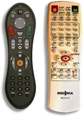
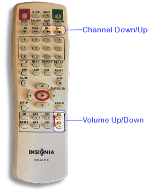
You are watching TV . You need to switch the channel and still change the volume. Which remote control would you prefer to hold in your hand?
Which remote would you choose to change the volume?
On the white remote on the right, the channel toggle buttons on the top are too far away from the volume buttons on the bottom right.
Also, these horizontal and vertical directions are not consistent and require some mental training in order to get used to them. In addition, the visual weight (shape, size, contrast) of these buttons is identical to almost all other controls on this remote, including the rarely pressed keys labeled Language and Clock .
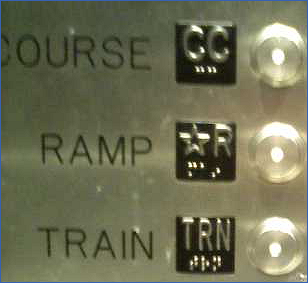
You are in the N-terminal elevator at Seattle Airport . You need to get on your plane. The elevator has three buttons to select a destination:
- CONCOURSE (CC)
- RAMP (* R)
- TRAIN (TRN)
What key will you press? That RAMP (trap) button with an asterisk opposite it looks extremely inviting. In the end, I have to go up the ramp to get on the plane. And do not the asterisks use the elevator buttons to indicate the main floor or hall? And why do we need a CONCOURSE (airport main hall)? I need to go to my landing exit, which should be located inside the terminal.
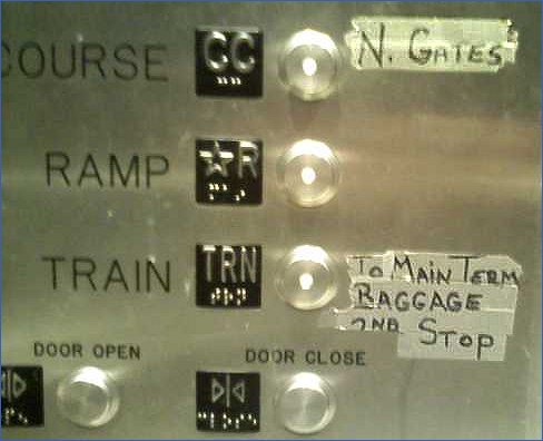
Here is a more complete picture of this elevator control panel:
Obviously, there was a big uncertainty between the level of the RAMP (some hidden average level where the passengers would not want to be ) and the CONCOURSE level (where you can board the plane). Probably for this reason they added the physical equivalents of tooltips commonly used in computer programs. Of course, such clues are completely invisible to blind people, who are more likely to crowd on the floor marked with * R.
This is another proof that the designers of things around us (including computer programs) do not pay attention to important issues.
Let's now go back to our original problem. Why is it so hard to create a good user interface? Although a number of factors influence the final answer, I believe that the most important factor is the level of preparation . It seems to me that the majority of developers and designers who create interfaces for people simply do not possess a drop of the knowledge that could help to create a much higher-quality interface than usual.
You ask how big this difference can be? Well, for starters, let's go back to the gas station, where I bought gasoline this morning. Having a credit card, I saw the following message on the screen:
"Is this a debit card?"
Of course, I can not continue the operation until I answer this question. Well, I actually use a credit card , not a debit card , so I know that the answer is no . However, at that moment it was not clear to me how I should communicate this answer to the computer.
So, the next moment I look down to look at the numeric keypad. After reading the names of half a dozen keys, I find the “Yes” and “No” keys on the bottom right of the keyboard (much further from the message to which they actually relate).
It should also be mentioned that the question (for example, “Debit Card?”) Changes from refueling to refueling - sometimes the computer wants to know if I use a credit card , sometimes it asks me to find the Credit and Debit buttons and click the correct one.
This time the question turned out to be a debit card, so I pressed the No button and looked at the screen above in order to see if I could refuel now.
All this, without exception, devours about 10 seconds of my life every time I use my credit card. And this is not only at gas stations, but also in grocery stores and elsewhere, where payment must be made. Every time I try to pay my money to sellers, they just try to slow me down. This is not at all in their favor, and not in mine either.
A poorly designed user interface acts as a frictional force on the economy. How much is it? Well, let's start with multiplying these 10 seconds by the millions of transactions that are processed every day on all of these computers, and you get a picture of a huge waste of time. Multiply this time by the average salary of people and you will get the price of such a decision.
So why bother with this debit card question at all? Personally, I never carry debit cards with me. For me, the answer is always the same. Well the same, if the question does not change from computer to computer. And, of course, we live in a world where computers could identify themselves (at a gas station, in a bank, etc.) which category my card belongs to.
So, around us very often there is a poor-quality user interface, the reason for this may simply be the lack of skills of its designer. Although perhaps you thought that the reason lies in something else.
This statement is easy to verify. Read this series of articles, get the skills you need and watch how it will radically increase your ability to create good interfaces.
In the next article, we will look at the concept of “clarity” of an interface.
Source: https://habr.com/ru/post/105766/
All Articles