Usability audits in the public domain (Epilogue of the “Usable Web Project” contest)
Earlier in this blog. About one thousand years ago, the “ Usable Web Project ” competition started. Since then, we put 108 minuses for the posts about the contest (not counting this), sent 166 applications for participation, we selected 15 of them, and as a result of the last confrontation, only 5 survived. We left comments on the usability of their sites to everyone and called hate some web designers.
Whether habrovchane followed the course of the competition or not, some of them may be interested in how it all ended. Reporting The winners received gift books and full-fledged usability audits. And even gave their comments. At first we wanted to build a post around them, but then we decided that they would look better on the feedback page of our site. Then they thought that it was possible to publish a brief usability-lynch, but what's the point if all this is in audits. Therefore, with the consent of the winners, we post them in open access.
 Kinobaza.tv audit (pdf, 3.11 Mb)
')
Repka.ua audit (pdf, 1.23 Mb), application: mind mapping (pdf, 79.2 Kb) with recommended menu structure
audit of PoPravilam.com (pdf, 653 Kb)
So that you do not think that these sites have only disadvantages, we will briefly describe each of them, since they deserve it. Otherwise they would not have won the competition, right?
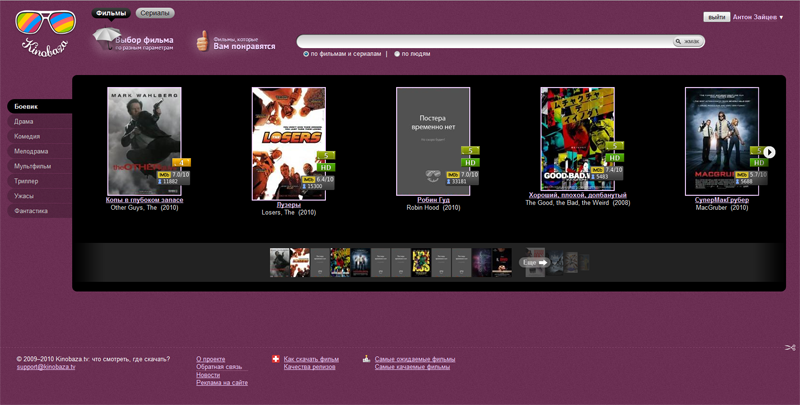
The slogan of the Kinobaza.tv site is “What to watch? Where can I download?". In essence, this is a search engine for torrent trackers, as well as sites for online viewing of video and video storages. Accordingly, the found film can be viewed online, downloaded for a direct link or from torrents. In addition to the selection of the film according to the criteria (genre, quality, sound track and much more), Kinobaz has two more chips.
First of all, these are recommendations or “films that you should like” - they are calculated by the Imhonet service. Secondly, there are notifications: if the expected film or a new episode of the series becomes available for download, you will receive a letter.
Kinobaz audit was the most difficult. First, as the first place holder, the project besides received two audits in one: usability and SEO. Secondly, the site is non-standard, with non-standard design and navigation. When we summarized the experience on 166 reviewed sites, we were accused of having one size fits all, and “Google saw our standard design in the coffin”. The film base, like Google, does not seek a typical design.
Habrayuzer daeq3 commented on the future plans for the project: “ Very soon (within 2-3 weeks) rather big changes are coming in the interface of the site, designed mainly to facilitate its use for people who are not very familiar with the technology of torrents and with the Internet in general. Roughly speaking, the site will add new buttons like “do me good,” but with the ability to use the “advanced interface” for more experienced users. In recent months, we have become much better aware of what users want from the site, and in the near future it will become much better. Follow the news and come to us. ”
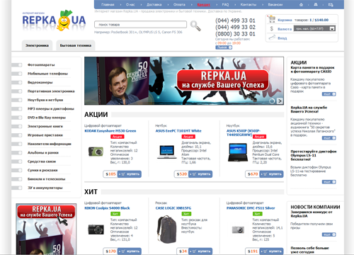
The online store Repka.ua trades home appliances and electronics in Ukraine. Own points of issue are in Kiev and Lviv, is expected to open offices in Zaporozhye. In other cities purchases are delivered by the carrier.
The visitor decides whether he will buy something in this online store, based on such sections as “Delivery”, “Payment”, “Guarantee”. Therefore, structuring the relevant information and menus was one of the main objectives of the audit. But the most important thing in the store is the menu of the catalog. He had to redraw it completely.
With Dmitry Latansky, the project manager, we continued to communicate even after the end of the audit, “we seriously thought about further cooperation.” In addition, Dmitriy wrote down on points what he wanted to see in the audit, but did not see: “a review of competitors in the Ukrainian market, an audit of the filter system (complex functionality that is intended to improve usability, but there is not a word about it in the report), recommendations on functionality or elements that should be on the site, but they are not there. " The filter, in our opinion, is excellent, but the lack of proposals for planning a new functional is also noted in the recall of the film base. Took yourself a note.
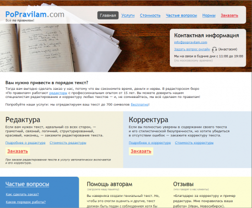
“ By the rules ” is an editorial bureau that takes orders for editing and proofreading via the Internet. With the exception of “By the rules”, no editorial bureau provides (judging by their sites) the following possibilities:
For the site of the editorial bureau, the main thing is the texts: a description of the services, their cost, and the advantages of working with this particular office. The method of questions here is especially relevant. It makes sense to build both the menu and the structure based on the questions that the potential client asks himself by visiting the site. The comment from the bureau reinforced our opinion: “Recommendations on increasing the conversion of website visitors into customers gave us food for analysis,” Anastasia Nizovskaya wrote in response to the audit. - "Based on the report, we will fundamentally rebuild the site of our bureau."
This epic usability contest ends. For most, we are sure she went unnoticed, but for us it was something like “Lord of the Rings.” It seems that the ring in the volcano dropped. Thanks to everyone who followed the competition, criticized, debated and expressed opinions.
In the following series, we will continue to write about usability, selling sites, Internet marketing and television working. Titles.
Whether habrovchane followed the course of the competition or not, some of them may be interested in how it all ended. Reporting The winners received gift books and full-fledged usability audits. And even gave their comments. At first we wanted to build a post around them, but then we decided that they would look better on the feedback page of our site. Then they thought that it was possible to publish a brief usability-lynch, but what's the point if all this is in audits. Therefore, with the consent of the winners, we post them in open access.
Kinobaza.tv audit (pdf, 3.11 Mb)')
Repka.ua audit (pdf, 1.23 Mb), application: mind mapping (pdf, 79.2 Kb) with recommended menu structure audit of PoPravilam.com (pdf, 653 Kb)So that you do not think that these sites have only disadvantages, we will briefly describe each of them, since they deserve it. Otherwise they would not have won the competition, right?
Kinobaza.tv
The slogan of the Kinobaza.tv site is “What to watch? Where can I download?". In essence, this is a search engine for torrent trackers, as well as sites for online viewing of video and video storages. Accordingly, the found film can be viewed online, downloaded for a direct link or from torrents. In addition to the selection of the film according to the criteria (genre, quality, sound track and much more), Kinobaz has two more chips.
First of all, these are recommendations or “films that you should like” - they are calculated by the Imhonet service. Secondly, there are notifications: if the expected film or a new episode of the series becomes available for download, you will receive a letter.
Kinobaz audit was the most difficult. First, as the first place holder, the project besides received two audits in one: usability and SEO. Secondly, the site is non-standard, with non-standard design and navigation. When we summarized the experience on 166 reviewed sites, we were accused of having one size fits all, and “Google saw our standard design in the coffin”. The film base, like Google, does not seek a typical design.
Habrayuzer daeq3 commented on the future plans for the project: “ Very soon (within 2-3 weeks) rather big changes are coming in the interface of the site, designed mainly to facilitate its use for people who are not very familiar with the technology of torrents and with the Internet in general. Roughly speaking, the site will add new buttons like “do me good,” but with the ability to use the “advanced interface” for more experienced users. In recent months, we have become much better aware of what users want from the site, and in the near future it will become much better. Follow the news and come to us. ”
Repka.ua
The online store Repka.ua trades home appliances and electronics in Ukraine. Own points of issue are in Kiev and Lviv, is expected to open offices in Zaporozhye. In other cities purchases are delivered by the carrier.
The visitor decides whether he will buy something in this online store, based on such sections as “Delivery”, “Payment”, “Guarantee”. Therefore, structuring the relevant information and menus was one of the main objectives of the audit. But the most important thing in the store is the menu of the catalog. He had to redraw it completely.
With Dmitry Latansky, the project manager, we continued to communicate even after the end of the audit, “we seriously thought about further cooperation.” In addition, Dmitriy wrote down on points what he wanted to see in the audit, but did not see: “a review of competitors in the Ukrainian market, an audit of the filter system (complex functionality that is intended to improve usability, but there is not a word about it in the report), recommendations on functionality or elements that should be on the site, but they are not there. " The filter, in our opinion, is excellent, but the lack of proposals for planning a new functional is also noted in the recall of the film base. Took yourself a note.
Popravilam.com
“ By the rules ” is an editorial bureau that takes orders for editing and proofreading via the Internet. With the exception of “By the rules”, no editorial bureau provides (judging by their sites) the following possibilities:
- the ability to get the final text in any format
- the opportunity to see for yourself what exactly the editor corrected at any stage of work,
- the ability to independently accept and reject editors at any stage of work.
For the site of the editorial bureau, the main thing is the texts: a description of the services, their cost, and the advantages of working with this particular office. The method of questions here is especially relevant. It makes sense to build both the menu and the structure based on the questions that the potential client asks himself by visiting the site. The comment from the bureau reinforced our opinion: “Recommendations on increasing the conversion of website visitors into customers gave us food for analysis,” Anastasia Nizovskaya wrote in response to the audit. - "Based on the report, we will fundamentally rebuild the site of our bureau."
The end
This epic usability contest ends. For most, we are sure she went unnoticed, but for us it was something like “Lord of the Rings.” It seems that the ring in the volcano dropped. Thanks to everyone who followed the competition, criticized, debated and expressed opinions.
In the following series, we will continue to write about usability, selling sites, Internet marketing and television working. Titles.
Source: https://habr.com/ru/post/105713/
All Articles