Life is two weeks long
In this post, I’ll tell you how to create a product site in 20 hours alone from scratch, compare the two systems of artificial life support for the site (Yandex.Direct and banner advertising) and also tell you why it’s better not to waste time on it. The story is divided into stages of the life of the site.
Conception and childbirth
Conception site happened unexpectedly. Before the start of the “Japan Close-ups” course, there were 2 weeks and a few empty seats. I decided to test the effectiveness of attracting users through Yandex.Direct and the creators of the course allowed to conduct such an experiment. Actually, the work began on the same day, but there was very little time - a total of 20 hours. Therefore, I had to sacrifice sense and make a purely advertising product.
To come up with an idea for a product site:
- Understand what this product is and what problems it solves;
- Who faced such problems and how exactly the product will help them;
- Formulate the description of the solution to the problem so that the visitor immediately understands what is being said on the site;
- In the sections of the site in detail, but without water, describe how the product will help each group of visitors. It is better not to build a universal description, but create a separate page for each group of problems and direct users to it;
- Graphic design can be left for later. It will itself come to mind when you begin to describe the idea of the site on paper. And if it does not come, then it is not as important as the lack of text on the site (although, in the case of material products that can be beautifully shown, the situation is different).
As an example, I will give my reasoning:
- The course consists of intensive classes in the Japanese language and culture. It helps a person quickly master the basics of Japanese and better understand Japanese culture in general;
- Japanese can be useful: tourists who are going to go to Japan, businessmen, employees of Japanese companies, anime workers and other people who for some reason are not indifferent to Japan. In order not to produce a lot of text, I will cite reasoning only for tourists. A trip to Japan is expensive, it means that people go there not just to rest like in Cyprus, but precisely because they are interested in Japan. But if you know at least the basics of the language and the Japanese mentality, then you can get much more pleasure from the trip, since you don’t have to worry about finding someone who understands English.
- To make it immediately clear what is at stake on the site, in each section I combined the main menu with the title. It turned out something like: "The course of the Japanese language and culture for businessmen, their employees, tourists and otaku will make it easier to understand business partners"
- The copywriter from me is like a bullet from dung, but as I could, I described the problems to be solved on the pages of the site. For each category of visitors - their own. Bring them here too long, who are interested - can look at the site.
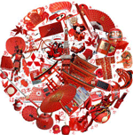
- The basis of the graphic solution lay the Japanese flag. And since “Japan is a close-up,” I showed that the plan is so large that even the structure of which the flag consists is visible.
')
All texts and pictures took about 12 hours in total.
Layout was made for the weekend and took hours 8. Layout advice: naturally, do not get carried away with complex elements. With speedy development, I advise you stupidly to use tabular layout. Or even find a ready-made skeleton somewhere.
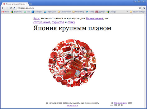
A week later, from the beginning of the creation (evening + weekend), the site was launched. Then it was necessary to do something for which he planned - to test ways to attract visitors.
Life, Direct and Anmeson
To breathe life into the site, I decided to first connect it to Yandex.Direct. Rates were set to the maximum for all relevant requests. But even so, just over 30 visitors came to the site in a day. The average cost of one was 30 rubles.
Banal directives for directing for beginners: specify in the ad information that cuts as many non-target users as possible. If you have a paid course, then indicate in the stop words "free", and in the ad text - the price of the service. If you work only in one city, then target the ad only for it. Otherwise, the campaign budget will hide in front of no visible result.
The average depth of viewing the site was 4 pages, which for a site of 7 pages is quite good.
The next day I agreed with the author anime-zone.ru , about placing a banner on the pages of his site (for which many thanks to him!).
Banner specifically made low-key:

As a result, more than 270 visitors came to the site per day. The price of one visitor from the site was several times lower than from the direct.
Now a small comparison of the effectiveness:
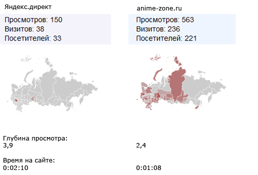
With direct, of course, users come more relevant. They browse more pages, and stay longer on the site. But the average number of relevant users, I believe, was approximately the same. At the same time, when advertising through the banner was one plus - the site looked at a fairly large number and not targeted, but thematically close users - and they may one day become targeted.
Quick Yandex
To my surprise, the site in the search for Yandex became visible on the second day. While trying to see which pages are indexed, Yandex answered that the site is not yet in the index.
What it is connected with is not completely understood. Whether direct played a role, or metric.
Inevitable oblivion
Soon the last habr users will leave the site, they will disconnect it from the artificial life support apparatus and it will plunge into the abyss of obscurity and loneliness. Such is the sad fate of all advertising sites that do not carry a semantic load except advertising.
The result of the work is not comforting - none of the 300 visitors called. Perhaps I did not make a good enough site.
But soon I am going to revive the site in a new guise: full of all sorts of useful tools to help in learning Japanese. And then, having forgotten about the dark advertising past, the site, I hope, will live a full life.
findings
If you are tempted to make a quick advertising website to promote any product, then think again: maybe it is better to spend this time creating something more useful? And advertising is better to do not a separate site, but on some thematic resource. For courses it is, for example, theoryandpractice.ru
Link for those who are interested in what eventually happened: japan-zoom.ru
UPD
And here is the statistics from Habr. Yesterday, the site hung in thematic blogs, and tonight hit the home. What happened:
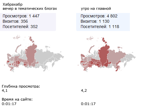
Naturally, Habr's audience can hardly be considered targeted. But she has one important feature: people who are not indifferent to quality and possess valuable knowledge have gathered here.
Very nice to hear good reviews about the design of the site. But to those who leave constructive criticism, I am grateful no less. After all, the most valuable thing you can get from publishing on Habré is an experience that will allow you to find errors, correct them and make the product even better. Thank!
What is important from the comments made at the moment:
n1313 gave a valuable comment that it is necessary to clearly indicate that the course is in Moscow. Otherwise, you can fool users from other regions. Initially, I planned that visits would be only direct, and it is geo-targeted, so I did not specify information that is already meant for the visitor who came through the link. But the real situation turned out to be different - and I’ve disappointed the expectations of some site visitors. What I apologize to them for. For the future, be sure to consider.
If there are draft materials that look relatively good, but may contain errors, in no case should they be laid out. And if you need to lay out, then you need to at least laid out the site 10 times checked by a person who understands the topic. Now it turned out that @Vile and ISpy found errors in the uploaded materials - this is a shame on my head. Naturally, the final razdatka will be read and all errors in it will be caught, but this is not an excuse. Even despite the fact that, it seems, if a person can read a Japanese text, then Japanese courses for beginners are hardly necessary for him - such moments cannot be allowed. Thank them for their attention, and for not being too lazy to read the laid out razdatku.
Source: https://habr.com/ru/post/105289/
All Articles