About rubber sites and about sore
 Good afternoon, dear habrakrady!
I began today to delve into the past of the blog "Web Design" (in my opinion, very interesting and useful). Often there were some very useful articles, less often - irrelevant ones (I outgrew them myself) ... But what really got me hooked is the question of the rubberiness of sites! I do not know why. Probably because everyone is so eagerly debating, so defending their positions, that it is a pleasure to read! From here I conclude that the topic is acute, and I am writing my next topic.
Under the cut about 3 MB
As I understand it, at this point in the time continuum, opinions are divided into three camps:
- “Sites need to be made rubber - this is progressive!” Led by the formidable and powerful Lebedev
- "We are fundamentally against those who believe that websites should be made rubber!" - the percentage of the population rebellious in its essence responds vehemently
- “It’s not at all necessary to make websites with rubber” - they are spoken by authoritative people and almost all foreign web design (and I'm somewhere here)
So in continuation of the topic of rubber and disagreements around her I want to show you one original project that we recently had the opportunity to implement. I hope its chips and implementation will be interesting to the public, but the main thing that I would like to hear is the opinions of the first of me listed factions regarding whether we managed to make an interesting website without the notorious rubberiness :)
')
I want to appeal to customers with whom, sometimes and unfortunately, we have to deal with almost everyone.
Appeal
Dear customers (those who decide on financial issues. Yes, yes, those who order music), do not spare money for technical support and professionally designed content! How many beautiful layouts on the web are mercilessly ruined by unreasonable and unprofessional content, how many designers have committed their lives to creative suicide (I hope I'm kidding).
In a word - let's live together and trust each other our professional duties!
Examples
It will be just like in Euro News heading "No comments".
It was - this site layouts.
It became - this is what happened after filling the site content with the customer. Sometimes it hurts me to watch. Although, we have to admit, in life you can see even worse examples.
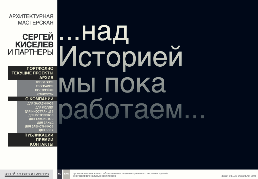
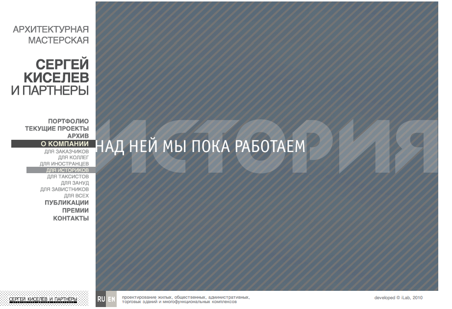
1. It was
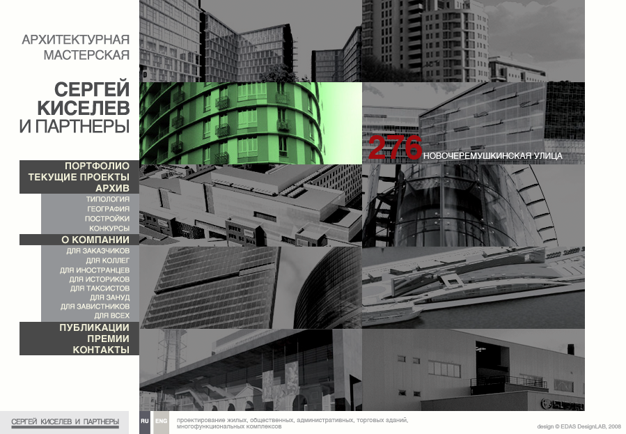
1. It became
We draw attention to the icons of Ru and Eng and the clarity and location of the signatures of the projects of the portfolio.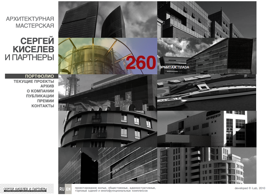
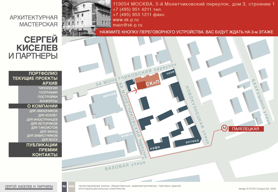
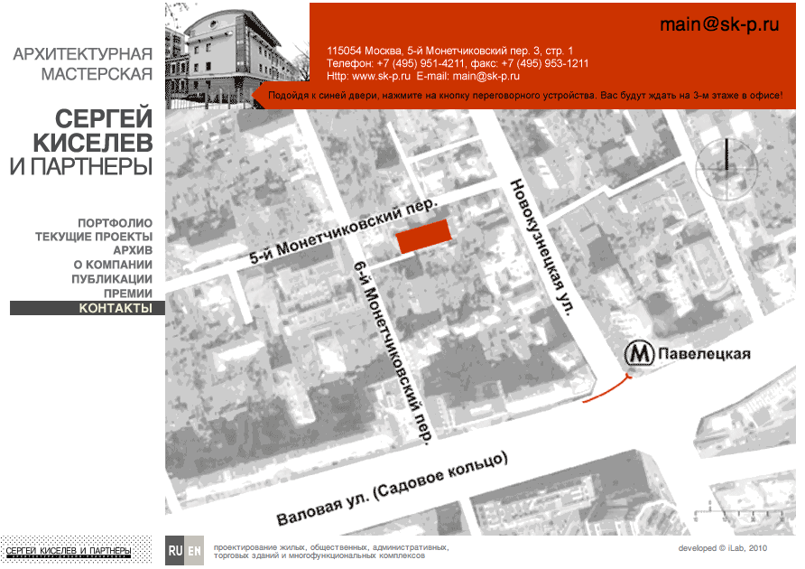
2. It was
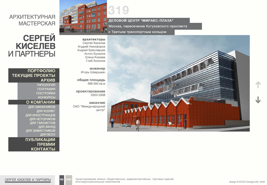
2. It became
We look at the fill bars with shading above and below.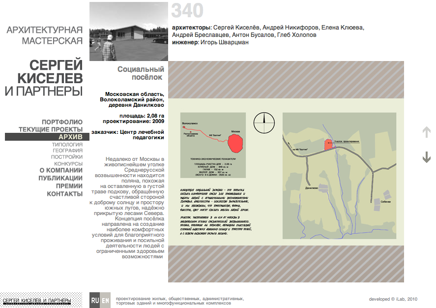
3. It was
3. It became
4. It was
4. It became
Maybe I'm too prejudiced? Have you had any such disorders?
Source: https://habr.com/ru/post/104622/
All Articles