We improve the styles of comments on Habré (via user-style or the Stylish plugin)
 The stylist Stylish / Habrahabr - Prettifier (Firefox) has been reworked , it is quite well developed in terms of appearance, but a more compact display of comments has been added. The resulting styles can be used not only with him, but also set as user styles for the site (in Opera, Chrome) or set via Stylish in Chrome (not tested). .
At the moment, the author of the stylist has posted version 2.0.1.2 (May 24, 2010) , and promises to update it no earlier than October. Some minor details (rounded borders around page numbers) are from the earlier version 1.9.9.1 (February 13, 2010).
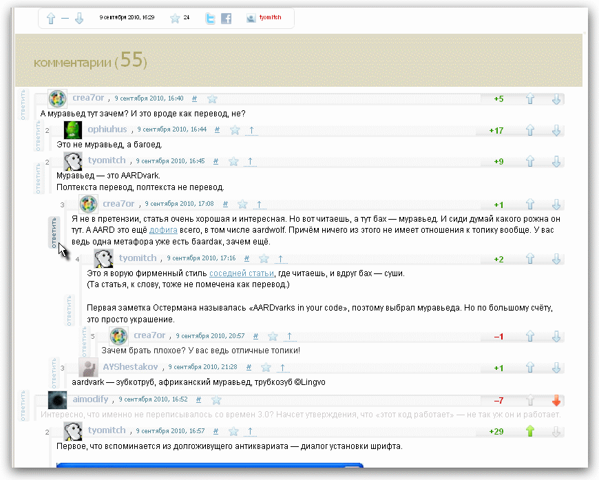
So comments on Habré without stylists look:
')

There are some disadvantages:
1) closely located buttons "+" and "-";
2) loss of space on the button (link) "Answer", which, moreover, is poorly visible;
For the most part, these issues are resolved in the Prettifier.
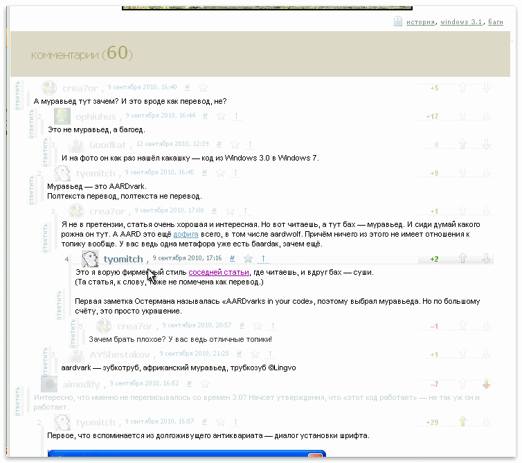
Turn on Habrahabr - Prettifier v.2.0.1.2. (I worked with him for 3-4 months, he proved to be convenient.)

With the existing content do the following:
1) we place the rating buttons far away;
2) drag the answer button to the side and save space;
(The work was started to correct the indenting of the text of the comments to the right, but this was already done by the developers of the site.)
The lines that have undergone changes:
(useful for parsing or for those who want to make a user-style without stylish / Habrahabr - Prettifier
/* */
.comment_holder .entry- content {
max-width : 800px ;
margin-left : -6px !important ;
}
...
/* :*/
#comments {
padding-left : 74px !important ;
overflow : hidden ; margin-left : -49px !important ;
}
#comments > .hentry > .comment_holder {
margin-bottom : 0 !important ;
}
.entry- content {
margin-bottom : 0 !important ;
}
.comment_holder .entry- content ,
.popular-comment .entry- content {
padding : 10px 0 6px 5px !important ;
}
/* */
.comment_holder .mark {
margin : 1px 38px !important ;
}
/* :*/
.new-reply {
background : #E0E0F8 ;
}
.comment_holder .reply {
margin-top : 0 !important ; margin-bottom : 0 !important ;
}
.comment_holder .reply a {
background-color : #eee ;
width : 50px ;
padding : 2px 7px 5px !important ;
-moz-border-radius : 5px ;
}
.comment_holder .reply a :hover {
background-color : #ddd ;
}
/* :*/ </font >
.entry-content .reply a.js-serv {
position : relative ;
left : -71px ;
top : -12px ;
}
/* :*/
ul .hentry .vote .buttons a {
display : none ; /* */
float : none !important ; /* */
}
ul .hentry .vote .buttons {
padding-left : 15px !important ;
}
ul .hentry .vote .buttons a :last-child {
margin-left : -26px !important ;
margin-top : -16px !important ;
}
ul .hentry .vote .buttons a {
background-image : url ( 'http://habrahabr.ru/i/icos/icons_vote_posts.gif' ) !important ;
height : 15px !important ;
width : 11px !important ;
}
ul .hentry .vote .buttons .vote-for-comment {
margin-left : 11px ;
}
ul .hentry .vote .buttons a .vote_plus {
display : block ;
background-position : left bottom !important ;
}
ul .hentry .vote .buttons a.vote_minus {
display : block ;
background-position : -11px -15px !important ;
}
...
ul .hentry .vote .voted_plus a.vote_plus {
margin-right : 30px ;
background-position : 0 0 !important ;
}
/* - ( )*/
.comment_holder .msg-meta {
background : #ddd ;
}
.hentry .hentry .msg-meta ,
.popular-comment .msg-meta {
background : #ddd ;
}
/* "html-"*/
.comment-help dd span {
color : white ;
}
.comment-help dd span a.js-serv {
margin-top : 16px ;
float : right ;
}
#js-field-holder-with-help .comment-help dd span a.js-serv {
margin : 6px 18px 0 0; ;
}
#js-field-holder-with-help {
margin-top : -16px ;
}
Notes :
*) the remaining changes to the full code of the plug-in are not significant (but there is another useful improvement);
*) The plugin is located at userstyles.org/styles/36690 ;
*) the styles are compatible and complement the extensions to Habrat Habratulz , Karmavyuer .
*) in the process of writing it was clear that the developers of the site are also not asleep and are working on the appearance of comments: the avatar and the user’s name disappeared above the input field at the bottom of the page (well, it only hindered). So, we “jointly” twirled the view of the input field, and it became so (this is a slightly earlier version, the buttons were later refined):

*) pale arrows on a darker background are lost, so in an amicable way one should also darken the pattern of the buttons;
*) sent a letter to the developer with a proposal to use my revisions or part of them in the next versions and uploaded his version of styles on userstyles.org with all references to sources.
*) it would also be nice if the developers of Habr implement any of the styles natively.
UPD:
*) buttons and headers are improved with gradients in the headers - version 1.1 is made.
The gradients on the headings are different for the first comment level and for the rest.

The code is posted on userstyles.org/styles/36690 . View code (without installation) - through the same page.
*) Changed styles to improve readability: the headings and buttons are faint, the text is separated by them. Version posted on userstyles.org/styles/36690 .
*) If you uncomment (removing 1 space between "*" and "/") a few lines / * for netbooks ... * /, we will get a sidebar (which is usually on the right) at the bottom, and text and comments - across the width of the window (for width browser windows 730-1000 pixels.). Together with the increased compactness of comments, it becomes even more convenient for netbooks with their low window. The version with the usual sidebar position is convenient to use with a window width of 900 pixels.
*) The big void separating the text and comments is replaced by a large pale field of khaki color - it is more convenient to catch a look at the place where comments started.
UPD 13.09.10: version 1.2.1: the signature in the articles has been moved up, some minor fields have been corrected in height.
UPD 14.09.10: version 1.2.2: the headers are even paler (opacity: 0.33), but when you hover the mouse, they restore opacity. Screenshot - on userstyles.org/styles/36690 or below.
Source: https://habr.com/ru/post/103943/
All Articles