Do not be afraid to change!
 Today I would like to tell about how we threw out semi-annual work and for 2 months did everything anew. About how we were scared, sorry and insulting. And of course about what happened as a result.
Some time ago, I wrote that one should not force a person to think (for a long time and a lot :). This is a kind of continuation of the same topic, but with concrete results.
')
Simplification number one
At the beginning of this year we launched a service for group discussion of pictures. Everyone could open their account there, create a project, upload sketches there and invite colleagues / clients for discussion. The running version looked like this:


A huge interface with lots of functionality. You can add projects, close projects, view updates, upload a project avatar, view project activity. Everything seems to be beautiful, impressive, functional, etc.
But, the use of this business brought to the life of designers a huge number of problems. Unnecessary clicks, vagueness of grouping, tags and much more distracted from the very essence of the project - discussion of sketches. In order to upload a sketch, it was necessary to create a project, invite people there, wait for their registration and upload the sketch itself. Creating this interface and logic, we lost the essence.
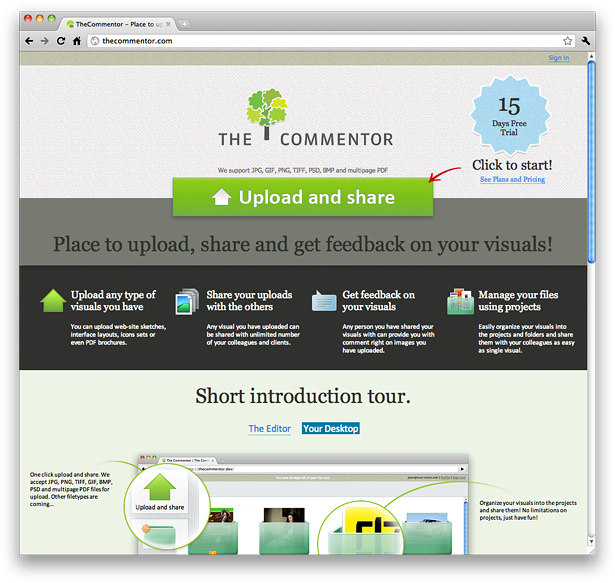
In June, we decided to demolish everything and create something really convenient and simple, throwing out all the tinsel that had accumulated at that time. Then we realized that we need to take a prototype of any service for downloading and “sharing” (Droplr, Dropbox, Google Docs, etc.) files and add the ability to comment on it. And we made a simple file system with the capabilities of “sharing” of all materials, and it began to look like this:


We used what people are used to - folders. They made it possible to upload and fidget sketches without reference to projects (this was impossible to demand in the old version). Removed account users, now you don’t need to think about them, invite them and register, you simply “fumble” a sketch with any e-mail address.
The result - entry into the service has become as simple as possible. We have achieved that almost 90% of new users have tried the main functionality of the project.
Murder registration.
As we said above, in the old version of the service, each user had to register, create an account, add the first project, invite users into it (who also had to register) and only after that could they use the functions for which the service was intended . This is how the registration form looked like:


It seems that filling out such a form is not a problem. Actually not the case. The percentage that went through this form was about 7%, despite the fact that almost the entire audience that came to the site was targeted (about 80%). And there is nothing left to say about the fact that a completely ridiculous percentage began to use the main function.
We took the easiest step - we removed the registration. Totally! Any user can immediately upload a sketch and “shuffle” it with their colleagues or clients, for this they only need to enter their email after upload (we will also refuse it soon, making the entry even easier). It looks like this:

One button to download, a small form after loading, in which the user must enter his mail and emails of users with whom he wants to “mess up” the sketch. The result - instead of 7%, we got about 30%. Growth more than 3 times. And besides, almost 70% of those who “zasharil” the first picture received comments and tried it in action.
Comment Wednesday
The environment itself (we call it the editor) for commenting is written in Flash / AS3, which, as we know, is a small problem with different facets. In the old version, we were faced with the fact that it began to slow down a lot (especially on Mac / Unix systems). The old version looked like this:
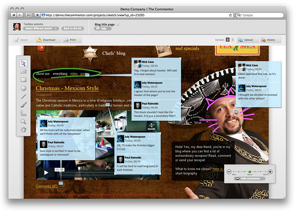

The whole top is occupied by functionality that is of little concern to the discussion of the picture. A huge number of hidden functions (import, work with versions, etc.) which, as it turned out, used less than 3% of all users.
We decided to “clean” all the insides of the editor and concentrate only on the functionality that is really important. As a result, we have such an option:

We combined ZOOM with the main block of tools, abandoned some tools that nobody used. They removed a huge hat, leaving more space for the working area and slightly reworked the block with comments (readability of the text, size of avatars, etc.).
As a result, we got an editor that does not slow down, in which the maximum space for working with the layout and which "weighs" is 40% less.
Free version disclaimer
Now a little about business. We decided to completely abandon the free version, which was a real "needle in the ass." After registration, each new user starts a “trail” for 15 days. During this time, all the functionality of the service is available to him. After this period, we ask the user to make their choice.
We made this decision guided by the fact that 90% of paid accounts on the old version were purchased within a week after using the free version, and 50% of these 90% were registered immediately to a paid plan.
It’s too early to draw conclusions, but we will definitely share our experience of what is better, the availability of a free version or a “trail” and only paid versions.
What have we got for ourselves?
As a result, we again learned for ourselves the basic rules of any project, which now we hang on the wall as an eternal reminder:
- Do the main function one. Throw out the rest.
- Simplify everything! If there are 5 buttons, try to make 2, if there are 3 screens, try to make 1.
- Do not be afraid to change! Although it's a shame to throw out semi-annual work :)
PS: we will be very grateful for any comments, ideas, decisions that you think can make the service better! Try discussing your first sketch.
Source: https://habr.com/ru/post/103785/
All Articles