Prototyping in Expression Blend + SketchFlow. Part 3. Work with controls
We continue to deal with prototyping using SketchFlow. In the previous series:
Today we will look at working with controls, but let's start with primitives.
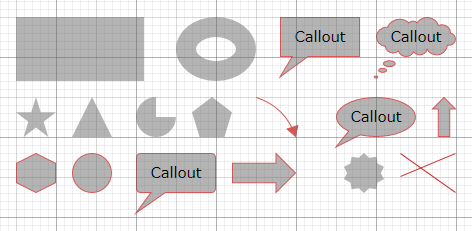
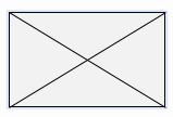
First of all, besides the fact that you can import ready-made pictures, you can draw some primitives for layout layout directly in the Expression Blend (using rectangles, lines and ovals, there are curves, asterisks, arrows, triangles, callouts and a number of other primitives):
To facilitate screen layout, you can turn on the grid and snapping (sticking) to the grid and other objects. This is done through the corresponding buttons at the bottom of the workspace:
')

The same options, as well as the grid cell size, can be configured via the menu Tools ⇒ Options ⇒ Artboard

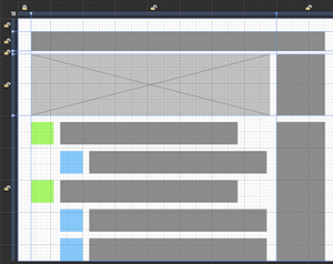
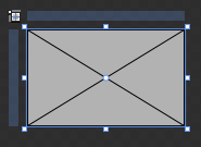
Additionally, you have guides (for Grid Layout), which can also be used to organize objects:

In total, pretty quickly, you can identify the overall markup (composition). By the way, guides are interesting in that objects can be attached to them, respectively, by changing the position of the guides, you can change the composition:
Moving on to real controls;)
From the point of view of prototyping, the fact that SketchFlow is based on Expression Blend, which in turn was designed to design applications for Silverlight and Windows, is a great advantage: you already have a library of ready controls and a mechanism for creating new ones, as well as styling capabilities. and layoutes for grouping objects.
Technically, all controls that you use are not just pictures of controls, but quite functional objects: buttons are pressed, checkboxes are set down, list items are selected.
You can get access to ready controls through the Assets panel in two ways:
In both cases, you can choose the best view for yourself: a list (small icons) or a grid (large icons), and also search for the desired controls by name, which is very convenient in the case of a large collection. The tree of available elements is displayed on the left: not only ready controls, but also your own controls and objects, including screens, components and images, are included here.
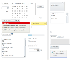
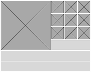
To add a control to the screen, simply drag it to the workspace or select the desired control in Assets and “draw” it in the workspace. An example of controls is given below (these are not all available ready-made controls!):
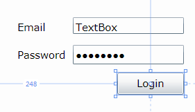
From such a collection you can easily collect something useful, for example, a login form:
By default, all controls have a standard style for Silverlight (as in the pictures above), however, a special sketch style (drawing style) is also available for SketchFlow projects.
Sketch style is interesting because it is intentionally simplified and “drawn”. In the context of the prototype, this means that in the end the whole project looks more like paper prototypes than a finished licked design with gradients, volumetric shapes and other effects. This allows the development of a prototype to concentrate on the overall concept and ideas, rather than on the graphic design. The customer obviously understands that this is not a final design, but a prototype.
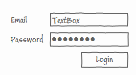
Sketch controls have a “ –Sketch ” suffix. The sketch style can also be applied to many ordinary controls via the context menu Edit Template (or Edit Style) ⇒ Apply Resource ⇒ * -Sketch. For example, the above form in the sketch design will look like this:
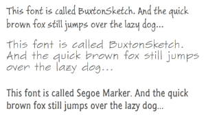
The sketch style is also available for primitives (see Shapes ⇒ SketchShapes in the Assets library). SketchFlow comes with special Buxton Sketch fonts, including Cyrillic.
In addition to the usual controls, you can add special mockups to SketchFlow. If you can open MockupDemonstration among the examples shipped with Expression Blend, you can see them in action.
To add mockups to any project on SketchFlow, you need to connect the appropriate library at startup. This is perhaps the only tricky enough thing to do to achieve a result :)
You need the Microsoft.Expression.Prototyping.MockupsSL.dll library and the accompanying Design folder . They can be found in the folder with examples, for example, here
C: \ Program Files \ Microsoft Expression \ Blend 4 \ Samples \ en \ MockupDemonstration.zip \ MockupDemonstration \ Libraries \ Silverlight \ Debug or, if the samples are unpacked separately, something like Documents \ Expression \ Blend 4 \ Samples \ MockupDemonstration \ MockupDemonstration \ Libraries \ Silverlight \ Debug (and similarly for WPF - the version for .NetFramework is needed).
Then they need to be placed here: C: \ Program Files \ Microsoft Expression \ Blend 4 \ Libraries \ Silverlight \ v4.0 \
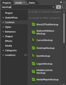
After that, in the Assets library of controls, you will see the mockups (the corresponding objects end in “ Mockup ”), they have green icons:
Now you can easily draw a window, a browser, a login form or a button with an icon and a number of other ready-made layouts.

In addition to ready controls, you can also create your own for reuse. To do this, simply select a group of objects and click Make into User Control from the context menu ... Or simply add a new User Control to the project.
For example, you want to add a special control, symbolizing the place for the picture:
You can, of course, each time re-draw a rectangle and two lines and follow the coordination of sizes. And you can do it once, select all three objects and make a new control, which will now be available in your library:
Now it can be easily used:
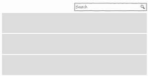
Similarly, you can make your own control for the search form.
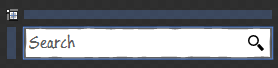
which can then be easily inserted into various interfaces. Moreover, by using the Grid as a Layout, the size of the search field can also be changed:
Finally, in conclusion of this article I want to give another way to quickly enough get the necessary interface components. Yes, we are talking about import again. If you are developing a specific application, such as an application for Windows Phone, iPhone, Android or an application for Facebook, it becomes reasonable to use the interface components from the relevant ui guidelines. As a rule, they are easily accessible in PSD, and then it remains only to import:
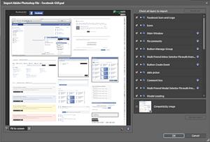
Then you can spread the necessary components to individual controls, or use Copy-Paste:

In the next series, we will look at lists and working with data samples. In the meantime, test your ideas on prototypes and participate in a prototype competition on SketchFlow.

Today we will look at working with controls, but let's start with primitives.
Primitives
First of all, besides the fact that you can import ready-made pictures, you can draw some primitives for layout layout directly in the Expression Blend (using rectangles, lines and ovals, there are curves, asterisks, arrows, triangles, callouts and a number of other primitives):
To facilitate screen layout, you can turn on the grid and snapping (sticking) to the grid and other objects. This is done through the corresponding buttons at the bottom of the workspace:
')
The same options, as well as the grid cell size, can be configured via the menu Tools ⇒ Options ⇒ Artboard
Additionally, you have guides (for Grid Layout), which can also be used to organize objects:
In total, pretty quickly, you can identify the overall markup (composition). By the way, guides are interesting in that objects can be attached to them, respectively, by changing the position of the guides, you can change the composition:
Moving on to real controls;)
Controls
From the point of view of prototyping, the fact that SketchFlow is based on Expression Blend, which in turn was designed to design applications for Silverlight and Windows, is a great advantage: you already have a library of ready controls and a mechanism for creating new ones, as well as styling capabilities. and layoutes for grouping objects.
Technically, all controls that you use are not just pictures of controls, but quite functional objects: buttons are pressed, checkboxes are set down, list items are selected.
You can get access to ready controls through the Assets panel in two ways:
- Fixed tab (if not, you can add it through the Window menu)

- Drop down panel
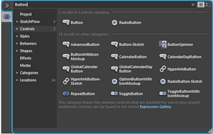
In both cases, you can choose the best view for yourself: a list (small icons) or a grid (large icons), and also search for the desired controls by name, which is very convenient in the case of a large collection. The tree of available elements is displayed on the left: not only ready controls, but also your own controls and objects, including screens, components and images, are included here.
To add a control to the screen, simply drag it to the workspace or select the desired control in Assets and “draw” it in the workspace. An example of controls is given below (these are not all available ready-made controls!):
From such a collection you can easily collect something useful, for example, a login form:
Styles and Sketch Styles
By default, all controls have a standard style for Silverlight (as in the pictures above), however, a special sketch style (drawing style) is also available for SketchFlow projects.
Sketch style is interesting because it is intentionally simplified and “drawn”. In the context of the prototype, this means that in the end the whole project looks more like paper prototypes than a finished licked design with gradients, volumetric shapes and other effects. This allows the development of a prototype to concentrate on the overall concept and ideas, rather than on the graphic design. The customer obviously understands that this is not a final design, but a prototype.
Sketch controls have a “ –Sketch ” suffix. The sketch style can also be applied to many ordinary controls via the context menu Edit Template (or Edit Style) ⇒ Apply Resource ⇒ * -Sketch. For example, the above form in the sketch design will look like this:
The sketch style is also available for primitives (see Shapes ⇒ SketchShapes in the Assets library). SketchFlow comes with special Buxton Sketch fonts, including Cyrillic.
Mockups
In addition to the usual controls, you can add special mockups to SketchFlow. If you can open MockupDemonstration among the examples shipped with Expression Blend, you can see them in action.
To add mockups to any project on SketchFlow, you need to connect the appropriate library at startup. This is perhaps the only tricky enough thing to do to achieve a result :)
You need the Microsoft.Expression.Prototyping.MockupsSL.dll library and the accompanying Design folder . They can be found in the folder with examples, for example, here
C: \ Program Files \ Microsoft Expression \ Blend 4 \ Samples \ en \ MockupDemonstration.zip \ MockupDemonstration \ Libraries \ Silverlight \ Debug or, if the samples are unpacked separately, something like Documents \ Expression \ Blend 4 \ Samples \ MockupDemonstration \ MockupDemonstration \ Libraries \ Silverlight \ Debug (and similarly for WPF - the version for .NetFramework is needed).
Then they need to be placed here: C: \ Program Files \ Microsoft Expression \ Blend 4 \ Libraries \ Silverlight \ v4.0 \
After that, in the Assets library of controls, you will see the mockups (the corresponding objects end in “ Mockup ”), they have green icons:
Now you can easily draw a window, a browser, a login form or a button with an icon and a number of other ready-made layouts.
Own kontol (User Control)
In addition to ready controls, you can also create your own for reuse. To do this, simply select a group of objects and click Make into User Control from the context menu ... Or simply add a new User Control to the project.
For example, you want to add a special control, symbolizing the place for the picture:
You can, of course, each time re-draw a rectangle and two lines and follow the coordination of sizes. And you can do it once, select all three objects and make a new control, which will now be available in your library:
Now it can be easily used:
Similarly, you can make your own control for the search form.
which can then be easily inserted into various interfaces. Moreover, by using the Grid as a Layout, the size of the search field can also be changed:
Interface Elements
Finally, in conclusion of this article I want to give another way to quickly enough get the necessary interface components. Yes, we are talking about import again. If you are developing a specific application, such as an application for Windows Phone, iPhone, Android or an application for Facebook, it becomes reasonable to use the interface components from the relevant ui guidelines. As a rule, they are easily accessible in PSD, and then it remains only to import:
Then you can spread the necessary components to individual controls, or use Copy-Paste:
In the next series, we will look at lists and working with data samples. In the meantime, test your ideas on prototypes and participate in a prototype competition on SketchFlow.
Source: https://habr.com/ru/post/103768/
All Articles