Why is capitalized text difficult to read?

It is not known where the fashion for the design of the text in capital letters has gone, but the fact remains that the use of capital letters surrounds us everywhere. If you write the text in capital letters on the Internet, people will decide that you are shouting, or they will doubt your mental health. But most often, all capital letters annoy people, and the text written in this way is very difficult to read quickly.
People use this technique, wanting to emphasize what was said, considering that such a text will attract more attention. But in fact, the message typed in capital letters does not emphasize what was said, but rather is lost compared to the usual set. The reason for this phenomenon is the lack of contrast between the forms of letters of the text typed in capital letters.
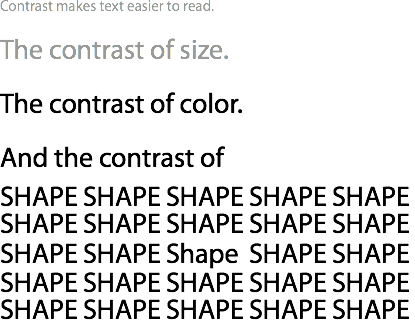
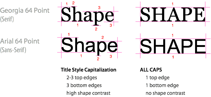
Text typed in uppercase significantly reduces the contrast in the shape of each word. In fact, the shape of any word typed in capital letters, regardless of the font selected, with or without serifs, is always a rectangle. As a result, the words typed in capital letters have one adjacent edge of the letters above and below, which leads to a decrease in shape contrast. Words in which only the first letter is capitalized and others are not, have many edges, located near above and below, giving the word high contrast. The more non-adjacent edges a word has, the greater its contrast. Words typed this way are much easier to read. And when your message is easier to read, then its meaning will be understood faster.
Nevertheless, the text typed in all capital letters is used not only on websites, but also in books, advertising, television, movies and magazines. And so everywhere, because it seems to people that in this way they can emphasize the importance of what they are trying to say. But if you are trying to say something really important, your message will say it for you without additional tweaks. And applying all caps will only make it worse.
')
In which cases is it permissible to use all caps? Such a set is good in situations not related to reading, such as logos and acronyms. But if your message implies reading, the use of all capital letters, and thus a decrease in the contrast of the text, negatively affects the result. You want your text to be read quickly and easily? That is why the Caps Lock key is harmful in most cases.
Along with exclamation marks in writing, which are used extremely rarely, it is important to use all capital letters in the design extremely rarely, or not to use them at all.
via UX Movement
Source: https://habr.com/ru/post/103659/
All Articles