Designing attractive, realistic user interfaces
The secret to developing attractive interfaces is realism. Your task is to give volume to flat elements using the properties of real objects, such as irregularities and roughness, glare and shadows, and various surface textures. Ideally, they should look like objects on your desk. Creating a cool interface, first of all you need to think not “how”, but “why”.
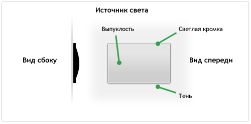
As you work on a realistic interface element, ask yourself how it would look in the real world. For example, take a look at the button on the side:
')
The button is drawn so that it looks a bit raised, it has a matte surface, a slight bulge and a thin outline. In three-dimensional space, the light source illuminates the edges of the object (slightly brighter at the upper edge), and the bulge gives a slight darkening in the lower half of the button. The element rises quite a bit above the surface, so its shadow is small.
In Pastebot - an application from Tapbots - the panels used are similar to the example buttons above and located one after another:

The light source is on top, so each panel has a shadow at the bottom and a highlight on the top edge. On the side, it looks like an angle bracket <.
The interface elements that we like, as a rule, look realistic, so you need to pay more attention to drawing the correct highlights and shadows.
In my lesson on drawing the icon of the Internet ball, I showed how the material of an object affects its appearance. Knowing what the object is made of, it will be much easier for you to make it realistic.
Recently, I referred to several nice dock substitutes for the Mac , many of which illustrate how important it is to consider material in design. In Phantom, the designer uses two materials: a grainy surface similar to the back of a laptop and a translucent glass surface.
Apple used to use shiny glass interface elements on MacOS X, then it was rumored that a total interface update with matte elements was being developed. A complete update did not happen, but for several years already frosted textured elements have supplanted shiny glass.
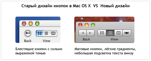
In new versions of iTunes, many elements like scrollbars and buttons have been replaced with new matte ones.
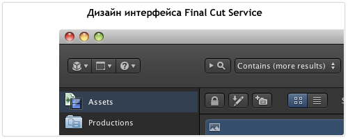
Apple also began to use matte textures in its other designs, especially in the Final Cut Server . In the interface of this application, Apple refused to shine and added volume to the elements, slightly lifting them above the surface. The icons on the buttons also look voluminous, thanks to the minimal shadow. The interface panel is similar to the surface of dark textured metal and the whole application looks like a control panel of high-tech equipment.
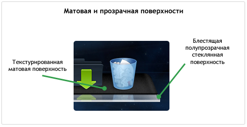
Here are some examples showing how different types of surfaces affect the appearance of an item:
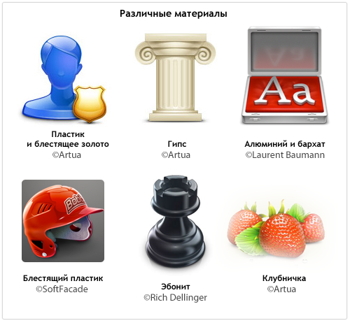
The next time you want to draw some shiny object, think about what material you are working with: plastic, glass, aluminum? If you paint an object with a matte surface, think how much it will be textured and granular: paper, sandpaper, cardboard or aluminum like on a Mac? Is there transparency? Do you want to draw a hyper-realistic material or imitation?
It's one thing to look at other people's beautiful interfaces, icons and illustrations, and quite another to create them yourself. Here are a few photoshop tricks that I use myself.
Noize Layer ( Noise Layer )
Key detail in matte surfaces is grit. The easiest way to make such a texture is to create a layer with a single-color fill, and then add noise using the Noize filter. It is important not to overdo it and make it barely noticeable.

Radial Highlights (Circular Lighting)
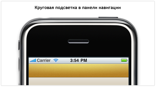
The main source of light, as a rule, is on top, but this does not mean that you cannot add another source to make it more expressive. Below is shown the navigation bar I have drawn for an iPhone application that uses a light all-round backlight to give volume. Blend Mode was set to Overlay to highlight and increase the saturation of the background. The transparency of the layer is reduced so that it does not turn out too bright. Also note that the top edge of the panel is additionally highlighted to create a volume surface effect.
Layer Styles
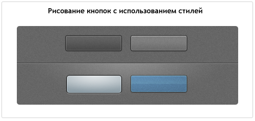
Styles are a key part of my workflow, I use them everywhere. I usually draw a vector object, set the Fill parameter to 0% and start using styles. Anyone can add a simple shadow with Drop Shadow, but if you are ingenious in working with styles, you can do some really interesting things. For example, you can use only one Stroke, but the stroke effect can be simulated several times with Inner Glow and Outer Glow, using the Spread and Choke properties and turning the glow into sharp lines.
Using this technique, you can achieve a variety of effects with minimal effort. Below are several styles for rounded rectangles using single-pixel glow and shadows. The PSD file with examples is licensed under the Creative Commons license .
When in the interface something cuts the eye, it looks like a fake, something that can not be in reality. Finally, a few tips to help you avoid many mistakes when developing realistic interfaces:
Volumetric thinking
As you work on a realistic interface element, ask yourself how it would look in the real world. For example, take a look at the button on the side:
')
The button is drawn so that it looks a bit raised, it has a matte surface, a slight bulge and a thin outline. In three-dimensional space, the light source illuminates the edges of the object (slightly brighter at the upper edge), and the bulge gives a slight darkening in the lower half of the button. The element rises quite a bit above the surface, so its shadow is small.
In Pastebot - an application from Tapbots - the panels used are similar to the example buttons above and located one after another:
The light source is on top, so each panel has a shadow at the bottom and a highlight on the top edge. On the side, it looks like an angle bracket <.
The interface elements that we like, as a rule, look realistic, so you need to pay more attention to drawing the correct highlights and shadows.
Material and surface
In my lesson on drawing the icon of the Internet ball, I showed how the material of an object affects its appearance. Knowing what the object is made of, it will be much easier for you to make it realistic.
Recently, I referred to several nice dock substitutes for the Mac , many of which illustrate how important it is to consider material in design. In Phantom, the designer uses two materials: a grainy surface similar to the back of a laptop and a translucent glass surface.
Apple used to use shiny glass interface elements on MacOS X, then it was rumored that a total interface update with matte elements was being developed. A complete update did not happen, but for several years already frosted textured elements have supplanted shiny glass.
In new versions of iTunes, many elements like scrollbars and buttons have been replaced with new matte ones.
Apple also began to use matte textures in its other designs, especially in the Final Cut Server . In the interface of this application, Apple refused to shine and added volume to the elements, slightly lifting them above the surface. The icons on the buttons also look voluminous, thanks to the minimal shadow. The interface panel is similar to the surface of dark textured metal and the whole application looks like a control panel of high-tech equipment.
Here are some examples showing how different types of surfaces affect the appearance of an item:
The next time you want to draw some shiny object, think about what material you are working with: plastic, glass, aluminum? If you paint an object with a matte surface, think how much it will be textured and granular: paper, sandpaper, cardboard or aluminum like on a Mac? Is there transparency? Do you want to draw a hyper-realistic material or imitation?
Few tricks
It's one thing to look at other people's beautiful interfaces, icons and illustrations, and quite another to create them yourself. Here are a few photoshop tricks that I use myself.
Noize Layer ( Noise Layer )
Key detail in matte surfaces is grit. The easiest way to make such a texture is to create a layer with a single-color fill, and then add noise using the Noize filter. It is important not to overdo it and make it barely noticeable.
Radial Highlights (Circular Lighting)
The main source of light, as a rule, is on top, but this does not mean that you cannot add another source to make it more expressive. Below is shown the navigation bar I have drawn for an iPhone application that uses a light all-round backlight to give volume. Blend Mode was set to Overlay to highlight and increase the saturation of the background. The transparency of the layer is reduced so that it does not turn out too bright. Also note that the top edge of the panel is additionally highlighted to create a volume surface effect.
Layer Styles
Styles are a key part of my workflow, I use them everywhere. I usually draw a vector object, set the Fill parameter to 0% and start using styles. Anyone can add a simple shadow with Drop Shadow, but if you are ingenious in working with styles, you can do some really interesting things. For example, you can use only one Stroke, but the stroke effect can be simulated several times with Inner Glow and Outer Glow, using the Spread and Choke properties and turning the glow into sharp lines.
Using this technique, you can achieve a variety of effects with minimal effort. Below are several styles for rounded rectangles using single-pixel glow and shadows. The PSD file with examples is licensed under the Creative Commons license .
Act thinner
When in the interface something cuts the eye, it looks like a fake, something that can not be in reality. Finally, a few tips to help you avoid many mistakes when developing realistic interfaces:
- Everything should be clear. No soap in the lines and on the edges of the objects.
- Always use transparency. There is nothing completely black or white, dark or light.
- Try to use the vector whenever possible, because Rasterize you always have time. Do not use Free Transform for vector objects, only the Direct Selection Tool to move individual nodes.
- Experiment with the Layer Styles. For example, a purely white internal glow is too rough and bulges the object. But using the Overlay blending mode, you animate the object, increasing the color saturation.
- Shadows will destroy your design if you do not use them wisely. Interface elements should be close to the surface, so use a shadow size of 1-3 pixels and a distance of 0-3 pixels from the object. This is not WordArt.
- To save an object in PNG or GIF format, first convert the layer to a Smart Object, and then rasterize it. This will keep the color blending modes set.
- When adding text to an element, it must be either convex (with a dark single-pixel shadow) or indented (white single-pixel shadow), but never at the same level as the button surface.
- Objects from the real world rarely have perfectly right angles. Use slightly rounded corners to add realism.
- In reality, all objects cast a shadow. Unless you draw vampires and you want your object to look voluminous, add a shadow to it, even if it is almost imperceptible.
Source: https://habr.com/ru/post/103317/
All Articles