Usability of applications. (Part 1: Online Shopping)
The online store is a showcase, the facade of the building, staff, lighting ... I think I was mistaken and describe a regular store. No, the online store is not much different from its real counterpart. The main page is a facade, a signboard, and a store decoration. Search - these are sales assistants ... and so on ... Opening a successful online business is no easier than in reality, although spending money is much less.
Online store, very tempting business, in this article I will discuss the problems associated only with usability in most online stores. The easiest way to learn from the mistakes of others, let's do it and do it!
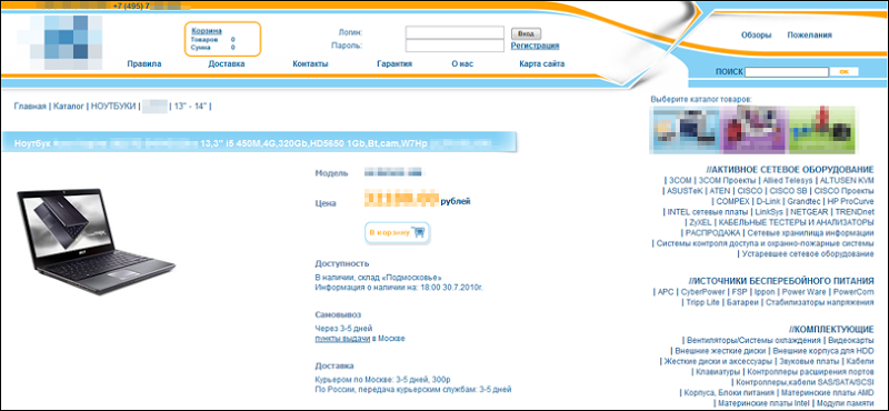
What are the problems in% of the name of the store% (the first one from the Yandex Market). I see a lot of them, a lot. Let's take it in order:
minus the name of the store and the phone in the upper left corner - so that no one noticed. It makes sense to hide the name only to the unfair seller.
minus Why there is no contact store on the main? A potential buyer visiting this site at a glance and you will not tell in which country and city it is located. Only +7 (495) Tells us about Moscow. I personally did not immediately see this phone.
minus Basket, why is she? I just went in, they show me that in my basket there are 0 goods for 0 amount ... why then should I show it? Apparently to stimulate shopping.
')
minus Links to incomprehensible interfaces (about us, site map, warranty, rules, reviews). Site map - the map is needed only where we cannot do without it, we are not in the forest or in the desert, we will try to find the necessary things in the store without a card. A well-designed interface is what you need. Warranty rules - a guarantee of what, what rules? It makes sense to show the rules and the guarantee when a person chooses something. It is better to use generalizations and templates as little as possible, even if we will show our guarantee for each product, because it differs from the separately purchased hdd and laptop.
minus the "login" and "password" fields in the store header is about the same as the bouncer around the club, it is alarming and frightening. This is not a secret object, and not a social network - it is a service, a minute service. At the sight of the login immediately thoughts about incomplete information for anonymous users or the inaccessibility of certain functions. User identification should not be intrusive - it is transparent to him. In the store, you are not asked to show your passport at the entrance in order to find out if you have been to them already or not.

minus the button “Add to cart”. Why not write, I want to buy it after clicking on which we are offered to either proceed to registration, or continue shopping. This is convenient, and it works in real stores: you take the goods from the shelf, look, read, try on the tooth ... say "I take it!". A person approaches you, picks up the goods, and says: “the goods will be at the checkout - he does not ask for your name, does not tell you the 9-digit number of your order, and so on. he is just an invisible servant , if you don’t take anything else, follow me. ” After all, most people take 1 item at a time.

minus one-line item description. The product costs 30k, I believe that the buyer has the right to receive a comprehensive description of the product + links to ixbt reviews, etc.
minus Lack of article, or it is too long / complex. The buyer wants to order the goods by phone, how to tell him what product he needs, not to dictate the factory part number of incomprehensible symbols, or the full name of the model. Why not simplify the perception of the article from 345786 to 34.57.86
minus Difficult checkout. The buyer came to the cashier, and then the cashier makes the buyer arrange a card, fill out personal data, answer a couple of questions. I would leave after that. No need to force your store user to register on your site. No one needs this. Ask him (phone, name) or (mail address, Skype and so on.), And say that contact him as soon as possible. It is better to discuss the final confirmation of the goods, time of the order, delivery options, payment options personally with the manager. Personal communication has, and allows a person the most convenient for him to choose the time and place to receive the goods. You do not need to ask the person to fill in the delivery address, he may not know: it’s better to get at work or at home, it all depends on the capabilities of your logistics service, the location of the points of issue of goods and so on.
minus the difficulty of finding a product. The buyer can know exactly what he needs, and can only guess. Create a flexible search for different degrees of user preparedness. Someone has enough pink laptop, and someone needs 15.6 "with a resolution of 1920x1080 and no less. In the beginning, you need to understand the degree of awareness in the question, and depending on the answers, such a search and provide.
minus Lack of motivation for further purchases . The system of discounts for repeated purchases in the store on the basis of transparent identification for the user. It will pleasantly surprise a person that they remember him, give him some bonuses ...

minus Wishes / complaints. No matter how badly the users write about the operation of your online store, it is impossible to hide such messages in any way - you need to respond to them. The absence of a complaint book or a third-party complaint book (for example, Yandex.Market) will also cause distrust. Users will type in the search engine “% store name% reviews”. Hide the rot can not be, it must be cut off the correct conclusions and deeds.
Well, remember lastly. The main rule of trade: The customer is always right.
Online store, very tempting business, in this article I will discuss the problems associated only with usability in most online stores. The easiest way to learn from the mistakes of others, let's do it and do it!

What are the problems in% of the name of the store% (the first one from the Yandex Market). I see a lot of them, a lot. Let's take it in order:
minus the name of the store and the phone in the upper left corner - so that no one noticed. It makes sense to hide the name only to the unfair seller.
minus Why there is no contact store on the main? A potential buyer visiting this site at a glance and you will not tell in which country and city it is located. Only +7 (495) Tells us about Moscow. I personally did not immediately see this phone.
minus Basket, why is she? I just went in, they show me that in my basket there are 0 goods for 0 amount ... why then should I show it? Apparently to stimulate shopping.

')
minus Links to incomprehensible interfaces (about us, site map, warranty, rules, reviews). Site map - the map is needed only where we cannot do without it, we are not in the forest or in the desert, we will try to find the necessary things in the store without a card. A well-designed interface is what you need. Warranty rules - a guarantee of what, what rules? It makes sense to show the rules and the guarantee when a person chooses something. It is better to use generalizations and templates as little as possible, even if we will show our guarantee for each product, because it differs from the separately purchased hdd and laptop.
minus the "login" and "password" fields in the store header is about the same as the bouncer around the club, it is alarming and frightening. This is not a secret object, and not a social network - it is a service, a minute service. At the sight of the login immediately thoughts about incomplete information for anonymous users or the inaccessibility of certain functions. User identification should not be intrusive - it is transparent to him. In the store, you are not asked to show your passport at the entrance in order to find out if you have been to them already or not.

minus the button “Add to cart”. Why not write, I want to buy it after clicking on which we are offered to either proceed to registration, or continue shopping. This is convenient, and it works in real stores: you take the goods from the shelf, look, read, try on the tooth ... say "I take it!". A person approaches you, picks up the goods, and says: “the goods will be at the checkout - he does not ask for your name, does not tell you the 9-digit number of your order, and so on. he is just an invisible servant , if you don’t take anything else, follow me. ” After all, most people take 1 item at a time.

minus one-line item description. The product costs 30k, I believe that the buyer has the right to receive a comprehensive description of the product + links to ixbt reviews, etc.
minus Lack of article, or it is too long / complex. The buyer wants to order the goods by phone, how to tell him what product he needs, not to dictate the factory part number of incomprehensible symbols, or the full name of the model. Why not simplify the perception of the article from 345786 to 34.57.86
minus Difficult checkout. The buyer came to the cashier, and then the cashier makes the buyer arrange a card, fill out personal data, answer a couple of questions. I would leave after that. No need to force your store user to register on your site. No one needs this. Ask him (phone, name) or (mail address, Skype and so on.), And say that contact him as soon as possible. It is better to discuss the final confirmation of the goods, time of the order, delivery options, payment options personally with the manager. Personal communication has, and allows a person the most convenient for him to choose the time and place to receive the goods. You do not need to ask the person to fill in the delivery address, he may not know: it’s better to get at work or at home, it all depends on the capabilities of your logistics service, the location of the points of issue of goods and so on.

minus the difficulty of finding a product. The buyer can know exactly what he needs, and can only guess. Create a flexible search for different degrees of user preparedness. Someone has enough pink laptop, and someone needs 15.6 "with a resolution of 1920x1080 and no less. In the beginning, you need to understand the degree of awareness in the question, and depending on the answers, such a search and provide.
minus Lack of motivation for further purchases . The system of discounts for repeated purchases in the store on the basis of transparent identification for the user. It will pleasantly surprise a person that they remember him, give him some bonuses ...

minus Wishes / complaints. No matter how badly the users write about the operation of your online store, it is impossible to hide such messages in any way - you need to respond to them. The absence of a complaint book or a third-party complaint book (for example, Yandex.Market) will also cause distrust. Users will type in the search engine “% store name% reviews”. Hide the rot can not be, it must be cut off the correct conclusions and deeds.
Well, remember lastly. The main rule of trade: The customer is always right.
Source: https://habr.com/ru/post/100646/
All Articles